I warned Nathan that I was going to drop a pie bomb on Flowing Data. Well, here it is; it’s labeled by its creator as a “feather chart.” I really hate to pick on people. I truly think Jon made a valiant attempt to use pie charts innovatively. However, this chart is not effective.
The chart uses 11 million ACT records (for international readers, that’s a standardized test in the US). It’s trying to show the relationship between ethnicity and test score and income and test score.
I created the y-axis as the ACT composite score, and then used self-reported income bands as the x-axis. Both are discrete, categorical values, even though ACT is numeric. ACT increases bottom-to-top, and income bands increase left-to-right. At the intersection of each variable is a pie chart, sized by the number of students in that group, and colored by ethnicity
The only problem is that the overlapping pie charts occlude one another. Unless one section of the pie chart dominates and allows the other sections to peek out over the top of the previous pie, then the chart is useless. For instance, in the first feather, there’s no way to know if the orange section is 40% or 60% for most of the chart.
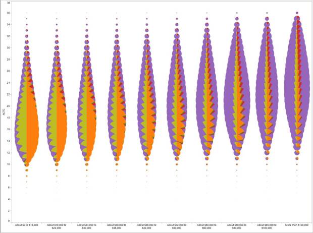
This chart has really good intentions, but the data would be better served with a bean or violin plot. If you’re a subscriber, you can check out Nathan’s great tutorial from last week about visualizing distributions.
 Visualize This: The FlowingData Guide to Design, Visualization, and Statistics (2nd Edition)
it’s not that bad. obviously the accurate information is lost because of the overlapping, but the overall message does come through.
Yeah… there’s something in there… the idea doesn’t work yet, but there’s something in it.
I think what he’s aiming for is sound, and this is a valiant, if flawed, early step. Maybe if it was rectangular/square shapes divided left to right… If this idea can be made to work, it’ll do something new.
(“to drop the pie bomb” is my verb phrase of the day btw, love it)
It does have some good and bad. I think replacing the pies with horizontal stacked bars would solve the occlusion issue. Jon is trying to show a couple things: 1) that income correlates to race. The predominate colors in each income band tends to show that – just not very accurately. 2) The median “bubble” move up as income increases. That is less obvious with the coloring interfering (color bias).
So, there maybe something to the style, but using pie charts is a poor way to color & represent the distribution/area.
I also think this has potential. For what you give up in precision, you gain in a gist-based understanding of the data, which is kinda why we do data visualization in the first place: so you can get the story the data tell at a glance. THis isn’t perfect, but is worth exploring further and refining.
I have to admit I totally fail to see how you can fit 3 variables with so many subcategories into bean or violin plots (even assuming you’ll do small multiples). Anyone cares to explain?
Oooohhhh, look at all the pretty colors. (I’m not some purist who wants monochrome graphics, but I do think that this graphic is pretty.)
As usual it all depends on the purpose: if it’s about analytics and punctual comparison of values, obviously it doesn’t work at all; but if the purpose is to tell a story, to convey a message, to share with an audience the overall (big) picture of a phenomenon, it works very well. And it’s certainly a picture that people will remember, thanks also to the visual metaphor (the feather). The point is not whether it is innovative or not: it’s about knowing the goal and see if the visualization serves it or not.
If we don’t define exactly the context, any discussion is limited in the effects. It’s not the case here, but I find less and less useful to discuss about visualization as an “abstract” device, disconnected from the intended user experience.
I guess that’s why they make chocolate and vanilla. As the whole blog post from which you extracted this points out, I normally don’t like pie charts, for all the reasons people normally cite: When you need to distinguish between very small differences in percentages of total sales for widgets versus sprockets versus gizmos over two or three years, for instance.
But this is a massive data set, and the point is not to give a precise measure of difference between any two groups; it is, as Paolo points out, to tell a story of an overall trend in a data set. In this instance, that the fat part of the feather gets higher as income goes up (suggesting that scores vary directly with income); that for every income, the pies get more purple as you go up the category, and that they also get more purple as you move left to right with income. They collectively tell a story about standardized testing, income distribution by ethnicity, and the inequalities in American education.
I’m sorry the idea of the forest was lost in the pursuit of the veins in the individual leaves on the trees.
And, I didn’t really think anyone would adopt the feather chart; I simply refer to it as that because they do look like feathers. I totally get that this is not a new design that will soon become all the rage. But to me, this tells a far better story than either the “bean” or “violin” charts.
People who are not capable to find classic solution, start to make perversions.
This is a comment that needs to be backed up with a real example of a “classic solution” that would tell the story for this data set. Else it’s just trolling.
Personally, I followed up on my horizontal bars thought from above by trying a few different ideas. I was surprised to see that the best option did turn out to be a variant on a classic formula – a row of stacked horizontal-bar charts, with, running alongside the Y axis, a very thin stacked bar chart showing the %s so that relative trends could be seen at the narrow ends (these sized so that each 25% was a square for easier reading).
Sometimes old ideas are the best, but not always. There’s no place for knee-jerk puritanical personal attacks on harmless experiments and attempts at innovation.
I’m late to this thread, but I was just about to suggest something like what you’re talking about when I saw your comments, Al. Did you ever build a proof-of-concept? Because I realized what you’re describing–what I was thinking about–is started to feel like a richer version of a population pyramid.
Visually the graph does a nice job of presenting information that is easily understood… Would be good for marketing things to consumers where the instant visualization is more important than the detailed analysis of data.