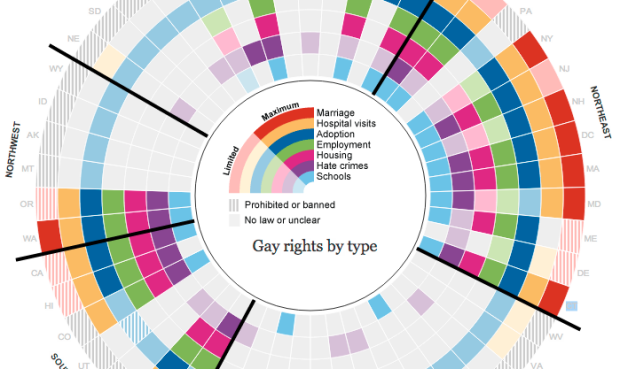
Gay rights vary across states and by region. The Guardian US interactive team does their research and shows this variance, covering several issues, from school to marriage. Segmented concentric circles make the foundation of the interactive where each circle is an issue, and each segment is a state. The states are organized by region, so it’s easy to see where areas of the country stand.
Be sure to scroll down for regional breakdowns by issue.
Nice work from both a technical and storytelling standpoint.
 Visualize This: The FlowingData Guide to Design, Visualization, and Statistics (2nd Edition)
I don’t see any pressing reason for this graph to be circular, or for the axes to be tilted off to the side. Otherwise excellent.
I find the circular layout to be useful for compactness and for seeing overall and regional trends and differences at a glance.
I have to agree with the first poster…a simple matrix would display this data much more clearly, and not take up much, if any, extra space.
This is another circle for circles’ sake.
Great information. Illinformed design.
Go on then.
Makes me very proud of my state, Washington.
After visually testing the circle layout vs. linear matrix in photoshop, I’d still have to go with the circle. It is very hard to read across a 50 column row end to end and discern percent for or against each issue. Think of the circle as concentric pie charts. It is quite easy to pick up the percent for or against on each ring.
Also, the circle mimics overall geography, allowing side by side comparisons of each region, while a linear arrangement requires a split somewhere, most likely I’d split it between southwest and southeast.
Well, yes – laying this out as 50 columns would be utterly silly.
50 rows, however, would be quite workable and not require any kind of splitting.
And the fact that this layout can be compared to ‘concentric pie charts’ is precisely the problem.
If the least effective basic chart type is your basis, and you make it more complex, then clearly it will be even less effective.
It takes a huge amount of visual processing to compare much of anything in this layout.
I would also strongly challenge the assertion that it is easy to pick up the percent ‘for or against in each ring’.
At *best* you can get a general idea of ‘is there more for or more against’.
What percent have no laws?
What percent have limited rights?
What percent have full rights?
Sure you can count it. But if counting is the answer, then there’s a failure in the design.
“Think of the circle as concentric pie charts.” – Jonathan
“The only thing worse than a pie chart is several of them.” – Tufte
There seems to be a trend for discussions of info design to divide into two camps… Those people who, like Jonathan above, who try things out and see what works, and those who find a suitable Tufte quote, lean back in their armchairs and consider the debate to be over.
It should be opinion and evidence and practice, not the opinion of one writer of quite good well presented books versus evidence and practice.
There also seems to be a trend of people not understanding the studies and the evidence, and therefore dismissing anyone who says that pie charts are bad.
The evidence of what works very firmly and clearly supports the fact that this type of display is far from the ideal of data visualization.
“The most useless way to comment on information graphics made by someone who certainly knows about Tufte is to bring up a quote by Tufte.” – Martin
Just reading the other comment that 50 x 7 would better be presented (on a laptop screen) in a simple matrix and that just consolidates my feeling that there is certailny something wrong with this anti-circle crusade…
So these examples:
https://flowingdata.com/2012/01/20/where-are-the-biggest-box-office-movies-streaming/
https://flowingdata.com/2012/01/11/vehicles-involved-in-fatal-crashes/
Would be more effective as circles?
having to visually scan and scroll all over to try to make sense of a circular display, no matter what size your screen is, is better than the vague possibility that your laptop screen is small enough that you might have to scroll the page slightly?
I don’t have to scroll at all on my laptop to see the complete visualizations in the examples linked to.
The science behind why it is much easier to grasp the message in the data in such matrix displays vs the same matrix curved around a circle is pretty clear. I have a very difficult time understanding why people get so emotionally attached…
@J – At a glance I can tell that more than half of the states have almost no laws other than those allowing single people to adopt and that those states are almost the whole southeast and most of the Midwest and Northwest. I could even tell you the regions without the labels because of the circle arrangement.
At a glance I can tell that only a couple of states have mostly limited rights (WI, NY, MD) and that most states have either no laws /unclear laws for most categories or have laws giving rights in most categories.
At a glance I can tell that most states on each coast except the southern states have mostly full rights (about 1/3).
I doubt you could take that much away that quickly from either a linear bar chart or a matrix.
@Jon – In defense of pie charts: http://neoformix.com/2007/InDefenseOfPieCharts.html
@Jonathan – it’s easy to talk about what you can tell ‘in a glance’ after you’ve looked at the chart for a couple of days ;)
Many of the things mentioned are not obvious at first glance.
Any of the things that may be would be far easier to determine by moving your eyes in a straight line up/down or left/right than it is by moving your eyes around a circle and into the middle of the circle to read the legend, and then out to see which state, and around to see what other states are like, and so on.
These are fairly basic scientifically sound principles with proven track records of real world use.
When it comes to ‘defense of pie charts’, I can’t help but feel that the literature is all strikingly similar to that of things such as climate change denial, creationism, and anti-vax arguments.
Oh no it’s a circle. Circles are bad. People who like this chart must be creationists who deny climate change.
Come on guys don’t stop the debate here… We’re just a few posts away from someone comparing someone else to Hitler based on their opinions on pie charts!
Melodrama much?
Just stating a pretty clear correlation between types of denial, and the similarity in the arguments used.
It’s simple to see that the arguments for pie charts other similarly flawed circular charts ignore the evidence of their ineffectiveness.
Equating defense of pie charts to other bad science is a far cry from calling someone Hitler.
Well that post is good evidence that your perception is a little off ;)
As a final note, a quick glance to the right column of this web page reveals two excellent examples of how a matrix display of this data would work very effectively.
There may be better formats than a circle, but I think the colors make it easy enough to read.
I strongly suspect the circle was meant to invoke the rainbow symbol of the LGBTQ movement. Though I’m not sure why they didn’t keep the ROYGBIV order though.
The slice/size allocated to each of the states are all equal. That size is not representative of how many people are in the state, so the comment that you get a sense of the percentages for or against is questionable. This would be misrepresenting that story a great deal if people are assuming percentages visually.
hated it at first glance, but loved it after a few moments. the circle is visually appealing, not obviously obstructive to interpreting the data, more reflective of geographic relationships, and suggestive of a rainbow (are color choices here intended for contrast/color blindness visibility?)
I have thrown together a couple of rough draft examples of ways to display this data:
http://public.tableausoftware.com/workbooks/GayRightsbyStatealaGuardian
This is my first time trying to use Tableau, so please forgive the basic nature of these (and again, they are rough drafts, not in any way attempting to be finished work). They lack the interaction and explanations because they are simple demonstration examples.
Color Key runs from Red (prohibited), Grey (no law), Light Blue (limited/prohibited), Medium Blue (limited) and Dark Blue (Maximum).
Simply Put, Red = Bad, Blue = Good.
FWIW