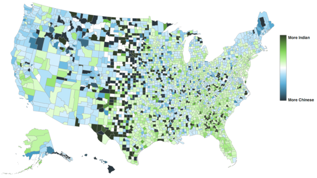
At first I thought this map, by David Yanofsky for Bloomberg, was your standard county-level choropleth map of demographics. Select a self-described heritage from the first drop down and you see where all the people are by count. That’s only kind of interesting, but you often just end up highlighting big cities.
However, select a heritage from the second drop down menu to compare against the first and you get a relative scale. The above for example shows those of Chinese and Indian heritage. It’s a simple calculation that makes a big difference in usefulness.
 Visualize This: The FlowingData Guide to Design, Visualization, and Statistics (2nd Edition)
I enjoyed playing with different combinations (Norwegian v Polish, Scots-Irish v Polish, and Italian v Swedish produce interesting regional results). This resource is easy and fun to use. If I may, the only change I recommend is to change the degree of darkness (value) at both ends of the diverging blue-white-green color scheme. Those darkest blues look a lot like the darkest greens, so the perceptual differences between mapped colors do not always correspond with the numeric distances between values. Other than that – very cool.
Came here to say the same thing – it’s a very good visualization with a not so helpful color scheme. Picking colors from opposite sides of the spectrum might help fix that issue, instead of picking both colors from the ‘cool’ family.
Being from Michigan’s Upper Peninsula, I also enjoyed seeing the Norwegian v Swede comparison. One complaint with the site, though: it’d be a lot better if you could normalize the population totals by land area or total population (i.e. the total populations would be expressed instead as densities, and you could also compare the population proportions of different heritage groups).
I noticed that too. Butte, Montana ‘one of the country’s most thoroughly Irish American cities’ (according to the Wikipedia article on Irish Americans) doesn’t make the choropleth.
Same comment. Los Angeles County has the greatest number of those of English descent, but I doubt it has the highest percentage of them. Also, the fact that county size increases so dramatically as one travels west skews any numbers (and chloropleths) calculated on a county level. (As an aside, it also has lots of nutty ramifications for federal environmental quality designations assigned by county, says this California air quality regulator.)