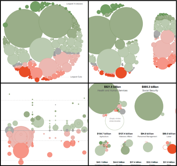
With Obama’s recent budget for next year proposed, Shan Carter et. al of The New York Times let you explore the plan in their new interactive. It provides four distinct views of what the breakdowns look like, all the while keeping a distinct link between each click with smooth transitions and consistent objects (much of which was handled with Mike Bostock’s D3).
Initially, a view of all spending is shown at once. Each bubble represents a chunk of spending, and each is colored by the change from last year. Green shows more money and red means less, and as indicated on the chart, spending is oriented from largest increase to largest cut, top to bottom.
Next tab: types of spending. This is when the magic happens. Instead of skipping to a new graphic, the existing bubbles divide to show mandatory and discretionary spending. Jump to the next view to see changes to discretionary spending, and finally see spending shown by department.
The transitions make this graphic. It’s often useful to see data from different angles, and the smooth transitions (rather than abrupt jumps) let you see how things are and how they have changed, effectively. This is fine work.
 Visualize This: The FlowingData Guide to Design, Visualization, and Statistics (2nd Edition)
I agree that the transitions are what make this graphic. They do a really good job of keeping the context for the user as they transition from one view to another.
My biggest complaint about this viz, though, is that the very small amounts in the budget are practically impossible to find or analyze. This graphic is really only good if you want to see what the big elements in the budget are. If this had zooming, I would be happier.
Since the data shows both expenditures and income, grouped by categories, I wonder if a stacked bar chart for each department wouldn’t have been easier to read…
I would classify this as entertaining. From an analytic stand point, a bar chart would be more effective.
From an analytic stand point, getting the raw data from http://www.whitehouse.gov/omb/budget then running your own analyses in R to answer your own questions would be more effective than expecting a newspaper company to do it for you :-P
(seriously though, I don’t understand the constant assumption in data vis circles that when an organisation publishes a visualisation, the target audience must be the one demographic (data analysts) who are capable of doing it themselves…)
As I said, it is entertaining. The NYT is more in the entertainment business than the helping people understand things business. If their objective is to entertain, then they have succeeded. If their objective is to provide people with understanding, they have failed. I spent about 5 minutes trying to draw conclusions from the viz before getting frustrated and considering making my own. I do think it is possible to seriously enlighten and entertain at the same time.
I agree with Mark. From a comparison standpoint the bubbles are not the best choice. The best part of this chart is the ‘organic’ transitions from one panel to the next, but you really don’t get a good sense of the different sizes of the categories with the use of bubbles.
Great info but I must agree with Lyell, Mark and Jon. Comparing size (bubbles) is more difficult than comparing length (bars) so I would also suggest a bar chart to get the most out of the chart.
I agree with the comments above, with an analytical and professional hat on.
Yet, it is about the audience. For most, I believe that this would be about revelation and exploration, not analytics. The proportionality issue mentioned above doesn’t detract too far from the objective of relative comparison.
I tend to get more agitated when design impedes or enhances rhetoric and polemics. Here, in the context of exploration, I think the organic bubble approach is wonderful.
Along with the comments above, I too find that the bubbles are nicely designed and the transitions make the overall piece a wonderful experience. But, if I want to actually use the piece for any comparative analysis of the budget proposal…well I struggle to do so.
I think that the Times actually did a better job last year with their tree map approach. I wish they had continued to develop and refine that approach instead of creating this wholly new method.
I’m on a computer that doesn’t support SVG, so I can only look at static images. I’m wondering though, wouldn’t bar charts complicate the comparison in their own way? I see about 40 groupings, each having anywhere from 2 to 20 subgroupings. Sure, it’s hard to compare the porportionality: But, wouldn’t it be equaly hard to compare all of these as bars? They are trying to display something that spends over 900 billion (HHS) alongside something that spends 78 million (USPS). How do you bar chart that? I think circles are the best alternative precisly because their porportionality.
Michael T hit it right on the head — it’s about audience, and “revelation and exploration, not analytics.” People don’t read the Times because they want to do hardcore data analysis. From a purely technical standpoint I’m excited to see they’re using d3 and throwing older browsers under the bus — other organizations will begin to follow suit and the glorious post-IE6/7/8 future will arrive that much more quickly:)
In case anyone would like to implement something like this with their own data, here’s a little tutorial I wrote up on how to do it:
http://vallandingham.me/bubble_charts_in_d3.html