Birds move. eBird shows us how.
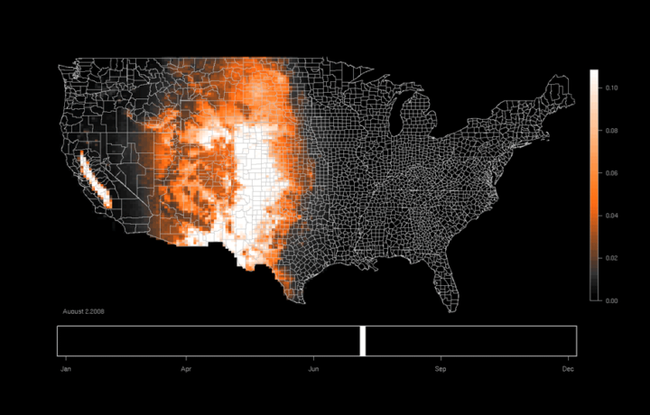
Understanding patterns of bird occurrence at continental scales has long been one of eBird’s fundamental challenges. Only now, with 42 million records and ever more thorough coverage nationwide, is this becoming possible. Ongoing research at the Cornell Lab is currently producing cutting-edge graphics that we are pleased to share here. Day-by-day predictions of species occurrence allows these models to shine a spotlight on the most awe-inspiring of natural spectacles: the ebb and flow of bird migration.
Cutting edge? No. They are thorough though, with maps (in the form of animated gifs) for a large number of species.
[eBird | Thanks, Ed]
 Visualize This: The FlowingData Guide to Design, Visualization, and Statistics (2nd Edition)
I work with these guys and helped design the maps. When they say cutting edge, they’re not talking about the rendering or animations, which are currently pretty crude. They’re referring to the statistical models, machine learning, and related computer science behind the graphics, and that this is the first time species distribution has been modeled at this scale and level of detail.