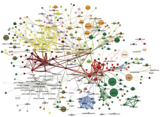
Food flavors across cultures and geography vary a lot. Some cuisines use a lot of scallion and ginger, whereas another might use a lot of onion and butter. Then again, everyone seems to use garlic. Yong-Yeol Ahn, et al. took a closer look at what makes food taste different, breaking ingredients into flavor compounds and examining what the ingredients had in common. A flavor network was the result:
Each node denotes an ingredient, the node color indicates food category, and node size reflects the ingredient prevalence in recipes. Two ingredients are connected if they share a significant number of flavor compounds, link thickness representing the number of shared compounds between the two ingredients. Adjacent links are bundled to reduce the clutter.
Mushrooms and liver are on the edges, out on their lonesome.
[Nature | Thanks, Elise]
 Visualize This: The FlowingData Guide to Design, Visualization, and Statistics (2nd Edition)
Good one !
+1
Make sure to check out the PDF with supplementary information as well, there’s a very pretty radial convergence diagram on page 5: http://www.nature.com/srep/2011/111215/srep00196/extref/srep00196-s1.pdf
Too bad that one didn’t make it in the paper :)
Except that it tells you absolutely nothing…
This has got to be the “no shit Sherlock” diagram of the year showing conclusively that alcoholic drinks made from fuit and plants share many flavours with (wait for it…)…fruit and plants! Most meat you will be pleased to hear is related in flavour terms to … meat (plus some other high protein foods). Stuff made from milk tend to share flavour ingredients with each other and err…milk! I honestly spent about an hour trying to find anything interesting or insightful in this and came up empty apart from the fact that onions seem to go well with meat so I am glad I have been using tehm in hamburgers! Many of the categories make sense in an ingredient/cooking sense but not in any other way – so herbs and spices link to plant derivatives or vegetables – so what they are plant derivatives or vegetables! It tells you more about where the authors categorised each food than anything about the groups. Also there are some very odd data choices – there is Fish, fatty fish and salmon for example (now I think salmon is both a fish and a fatty fish so what do the three categories mean – all fish, fish that arent fatty, all fatty fish or all fatty fish – except salmon ???
Maybe if the lines changed colur at each end so you could see where the links came from rather than the random starting colour it would help. As an example there is one meat – presumably industrial chicken as it is pretty much made of fish these days – which shares a lot of flavours with some seafoods, wouldn’t it be nice to see that and vice versa – which seafoods are closest to meat but you can’t. I think if it was the size of a wall you might see more but as it stands it is a better poster than information transfer tool.
As described in an earlier post (Difficulty Visualizing Social Networks – July, 2007), these kinds of network diagrams, despite being “pretty” in some sense, can be difficult to interpret. I wonder if further dimensionality reduction could be performed, beyond just using the backbone method described in the paper (Self-Organizing Maps comes to mind). Although visualizing the flavor network was not the main point of the paper, additional insights might be gained by another presentation of the data.