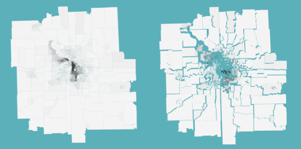
Jim Vallandingham maps racial divide in major cities using Mike Bostock’s implementation of force-directed maps:
Data is from the 2010 Census, at the tract level. The links are hidden, but each tract is connected to each of its neighbors. The lengths of these connections encode the disparity between racial make-up between neighboring tracts. So, if a ‘mostly white’ tract is connected to another ‘mostly white’ tract, then the connection is short. If a city had uniform proportions of races in each tract, the map would not move much. However, longer connections occur where there is a sharp change in the proportions of white and black populations between neighboring tracts. These longer connections create rifts in the map and force areas apart, in some ways mimicking the real-world effects of these racial lines.
Compare Jim’s maps with the catalyst — choropleth maps by Salon. Which do you think works better?
 Visualize This: The FlowingData Guide to Design, Visualization, and Statistics (2nd Edition)
Jim’s force-directed maps depicting racial divide are an interesting technical achievement and the idea well worth exploring. The fracturing of the geography has a pleasing metaphorical meaning for this data but I find it distracting and it seems more difficult to recognize the cities and look for correspondence between the data of interest and specific geographic features.
Overall, the racial data is more clearly depicted by the Salon choropleth maps.
Inasmuch as it’s difficult to recognize the cities and so forth, these remind me of cartograms. It’s hard to take away anything specific or recognize many features in cartograms, but they are effective in a shocking, OMG-look-how-huge-that-country-is way. Similarly, watching these cities shatter according to racial composition is a good in-your-face way to get the overall picture of segregation. But neither is good for clearly depicting data.
Pretty cool concept for this purpose and these data, I think!
I think I’m in the same boat as Andy. The data (raw values) are more clearly depicted by the choropleth maps. That being said, any thematic map (or visualization) provides a subjective angle on some story that emerges from the data, and I think that’s where these maps really shine – as a storytelling device. I feel the same way about cartograms.
I may be in the minority here, but often I’d rather maps ‘lie’ to me flamboyantly/overtly instead of hiding it underneath some sneaky class breaks on a choropleth. If I want to get at the data itself I’d prefer to just see the tables.
Thanks very much to all the responses so far. I really appreciate the feedback on this work.
I’m in agreement with what has been said so far. My goal was to visualize these divides in such a way that really put emphasis on the disparities themselves. I think an improvement to this visualization would be to allow the reader to get more insight into where or why these divides are occurring
The classic mantra: Overview first, zoom and filter, then details-on-demand. I think this visualization could be said to be effective in the overview stage – but needs improvement in the filter and details-on-demand.
I do enjoy how the tracts themselves in some way indicate geographic and city features. Its certainly not very precise, but you can make out the city centers, as well as rivers and some major roads just from the tract boundaries. It reminds me of a low-res version of Ben Fry’s All Streets map.
I’d rather compare to these maps: http://gotopublicschool.com/educational/eric-fischers-racial-division-maps
Salon’s maps make the “racial areas” look as if they were racially homogeneous. Fischer’s show that areas with 50% white or black persons can actually be very mixed. Besides, density is displayed and gives valuable additional information.
I personally feel that Salon’s oversimplified maps support clichés rather than bring information.
Hi,
It’s always a pleasure to read flowingdata. I can find there a lot of interesting visualizations.
What characterizes geolocated polygons is their shapes and their location (aneighboring relationships and X/Y location).
Here, the geometry of the polygons is not very interesting for the message. Overall, it’s the relationships each census tract has with neighbors.
I think one improvement to this map could have been to simplify the geometry of polygons because the complexity of shapes can be a bit confusing for reading.
Also, why not giving a different color to boundaries / or a different thickness to each polygon according to the level of seggregation? Hence, it would preserve delimitations between each census and neighbording relationships, which is not always visible in the center of this map where there are small census tracts with high level of seggregation.
Mathieu