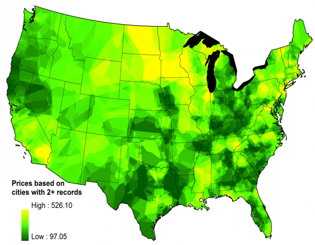
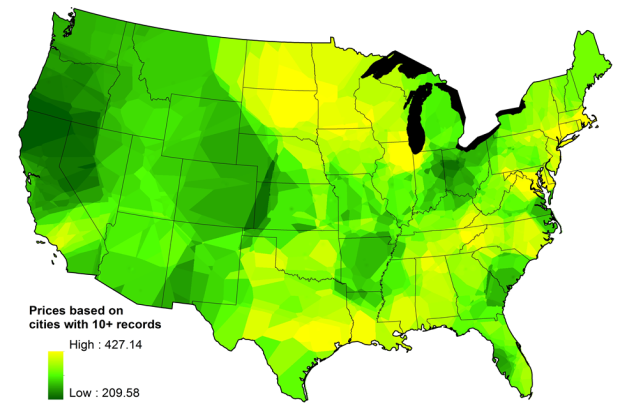
I was raised to always find the best deal whenever I bought anything. Wait for the sales, and then stock up. Drive an extra mile for the cheaper supply of gas. So thank goodness floatingsheep has mapped the price of weed across the country. The more yellow, the more expensive the weed gets and the darker the green the lower the price.
As was the case with the Sexperience 1000, these sort of private datasets do come with their caveats. The analysis was based on data from the Price of Weed, a user-managed source that tries to paint a geographic picture of cost. The people who use that site might not always be the most reputable sources. For example, the map above only used points where there were more than 10 pricings. When using lower the threshold to just greater than two points, the map shows higher variability.

Or who knows, maybe the weed aficionados are extremely accurate. Bottom line: go to the source for the best price.
Floatingsheep notes:
One of the things that jumps out clearly is the low prices associated with the marijuana production sites associated with Mendocino, Trinity and Humboldt County in California as well as Kentucky and Tennessee.


Looks like weed is free in the Great Lakes.
Better hurry. The secret’s out.
Or head to northwest California!
Would be interesting to see this map normalized by cost of living. I suspect that is why the LA area is so high (*rimshot*).
*giggle*
Is it just me or does this thing wreak of supply and demand and the basic economics of place utility? (pun intended)
Isn’t it simply because Var(avg(X)) = Var(X) / n?
This is great. Of course I am stuck on the east coast in philly and nyc, the most expensive areas
The fact that the data is “user-managed” makes me agree these are probably bunk stats… A study about prices in states that have decriminalized would be much more controlled as most of these states collect a fair amount of data about this. Either way, prices (of anything) vary by quality, quantity and legality. None of these factors are reflected in the data.
i’d love to see this map compared to quality of living or health. ha.. people need their medicine
Very interesting idea… That could make for some pretty interesting testimony for the legalization of medicinal cannabis.
Time to crunch.
I want to see how they controlled for quality. Maybe it’s cheap as dirt in the south, but it might was well be what they’re smoking…. Also, a graph of mean quality across region would be nifty, especially for the heads out there looking for their next move. Also, like the idea of comparing with hardship/health as it clearly functions as a palliative within populations. And finally, I’d love to see some dots overlaid on the map to represent incidence of Grateful Dead and/or Phish concerts.
I’m not sure how accurate this is. As I recall, good kine was $400/oz in Colorado.
Its not to accurate, i pay $250.00 for some kickass smoke in northern, Idaho.
There’s way too many other variables for this to be accurate. IE – The U.S.’ imported weed comes mainly from Mexico, and Canada. Mexico = Cheap stuff you can barely call weed. Canadian stuff = good weed, expensive in the states. So some of the lower pricing will be due to the lack of decent weed available.
Assuming, these figures are “per ounce”, You won’t get Canadian weed for < 180/ounce in the states. (and 180, would be a pretty good deal, or the worst weed Canada has to offer.)
thats bullshit man i can get OZs for 150 in australia
Yeah 150 an ounce thats the lowest ive seen them here in tassie as well and that is mates rates the highest 350 to 400 for hydro 150 is for bush normally 200.
Amazing. It even picks up Vermont.