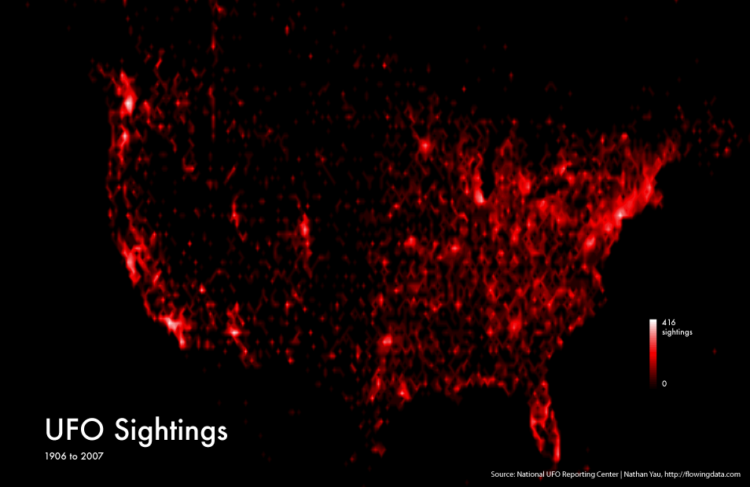
I came across some UFO sightings data on Infochimps, from the National UFO Reporting Center, and it seemed like a good excuse to mess around in R. I was just playing around, but the globular result was kind of fun to look at, so here it is.
The dataset is 60,000 sightings, but the above shows about 45,000 locations that could be geocoded immediately. The whiter the region, the more sightings there were in the area from 1906 to 2007.
Is it just me, or does the map above match up with this other map of major US airports?

Could some of the sightings actually be… airplanes? Nah. The aliens are coming. Luckily I have a big bat, several glasses of water, and asthma to keep me safe.
 Visualize This: The FlowingData Guide to Design, Visualization, and Statistics (2nd Edition)
Or just population densities?
Damn, population density matches major airports. People choose to live near major airports, maybe ? :D
Airports choose to live near population-dense areas, maybe?
No doubt population plays into it. The more eyes there are, the more likely they see something.
Proximity to bars. The more people stumbling outside drunk in the middle of the night seeing moving stars in front of their eyes?
That looks about right for South Florida…explains alot!
It might also have something to do with population density. It does seem to be a very close match though!
Merely assuming a uniform probability of any given person reporting having ‘seen’ a UFO would produce the same results, no data needed ;).
Beat me to it…
If I had do land my UFO on a strange planet, I’d try their airports first.
not sure how the data set looks but if you did some quick division by population… i wonder if it would look different in a sightings per resident view? Cool stuff.
Looks a bit like a honeycomb pattern, doesn’t it? What algorithm do you use to create the heat map? Also, could you please highlight Area 51 for me?
Agree w Pete C. Interesting premise but suspect airports act as proxy for population hotspots (the good old correlation vs. causation argument).
Could pick almost any people-based metric and see a similar pattern… I’m thinking, universities? http://www.usjournal.com/en/students/help/map.php
Yepp, if you overlay a population related map the highlights match up pretty well. Would be interesting though, to see which points stand out if the ufo-map gets normalized by population =)
How come the number of UFO stories that make the news is inversely proportional the ubiquity of devices with video recording ability?
There you have it. Absolute proof.
I found this veerrryyy interesting. I agree with the earlier posts about airports and population. It must have been fun for you to actually think about this and then do something with it. Please keep us all alerted with the latest information their coming. I’ve never met an alien I didn’t like…lol
The data is skewed since the cows quit reporting.
I would believe that the representation of “reported sun sightings” would be quite the same. Given the quota of ‘UFO believers’ is constant across the population.
It would also be interesting to see this with a 3rd variable of time. Is the distribution similar between historical activities:
1900-1930 (before large scale commercial flight)
1940-1945 (war)
1955-1965 (Cold War)
1990-today (when travel for the ‘ordinary’ business person became common)?
2005-today (pretty much everyone in the country has access to the internet’s easy-to-create information)
And comparing it to immigration (the terrestrial kind) might also be interesting. Do report frequencies increase when or where we get rapid increases of immigrants?
So we could potentially tease out the different effect of population centers from aircraft activity by looking to see if there are more reports in unpopulated areas in major air traffic routes than in unpopulated that are not in major air traffic routes. Looking at the map there appears to be some straight lines between major airports, which could be air traffic routes, but couple also be artifacts of interpolation. Which leads me to ask, what method of interpolation did you use?
kirt mcdonald? If so of dr james e mcdonald fame’wiki dr james e mcdonald’.
Very interesnting.
At first sight I tought it was a map representing democrat vote. So… if you map UFO sightinings to voters… what do you think you’ll get?
UFOs are also more common along LEY LINES (energy/dragon lines, where there is increased magnetism), and nuclear plants and radiation site !!!
I’m glad Canada is completely black…. I was worried for a second. :P
Way to ruin it, Nathan.
I want to believe.
@mikev – my sincerest apologies.
I’ll let it slide.
P.S. I posted a question in the forum about mapping flight paths a few months ago and I found this cool website:
http://www.gcmap.com/mapui?P=SFO-NRT-SIN,SFO-HKG-SIN
Here’s an example I created based on the places I’ve traveled for work in the last year:
http://www.gcmap.com/mapui?P=width%3A3%2Cord-cvg%2Cwidth%3A1%2Cord-det%2Cwidth%3A2%2Cord-dca%2Cwidth%3A1%2Cord-pvd%2Cord-mco%2Cord-phl%2Cord-dfw%2C&PM=b%3Adisc7%3Ablue%2B%25U&MS=wls&PC=blue&DU=mi
I had the width of the lines appear thicker for places I’ve traveled to more.
But Mikev, every person posting (and the author) believes in UFO’s. They exist, we all know they the exist, they are seen everyday. So with that comment made have no fears, you can continue believing in UFOs.
That said, just don’t believe that a UFO has any ties into interstellar travel and like that you can be very contented in your beliefs :) …..
What if you made a map of UFO sightings by county divided by county population to see if certain locales are more UFO-dense?
Another interesting analysis along the lines of your airport theory would be to take a dataset of known aircraft flight paths and create a distance (20 mile?) buffer around each of those lines, then sum the total number of buffers above a specific county/gridcell and then divide the total number of UFO sightings for that particular county/cell by the total number of likely airplane flightpaths visible from the ground.
This would give you a by-density comparison of UFO sightings to likely airplane sightings and see if there is a correlation.
It’d be really cool if you could write some kind of tutorial on how to do this in R . Great work!!
Matt
Is there any ohter country mapped?
@Daryberg – Unfortunately, the National UFO Reporting Center currently only keeps track of sightings in the United States.
Nathan, could you rerun the same analysis but discount for population? That way we’d be able to see places where there are exceptional numbers of sightings.
Let us also consider cheaper housing is closer to airports and those using cheaper housing are also more likely to engage in drug use, which then affects the probability of seeing “UFO’s.”