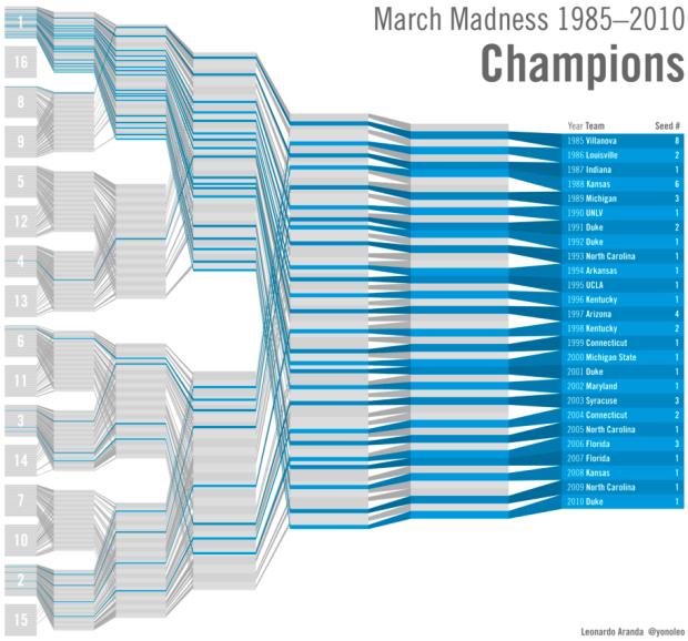
Working off last year’s bracketology graphic, Leonardo Aranda took a simpler approach in showing all the winners and losers from the NCAA tournament from 1985 to present. Each line represents a team (not a school), and championship winners are highlighted blue, so what you get is a quick view of the paths past winners have taken. No schools ranked lower than eight have ever win, and most winners have been seeded in the top three.
I like this version better than last year’s. The sorting is a lot easier to read and understand. What do you think?
[yonoleo | Thanks, Leonardo]
 Visualize This: The FlowingData Guide to Design, Visualization, and Statistics (2nd Edition)
I think this is a brilliant approach to visualising it. It identifies the one clear piece of information it wants to highlight, and presents it in an arresting and instantly readable manner.
I thought last year’s was good, but this one shows just how overcomplicated it was.
This graphic is almost perfect. Add some simple interactivity and it would shine. Hover over a blue line and it should highlight the entire line. As is, it seems a bit difficult to distinguish each line when they cross.
Thanks. I have the data on MySQL and generated the chart with PHP to generate an SVG graph. I already tested some interactivity and it works, but I just need to get around to build something solid.
Ideally you should be able to highlight conferences, schools, teams, upsets, etc. It just takes time.
Thanks for posting this, Nathan!
Of course. Nice improvement from last year.
You mean “seeded” rather than “ranked”.
Hey, I love it. I agree with Darin that having two contrasting colors such as blue and light green might help make it easier to read. Or, what if each seed had its own color? Great job.