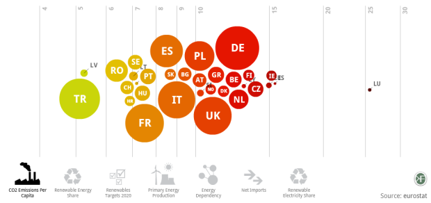
Designer Gregor Aisch has a look at energy usage in Europe. Click on a number of topics on the bottom to see how each country compares, or mouse over a specific country to get its details. Bubbles are color-coded according to relatively high or low levels (I think) and sized by population (I think). There isn’t a whole lot of explanation of what you’re actually seeing, but it has some interesting interactions in there. Maybe our European readers can add some context. Don’t forget to take it fullscreen and put it on autoplay.
[publicdata.eu via @moritz_stefaner]
 Visualize This: The FlowingData Guide to Design, Visualization, and Statistics (2nd Edition)
The CO2 graph shows why nuclear power is good if you believe in global warming.
Looking at it from Germany, I find it frustrating that the graphic automatically detects my country and assumes I want to look at it in that language. German is not my first language and I would like to look at it in English. There does not appear to be a way to change that.
Goddamn it, Luxembourg.
Goddamn it.
Ugh. The bumping bubbles are a total mess that contributes zero information while destroying any chance of seeing individual trajectories over time. I wish people would spend more time thinking about the info- part of infographics.
Luxembourg is a clear outlier in CO2/capita. But the reason is simple. Luxembourg is a very small country with low taxes on gas (for cars). So everyone who drives through (or nearby) Luxembourg stops there to fill his/her tank. Basically, it is the gas station of the neighboring regions. But all this petrol is counted as consumed by Luxembourg people.
The following error was encountered while trying to retrieve the URL: http://energy.publicdata.eu/ee/vis.html
Access Denied.
Access control configuration prevents your request from being allowed at this time. Please contact your service provider if you feel this is incorrect.