How to Make Bubble Charts
Ever since Hans Rosling presented a motion chart to tell his story of the wealth and health of nations, there has been an affinity for proportional bubbles on an x-y axis. This tutorial is for the static version of the motion chart: the bubble chart.
A bubble chart can also just be straight up proportionally sized bubbles, but here we’re going to cover how to create the variety that is like a scatterplot with a third, bubbly dimension.
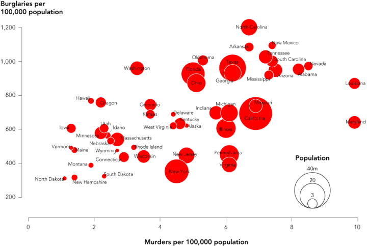
The advantage of this chart type is that it lets you compare three variables at once. One is on the x-axis, one is on the y-axis, and the third is represented by area size of bubbles. Have a look at the final chart to see what we’re making.
Step 0. Download R
We’re going to use R to do this, so download that before moving on. It’s free and open-source, so you have nothing to lose. Plus it’s a need-to-know-name of 2011, so you might as well get to know it now. You can thank me later.
Step 1. Load the data
Assuming you already have R open, the first thing we’ll do is load the data. We’re examining the same crime data the we did for our last tutorial. I’ve added state population this time around. One note about the data. The crime numbers are actually for 2005, while the populations are for 2008. This isn’t a huge deal since we’re more interested in relative populations than we are the raw values, but keep that in mind.
Okay, moving on. You can download the tab-delimited file here and keep it local, but the easiest way is to load it directly into R with the below line of code:
crime <- read.csv("http://datasets.flowingdata.com/crimeRatesByState2005.tsv", header=TRUE, sep="\t")
You’re telling R to download the data and read it as a comma-delimited file with a header. This loads it as a data frame in the crime variable.
Step 2. Draw some circles
Now we can get right to drawing circles with the symbols() command. Pass it values for the x-axis, y-axis, and circles, and it’ll spit out a bubble chart for you.
symbols(crime$murder, crime$burglary, circles=crime$population)
Run the line of code above, and you’ll get this:
Circles incorrectly sized by radius instead of area. Large values appear much bigger.
All done, right? Wrong. That was a test. The above sizes the radius of the circles by population. We want to size them by area. The relative proportions are all out of wack if you size by radius.
Step 3. Size the circles correctly
To size radiuses correctly, we look to the equation for area of a circle:
Area of circle = πr2
In this case area of the circle is population. We want to know r. Move some things around and we get this:
r = √(Area of circle / π)
Substitute population for the area of the circle, and translate to R, and we get this:
radius <- sqrt( crime$population/ pi )
symbols(crime$murder, crime$burglary, circles=radius)
Circles correctly sized by area, but the range of sizes is too much. The chart is cluttered and unreadable.
Yay. Properly scaled circles. They’re way too big though for this chart to be useful. By default, symbols() sizes the largest bubble to one inch, and then scales the rest accordingly. We can change that by using the inches argument. Whatever value you put will take the place of the one-inch default. While we’re at it, let’s add color and change the x- and y-axis labels.
symbols(crime$murder, crime$burglary, circles=radius, inches=0.35, fg="white", bg="red", xlab="Murder Rate", ylab="Burglary Rate")
Notice we use fg to change border color, bg to change fill color. Here’s what we get:
Scale the circles to make the the chart more readable, and use the fg and bg arguments to change colors.
Now we’re getting somewhere.
By the way, you can make a chart with other shapes too with symbols(). You can make squares, rectangles, thermometers, boxplots, and stars. They take different arguments than the circle. The squares, for example, are sized by the length of a side. Again, make sure you size them appropriately.
Here’s what squares look like, using the below line of code.
symbols(crime$murder, crime$burglary, squares=sqrt(crime$population), inches=0.5)
You can use squares sized by area instead of circles, too.
Let’s stick with circles for now.
Step 4. Add labels
As it is, the chart shows some sense of distribution, but we don’t know which circle represents each state. So let’s add labels. We do this with text(), whose arguments are x-coordinates, y-coordinates, and the actual text to print. We have all of these. Like the bubbles, the x is murders and the y is burglaries. The actual labels are state names, which is the first column in our data frame.
With that in mind, we do this:
text(crime$murder, crime$burglary, crime$state, cex=0.5)
The cex argument controls text size. It is 1 by default. Values greater than one will make the labels bigger and the opposite for less than one. The labels will center on the x- and y-coordinates.
Here’s what it looks like.
Add labels so you know what each circle represents.
Step 5. Clean up
Finally, as per usual, I clean up in Adobe Illustrator. You can mess around with this in R, if you like, but I’ve found it’s way easier to save my file as a PDF and do what I want with Illustrator. I uncluttered the state labels to make them more readable, rotated the y-axis labels, so that they’re horizontal, added a legend for population, and removed the outside border. I also brought Georgia to the front, because most of it was hidden by Texas.
Here’s the final version. Click the image to see it in full.
Cleanup and a key make the chart more informative.
And there you go. Type in ?symbols in R for more plotting options. Go wild.
For more examples, guidance, and all-around data goodness like this, buy Visualize This, the new FlowingData book.
Made possible by FlowingData members.
Become a member to support an independent site and learn to make great charts.
About the Author
Nathan Yau is a statistician who works primarily with visualization. He earned his PhD in statistics from UCLA, is the author of two best-selling books — Data Points and Visualize This — and runs FlowingData. Introvert. Likes food. Likes beer.

I prefer ggplot2 graphics- they are leaner and crisper.
crime <- read.csv("http://datasets.flowingdata.com/crimeRatesByState2008.csv", header=TRUE, sep="\t")
qplot(murder, burglary, data = crime, label = state, colour='red', size = 50*population)+ geom_text(colour = "black", hjust=0,vjust=1, size=3)+
xlim(c(0,10))
This graph is no better visually, and worse get’s populations to appear wrong… my dad who does not read English, for example, found odd American states having circle diameters implying populations about one billion (in fact the small circle of the legend says “5.0e+08” which is five hundred million…
On the other hand, isn’t any way of the plotting routine do the uncluttering of the labels automatically, perhaps adding small line segments to connect to the symbols if ambiguity can arise?
Regards,
Maybe it’s just me, but I’m not getting what the story you’re trying to tell us with this chart is.
Well, one story for me would be if I ever became a US-resident, I might be more inclined to move to North Dakota than North Carolina…
Looks like states with greater population have greater crime rate, with the exception of New York.
But the main point here is how to make the chart in R so that you have a PDF file to edit in Illustrator, or it’s open-source cousin InkScape.
What do you typically do once you have the plot in inkSpace/illustrator?
@drio – A lot of little things. When you open a PDF in InkScape or Illustrator, you can manipulate the individual elements by clicking and dragging. For example, you could click on an individual label and move it where you wanted, or you could change the color of a single circle. So it’s a lot easier to edit small parts of the graphic in there than in R, for me at least.
@Nathan,
Very helpful tutorial. Thanks!
Question for anyone who has used Inkscape for editing the PDF output from R. Do you encounter situations where some of the really tiny graphics are replaced by a symbol that looks like a lowercase ‘q’? How do you make sure that Inkscape imports even the smallest graphic created by R?
Ok, never mind. @christopher stieha’s response below addresses this issue.
This is nice. I’ve never played with R, but from this, it sounds pretty simple. I’ve done the same chart and same instructions for bubble charts, but using Tableau, not R, here:
http://www.thedatastudio.co.uk/blog/the-data-studio-blog/andy-cotgreave/how-to-make-bubble-charts
Cheers
Andy
You also want to sort your data in order of the bubble size variable so the biggest are plotted first (e.g. Georgia will show up on top of Texas instead of vice-versa).
@Erik – good tip
Alternatively you could make the bubbles transparent by setting the alpha channel, i.e.
fg=”red”, bg=rgb(255,255,255,50,maxColorValue=255)
Thank you so much for posting this tutorial! I haven’t touched a stats package since college, but I’m thinking I’d better get started, and you’ve made it easy.
Thanks this is great! I’ve been teaching myself R (slowly) but its nice to see how simple things can be once you know what you’re doing.
Love these R tutorials. Keep ’em coming!
Good tutorial, but I think your axes are incorrect. Ten murders per 1,000 people in Louisiana would be 1% of the population being murdered per year! A quick check of the data on Wolfram Alpha suggests the axes should be “per 100,000 population”, for example:
http://www.wolframalpha.com/input/?i=burglary+rate+texas
http://www.wolframalpha.com/input/?i=murder+rate+texas
Please do more R graphics tutorial, this one is awesome!
Thank you, PaulC.
Pingback: How to make bubble charts in ggplot2 « looks like a dance epidemic to me
Great post, I’m definitely looking forward to more R tutorials in the future as well. On a side note, I’ve noticed out rough and pixelated all of my plots look (see: http://j.drhu.me/bubblePlots.png). Is this just due to you cleaning up your images in illustrator before you post them, or can I edit the resolution of the plotting tool?
Thanks!
Ah, please don’t include the last paren in the link!
@Donald – i think the pixellation is a hardware thing (or a windows thing). but like matt said below, if you save it as a PDF, the output might be more clear.
Donald,
You might have better luck if you export the graphs as pdf, and then find a way to make your final image from that (pdf’s are much easier to manipulate in Illustrator or Inkscape). You could also specify the resolution of the png you want to save in R.
Great tutorial. I’ve tried to get even closer to gapbuster by getting 38 years worth of data and using tableau public to provide animation: http://dotlinking.blogspot.com/2010/11/us-crime-bubbles.html
It’s not possible to play animations in the browser based tableau, so you can either move the slider or download the workbook and then use the free tableau reader to view and hit the play button. If you click on a particular bubble you can track it over time.
Maryland’s position on the graph is grossly leveraged by Baltimore’s high homicide rate. If we exclude Baltimore, Maryland would drop on the scale.
Bev, I suspect that would be true of any state with large, urban cities.
Pingback: Momento R do dia « De Gustibus Non Est Disputandum
Pingback: Bubble charts in R « Infinity Plus Four
do you need the “pi” in the equation? since all the shape are circles, we only need to define the radius ratio difference as squareroot of the variables?
@Jonas – you’re right. i left it in there though for simplicity’s sake.
“Ever since Hans Rosling presented a motion chart to tell his story of the wealth and health of nations, there has been an affinity for proportional bubbles on an x-y axis.”… SERIOUSLY?? You got to be kidding – Excel has bubble charts since v 4.0 in 1992 (maybe earlier but I’m positive of that version) and any consultant uses them as the daily breakfast. Good tutorial for R, though.
I didn’t say it was the first. I said the bubbles became really popular :)
Nice graph, especially after the clean up in Illustrator. I agree, that is often the best way to put the polish on the final product. One note of interest. Research on how people perceive proportional symbols on maps suggests that readers don’t estimate circle areas well (one explanation being that we tend to live is a linear world). As a result, good cartographers will adjust the area calculation to “trick” the eye so that the reader’s interpretation is closer to the truth. A discussion of this issue and an R solution is found at http://www.jstatsoft.org/v15/i05/paper . Are there graphing packages that offer this option for bubble charts?
Nathan, thanks for promoting bubble plots, they are one of my favorite tools. I used your crimeRatesByState2008.csv data you to show how easy it is to generate static and dynamic bubble plots using JMP. You can check it out here http://bit.ly/gacVkY. Thanks.
Great tutorial.
Thanks for the insight into using Inkscape to open up pdfs and modifying the graphics.
Just a note to people using Inkscape: the open pdf function appears to have font issues (known bug). Following the above tutorial, many of the small circles came out as q’s. From Philippe Joyez at the bug forum at Inkscape, some pdf programs allow you to save as svg. In Ubuntu, one can open up the pdf in Evince, print it to svg, and then open up the svg in Inkscape without problems.
Thank you so much for this! It is very powerful, I think, to help people get from principles and theories of design to actual output. This post is a keeper!
If you wanted to get REALLY close to the resulting figure without using an image editor then you could use the following R-code. One might improve the state name positioning with an offset vector (and following the advice in ?text about interactive positioning).
par(tick = 0.2, bty = ‘n’)
#crime <- read.csv("http://datasets.flowingdata.com/crimeRatesByState2008.csv", header=TRUE, sep="\t")
#clean up trailing spaces in state field
crime$state <- gsub( ' +$', '', crime$state)
ylim <- c(200, 1250)
crime <- crime[ order( crime$population, decreasing = TRUE ), ]
radius <- sqrt( crime$population / pi )
symbols( crime$murder, crime$burglary, circles = radius, inches = 0.35, ylim = ylim, fg = 'white', bg = 'red', xlab = '', ylab = '', yaxt = 'n' )
ylabpos <- (1:6)*200
axis(2, ylabpos, labels = FALSE)
text(-0.35, ylabpos, labels = ylabpos, pos = 2, xpd = TRUE)
text( -1.4, 1350, expression(bold('Burglaries per\n100,000 population')), cex = 0.8, pos = 4, xpd = TRUE )
text( median(crime$murder), -50, expression(bold('Murders per 100,000 population')), cex = 0.8, xpd = TRUE )
#pos <- rep( NULL, nrow(crime) )
pos <- rep(3, nrow(crime))
pos[crime$state %in% c( 'Alabama', 'California', 'Connecticut', 'Maine', 'Mississippi', 'New York', 'North Dakota', 'Georgia', 'Alaska' )] <- 1
pos[crime$state %in% c( 'Hawaii', 'Indiana', 'Illinois', 'Minnesota', 'Nebraska', 'West Virginia', 'Wyoming' )] <- 2
pos[crime$state %in% c( 'Arizona', 'Massachusetts', 'Nevada', 'Rhode Island', 'South Dakota', 'South Carolina', 'Wisconsin' )] <- 4
text( crime$murder, crime$burglary, crime$state, cex = 0.5, pos = pos, offset = 0.25)
#create legend
legPop <- c( 4e7, 2e7, 3e6 )
legRad <- sqrt( legPop / pi )
hin <- par('pin')[2]
burgPerInch <- ( ylim[2] – ylim[1] ) / hin
radPerInch <- max(radius)/0.35
heightAdj <- legRad/radPerInch*burgPerInch
symbols( rep(9,3), rep(200,3) + heightAdj, circles = legRad, inches = 0.35, add = TRUE)
tAdj <- strheight('40m', cex = 0.5)
text(rep(9,3), rep(200,3) + heightAdj*2 – tAdj, c('40m', '20m', '3m'), cex = 0.5)
Pingback: Posting 11/25/2010 « doug – off the record
Pingback: Huiswerk informatie visualiseren « Crossmediale Journalistiek
Pingback: Things I Learned This Week – #48 | Synechism
Pingback: How to Make Bubble Charts in R « Epanechnikov's Blog
why wouldn’t you just make this in excel? I can see many uses of R over excel, but a bubble chart is one of the things thats very easy to do in a nice way in excel to my opinion.
There are a lot of ways to make different types of charts. This is just one of them, obviously. It just depends on what you want in the end.
Pingback: Bubble Map
I made a ggplot2 version:
http://ygc.cwsurf.de/2010/12/01/bubble-chart-by-using-ggplot2/
Pingback: Episode 39 – Punschzeit » Facebook, Ubuntu, Android, Susanne » Podcast macpcnux.net
Pingback: Link list for november 2010 « Mixotricha
Nice. This may be a silly question but how did you use R to save the graphic in the PDF format? Is there a command or a special library for that?
Simone,
Indeed, there is a command to save the graphic in PDF. In fact there is more than a way.
Get a look at http://stat.ethz.ch/R-manual/R-devel/library/grDevices/html/dev2.html to have an idea of a way of doing it.
Much better is to plot on the device directly, not copy from the screen to the device. E.g.:
pdf(“foo.pdf”)
plot(1:10)
dev.off()
Aspect ratios on screen might be different to the device you copy to. With the above you get fine control on the PDF produced by setting arguments to the `pdf()` function.
@Simone – I can’t remember if it’s different in Windows (I don’t think it is), but on my Mac, when the graphic pops up in R, there’s a menu option to save the image as a PDF.
Pingback: Mathew Analytics LLC » Blog Archive » Interesting Links #2
this has been helpful so far.
If I wanted to, however, classify the bubbles into three categories by different bubble colours, what code is needed?
For example, I want to show the burglary (y) by murder (x) with population size(~z) for 1. Females, 2.Males and 3.Children. Thereby having, for example, blue circles representing males, red circles representing females and green circles representing children…
Hi Nathan,
I have come to your site today, was exploring and doing some tutorials. I have a problem in this one, maybe a noob one, as I’m not an expert on Illustrator. I export the R bubble graph to PDF and open it on Acrobat ok, but when I open it on Illustrator some bubbles are missing and replaced by a [X] image. What am I doing wrong? Thans for answering. Btw, your site is great: lots of info and fun with data and graphics.
@Juan – Hm, I’ve never seen that before. Can you provide a screenshot or a link to the PDF in question?
Hi Nathan – I have put the files on a folder on my SkyDrive disk; please send me your email or a name to my email so I can give you access to it
Thanks,
Hi,
Just a followup, if Nathan can comment on this, that would be great, because I am trying to do the same thing.
Thanks!
Pingback: Bookmarks for March 23rd through March 28th
Hey Nathan – -can you put the sample data back up? I’m trying to make the example plot. Thanks
@Bev – I had changed the file name a while back but forgot to update this post. It should work now with the new URL to the dataset. Thanks.
@nathan, I’m getting this error when copying and pasting the code above – any ideas?
Error in plot.window(…) : need finite ‘xlim’ values
In addition: Warning messages:
1: In min(x) : no non-missing arguments to min; returning Inf
2: In max(x) : no non-missing arguments to max; returning -Inf
3: In min(x) : no non-missing arguments to min; returning Inf
4: In max(x) : no non-missing arguments to max; returning -Inf
Scott, Nathan
The data fie doesn’t appear to be consistent with the original. The sep now needs to be a “,” in the first line of code.
Oh, and the data seem to have some additional rows: for the whole of US and District Col
Hi all,
Love the logic and the visual of the chart. I do have one question. Is it possible to add a z-axis to the graph, so that the bubbles are plotted (or floating) in a 3D space. For example, suppose a Z-axis shows the average income per state. Perhaps more burglaries occur in states with average high income, and more murders occur in those states with lower income [obviously I have no idea, I am just guessing here]. In a 3D chart this would show up. An alternative may be to color the bubbles differently according to a their income, yet to me that makes more sense for a nominal variable. I am very curious which result would offer the best visual.
Any help would be greatly appreciated.
Thanks
Joep
[Netherlands]