We’ve seen this sort of thing before, with tweets mapped and such, but the recent A World of Tweets by Frog Design is nicely executed (in HTML5).
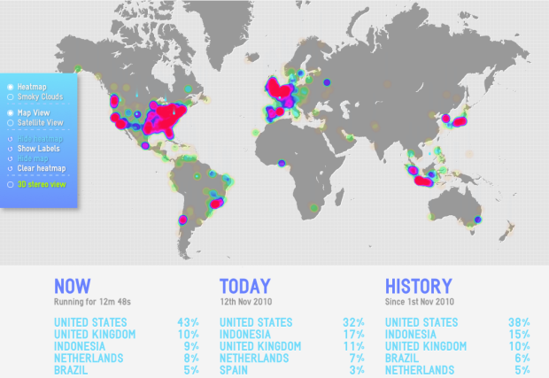
A World of Tweets is all about playing with geography and bits of information. Simply put, A World of Tweets shows you where people are tweeting at from the past hour. The more tweets there are from a specific region, the “hotter” or redder it becomes.
You can toggle between a few different views such as smokey or heatmap, or outline or satellite view, but the highlight has gotta be the 3d view. Unfortunately, I don’t have any red and blue paper lens glasses on me. Dang it.
 Visualize This: The FlowingData Guide to Design, Visualization, and Statistics (2nd Edition)
TBH it’s not that great a map given that the midpoint is not the equator…
Nicely presented, and I like that it detects where I am and tells me my country’s ranking. I’d love to be able to switch to tweets per capita, in order to get a real view of how active each country is…