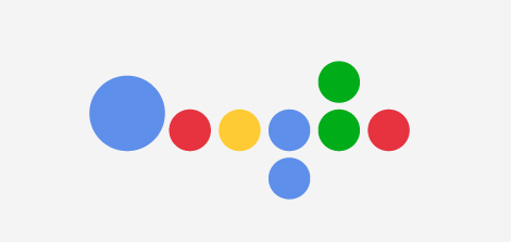
How well do you know your logos and brands? Or more importantly, how memorable are company logos that you don’t even need to see the whole thing to recognize where it’s from? Graham of ImJustCreative simplifies logos into basic shapes. The above is Google. That one’s easy. It’s got the shape. It’s got the color. Can you guess the rest?


See more simplified logos here and here.
[imjustcreative via Data Pointed]


 Visualize This: The FlowingData Guide to Design, Visualization, and Statistics (2nd Edition)

These came from http://unevolvedbrands.tumblr.com/
Yes, that tumblr and imjustcreative are the same person/studio.
I didn’t think the google one was obvious, though the apple one was
Great link in comment 1 above, but your explanation was clearer
Love your posts, thanks for another fun find!
Francis Baudevin, a Geneva artist, was doing something along these lines in the mid-’80s.