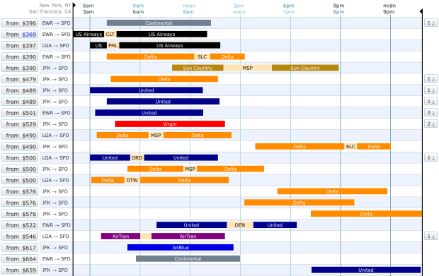
Booking flights became so much easier when it all shifted online, but it hasn’t changed in years. You put in your preferred dates and times and you get a long list of options. Oftentimes those listings can be a pain as you browse through all of your options. Oh the burden of choice. Hipmunk tries to make flight search easier with a visual interface.
As usual, you enter your origin and destination but instead of plain HTML tables, you get something like the above, and you can sort the options from least to greatest amount of agony. Rectangle lengths represent flight times and are color-coded by airline. Flights with the same take off and arrival times, but priced higher are hidden to help you narrow down quicker.
Hipmunk is still in the early stages, but a quick search shows a lot of promise.


 Visualize This: The FlowingData Guide to Design, Visualization, and Statistics (2nd Edition)

This is pretty similar to ITA’s excellent interface. http://www.itasoftware.com
This (and the ITA interface) are also both similar to a side project I had been working on for a while to visualize flight search using Kayak’s API. I have an older mockup online at http://labs.martyalchin.com/travel/ and you can see some screenshots of my more recent work on Dribbble at http://dribbble.com/gulopine/tags/flight. I was very surprised when I first saw Hipmunk and the ITA site, and I think it’s great that people are taking this space seriously. There’s still a long way to go, though, and I hope I can help contribute some ideas to the discussion.
It seems like a both beautiful and usable embrionary approach to visualized bookings. I wonder if bookings could actually be simpler with a unified multi-airline visualization-aware system like this.
This is brilliant..
I’ve done some around a few South African airlines, and they leave much to be desired.
Brilliant. Consolidated, simplified, efficient
This is a great interface…and I want to use it for all my future travels. I love the way connecting flights are displayed, complete with layover duration, and also showing both timezones at the top of the display. That said, it’s a bit of information overload and I’d prefer some additional methods to filter/eliminate some of the data. Like an ability to display only direct connections, or specific airlines, desired arrival times, etc.
I think what has to be addresse is the standard date selection you find everywhere… This would be a killer app for me…
Thank you very much for the write-up! Wow! What a great response from everyone. We really do appreciate this. Team hipmunk is still growing, but we’re 100% dedicated to product. And we’re counting on fantastic people like you (and your tweeters/commenters) to do the work a PR firm would do for one of those behemoth companies.
Pingback: michelle li » Flight Search with a Twist