A couple of months back, WNYC’s The Brian Lehrer Show asked listeners who have moved to or away from New York some questions. They asked current zipcode, previous zipcode, year of move, and some other questions. BLS then posted the data and let information and data folk have a go at it. Here are the results.
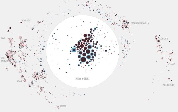
My favorite is Moritz Stefaner’s interactive (above). You’ve seen his stuff around here before. Red indicates more moving out and blue indicates more people moving in. The New York area is enlarged in the white circle since most moves happened within the state, and the rest are placed using a damped distance function. Updating bar graphs on the right provide more context. Check it out, even if just for the cool factor.
A static look of the data by designer Andrea Stranger is pretty interesting too. The map below shows moves from 2000 to 2010, and it’s accompanied by smaller maps for each year.

Check out the rest here. Some good stuff in there.
 Visualize This: The FlowingData Guide to Design, Visualization, and Statistics (2nd Edition)
Pingback: Matrix » [WNYC] Tracking New York Residents Who Moved