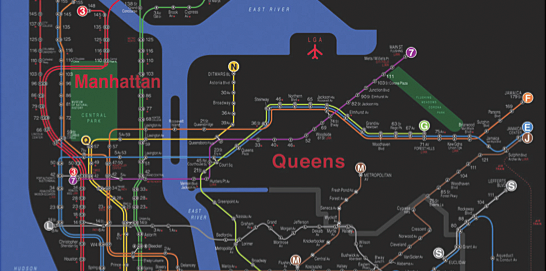
There’s a lot of history behind the New York City subway map, but despite all the revisions, people (especially out-of-towners) still find it hard to navigate the underground. Designer Eddie Jabbour took his frustrations and put that energy towards a heavy redesign. After the MTA rejected it, he put it up in the Apple Store as KickMap, so that people could at least make use of his map on their iPhone. So far, a quarter of a million of people have downloaded it.
Jabbour explains the design process in his article for O’Reilly’s recent compilation, Beautiful Visualization:
All of the choices I made were aimed at trying to make the user experience as seamless and pleasant as possible. Clearly I’m striking a chord, as over 250,000 people (and counting) have now downloaded copies of the KickMap from iTunes. That’s really great but I still want the KickMap — or something superior — to replace the current one in the subway system. I want people to be comfortable and even happy when using our unbeatable 24-hour subway system.
To be honest, I don’t remember the map being all that confusing when I was there. But what I do remember is that I hated holding that giant map folded up in my back pocket screaming tourist. It would’ve been great to have that on my mobile.
[via @mericson]
 Visualize This: The FlowingData Guide to Design, Visualization, and Statistics (2nd Edition)
Thanks for posting this with some critical comments. The other posts and tweets on this are generally accepting of the premise that the Kickmap is better than the MTA’s map. Or worse, most of the tweets simply rebroadcast the O’Reilly blog headline (“Redesigning the New York City subway map”) which gives the impression that the MTA’s map has somehow been redesigned and Kickmap has taken its place. Obviously that’s not the case.
I agree with you that the MTA’s map isn’t confusing. I’m a New Yorker so I use it all the time, but I think even if I encountered it anew it would be relatively easy to decipher. The Kickmap certainly has differences, but it’s a matter of opinion which one is better.
Frankly I think the main improvement that could be made over both maps is to make them geographically accurate. The MTA map and Kickmap both necessarily distort the city’s actual geography in order to present the jumble of subway routes in dense areas (especially Manhattan) in a way that’s legible. But overlaying the subway routes and stations on a map of the street grid not only shows you what route to take, but also provides you with an accurate representation of where to go for your destination after you leave the train.
Hats off to Jabour for selling so many copies of his iTunes app. But I wonder how many more people are using geographically accurate map services (not the least of which is Google itself which the MTA uses, or HopStop, or others — see examples in the discussion at the MTA developer resources group: http://groups.google.com/group/mtadeveloperresources). This is something we did over 6 years ago (see http://backspace.com/notes/2004/02/nonprofit-online-mapping-in-new-york-city.php), and currently implement at the OASISnyc mapping site (see http://bit.ly/9bwKDo and http://wp.me/pBfcP-3Q).
There’s also the issue of the MTA map showing the predominant weekday service, and omitting overnight service or weekend service — something that may not be obvious to most users (see one of the comments at the O’Reilly blog: http://radar.oreilly.com/2010/07/redesigning-the-new-york-city.html#comment-2808390). Kickmap tries to address this, but a better approach (IMO) would be to provide multiple service options as overlays on the street grid, as noted above. With an interactive map, or with a routing/scheduling application like Open Trip Planner http://demo.opentripplanner.org/ it can also be configured to display the type of service most relevant to your particular trip.
The O’Reilly interview is certainly fascinating for unveiling some of the process behind developing Jabbour’s map. Is his map better than MTA’s? Open to debate.
As a recent Miami to NYC transport, I absolutely refuse to carry a subway map (or stare at the maps on the cars) for that exact same reason as you. That said I have 2 map apps on my phone: Kickmap Lite and NYC Sub View, the latter of which is just an exact copy of the current MTA map.
Kickmap is, in my opinion, superior in the sense that the color differentiation is clearer. I am very slightly colorblind (red-green deficient) so that may sway my opinion somewhat.
All that said I never use Kickmap except as a backup when the MTA map seems too confusing (i.e. around Atlantic Avenue in Brooklyn). I can’t tell you exactly why. It probably has something to do with the lack of visual consistency with the current design yet the actual lack of improvements. Replacing things because of marginal increases in utility is haphazard and I think MTA would agree.
Yes, but is it location-aware? Seems like the wide-eyed out-of-towner would really benefit from that. “Did I miss my stop?” and “Am I still on the right line?” or “Is the next stop closer?” are all valid questions that I can remember asking in my less experienced mass-transit years.
Still, I agree with John from Miami/NYC – marginal increases in utility can cause more harm than help.
Pingback: Designing an easier-to-read NYC subway map « just do something… anything
Making decisions about which route to take based on a map is pretty inefficent.
It’s much better to put in the starting and the target location and let a computer calculate the correct route based on when trains arrive
Especially an iPhone App should allow you to click on your starting station and your target station and then give you the best connection.
At least that’s my experience from living in Berlin where our system often provides multiple ways to go from A to B and the website of the transportation service allows you to simple enter your starting and target destination.
It even takes into account the walking distance to get to the stations.
There are a few things he’s done here that are really, really helpful and should have been on the map since the beginning.
– The multiple lines offset from each other allows you to trace a line from start to finish. Since we don’t refer to the lines by color, you need to have them broken out to help folks recognize the difference between the ‘N’ and the ‘R’.
– The badges at the end of the line are GREAT. They would help so much with understanding the source and destination of lines.
As for the mentioned geographic accuracy, that comes up all the time and the key issue is the massiv amount of data in Manhattan. Frankly, no one really pays attention to the specific geography while using the subway anyway (just river crossings and borough boundaries), so it’s not that much of an issue for the average user.
I personally love the black map, though I think there would be a LOT of backlash over it’s use. It would be very useful to explain the differences in day/night use, though.
Just to clarify my point about geographic accuracy, it has to do with what happens going to and from the subway. Whether Jeff is right or or not that no one pays attention to the subway’s specific geography (I think they do), people use the subway as a means to an end, and the end usually isn’t the subway station itself. But if you rely on either the MTA’s map or Kickmap to figure out how to get *to* your station from where you are now, or *from* your stop to your ultimate destination, you can’t do it. Either one is approximate at best, and misleading at worst.
So, I guess people will continue to argue over Kickmap vs. the MTA’s map simply because it’s such an iconic image. For printed maps, I think they’re both good, but these days they only go so far. The interactive versions overlaid on the actual street grid are that much better :).
Great comments all but it seems apparent that the KickMap may not have actually been experienced first hand judging by the some of these critiques. The KickMap’s only commercial form is an interactive app sold for use on the iPhone and iPad. There are no paper versions yet. While the free KickMap Lite app is a simple scrollable, zoomable subway map, the 24-hour version is fully interactive and offers a variety of features that may not be apparent just looking at a jpeg. For example, to answer one of the comments about a lack of geographical reference, touching the screen for 3 seconds at any station on the map brings up a scrollable, zoomable Google Street Map of the immediate station area and further links to Google’s StreetView. The map also automatically changes to the Night version at 11 pm to show the system cutbacks that occur in the overnight hours. Transit alerts notify the user of any problems automatically through push notifications from the MTA. There’s even a built-in compass (a first with any subway map, I believe) to help orient the user once out of the station. The KickMap will continue to evolve and improve as app technology evolves so I look to these critiques as good input for further improvements. Thank you.
just comparing the jpegs, the kickmap is better. i was just in new york and wished i head read this post before i went. the MTA map is convoluted and busy. Kickmap’s sleek design and simplified legend make reading the map a breeze, never mind the interactive features.