From Ben Fry’s newly established Fathom Information Design, is a visualization for GE on our aging world:
According to the United Nations, the elderly population of the world is growing at its fastest rate ever. By 2050, there will be more than 2 billion people aged 60 or over. The age of a country’s population can reveal insights about that country’s history, and can provide a glimpse towards the economic and healthcare trends that will challenge their societies in the future.
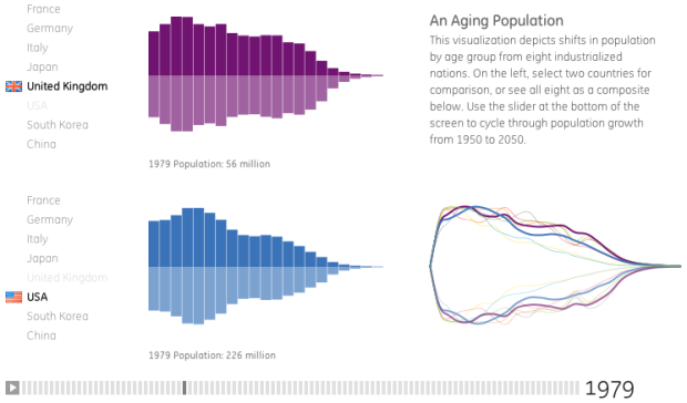
The piece is a simple but elegant interactive that lets you compare age distributions between countries, over time. Select one country on the top, and select another on the bottom. For each country, you get a pair of stacked bars (for men and women). Age moves left to right, so the left-most bars represent the youngest, and the right most represent the oldest.
Use the slider on the bottom to navigate through time, and the distributions shift further right (i.e. people live longer) in a wave-like motion, as the population of each respective country increases.
Finally, watch a composite of all eight selected countries in the bottom right.
The one thing missing for me is the percentages for each age/gender group as you roll over each bar. But I’m just being picky. Really good stuff. The interactive leaves it up to you to see what’s going on in the data.
How does your country compare to others?
 Visualize This: The FlowingData Guide to Design, Visualization, and Statistics (2nd Edition)
This is an interesting project but it shocked me that aesthetics trumped convention in the projection of the population pyramids. The bottom half of each looks more like a reflection of the top than the distribution of females. Population pyramids typically are vertically oriented and have static indicators of age groups, along with the percentages that they represent. They are easier to interpret that way. Here’s are a few examples:
http://lifeasclay.wordpress.com/2010/07/26/dc-as-seen-through-population-pyramids/
I’m surprised it only shows high-income countries. I make charts like this all the time for developing countries and the picture is very, very different. Some countries have huge dependent (young and old) populations supported by tiny AIDS-decimated workforces, and others have low life expectancies and millions of babies. The ones that strike me most are those where the changes are sudden. While an aging population in these rich countries is interesting, it doesn’t feel as important as what the same implementation would show for poor ones.