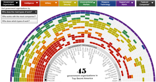
In response to the the 9/11 attacks, the United States government created a highly secretive set of organizations with zero transparency and very little oversight. How much money do these secret programs cost? How many people do they employ? The Washington Post reports on Top Secret America:
These are some of the findings of a two-year investigation by The Washington Post that discovered what amounts to an alternative geography of the United States, a Top Secret America hidden from public view and lacking in thorough oversight. After nine years of unprecedented spending and growth, the result is that the system put in place to keep the United States safe is so massive that its effectiveness is impossible to determine.
The series of articles, video, and graphics, allow readers to explore the information themselves.
Of main interest: a network diagram shows organizations and their top secret activities and a map shows the geographic distribution of government organizations and companies within Top Secret America.
Click on a specific organization for within group breakdowns. At this point it gets a little confusing with drill-down pie charts, especially if you’re just browsing, and a spiral view is also offerred which feels extraneous. The overall story and heavy research, however, makes it worth clicking through the clunky at times set of interactives.
[Thanks, Erika]
 Visualize This: The FlowingData Guide to Design, Visualization, and Statistics (2nd Edition)
Pingback: WaPo unmasks a hidden, top-secret America : Contrarian
um. whoa.
There’s a lot of information there, and I can’t make sense of it. But maybe I’m not very smart…
I feel like this thing either needs a brief overlay tutorial to explain (particularly at the drill-down level) what it is I’m looking at, or it just needs to be simplified. At the same time, I get the sense that if I considered it long enough, it might be effective. My initial conclusion is that it’s relying too heavily on mouseovers where I’m expecting to just be able to look at it. Comparisons are difficult when I can only see one item (via mouse over) at a time. For example, without mousing-over what is this diagram in the middle? :http://projects.washingtonpost.com/top-secret-america/network/#/single/functions/information-technology/
Nonetheless, this is a topic I have some interest in, so maybe I’ll keep staring at it…
I felt the same way. I had to fuss around a bit at first, but the story itself is really interesting, so it was enough for me to plow through.
Pingback: 'Top Secret America' draws notice for use of Web tools | cyberspace2
I agree that the presentation gets in the way of the story, and it’s just not well thought out. There are a lot of comments on washingtonpost.com, and they’re almost uniformly negative.
For example, somebody went to a ton of work to make a zoomable map for the series, except they eliminated the ability to zoom very closely or get any information when you drill down. It’s like a GPS system that tells people on the Interstate approaching a city, but then doesn’t tell them what exit to take or how to find their final destination.
The Post somehow thought their map would be helpful, but they needed to realize it’s a waste of a user’s time unless they can deliver a complete system.
Pingback: Belmont Club » Dancing In the Dark