The World Cup is an event where countries from all over the world compete, but what about the teams themselves? Players may play for a single country, but many are ‘imported’ from elsewhere in the world as their day jobs are actually elsewhere. This isn’t a new thing, but teams have certainly become more multicultural over the years.
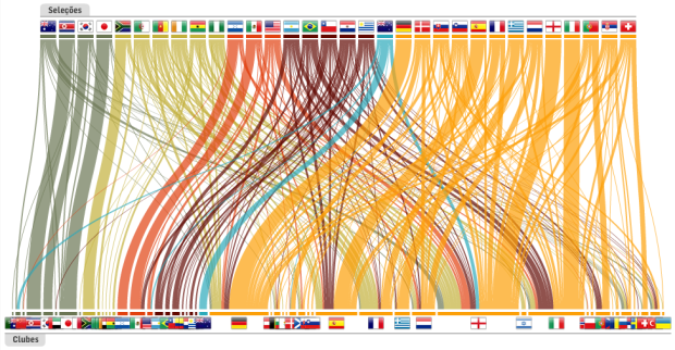
Carlos Lemos and Daniel Lima report for Estadao on this cultural change since the 1994 World Cup up to present. Compare 2010 (above) to the player makeup from 1994 (below). Hugely different. For the most part, players stuck with their own countries in 1994:

Roll over countries on top to see what clubs players are with, or roll over the bottom to see where players from a given club are from. Ribbon width indicates number of players. The greater the width, the more players from that country or team. Very elegantly done.
[Thanks, azathoth]
 Visualize This: The FlowingData Guide to Design, Visualization, and Statistics (2nd Edition)
Actually, that’s not quite right. You seem to be implying that this chart shows the birth country of players in the national teams in the World Cup – it actually shows in which country the players in each national team have their day job (i.e. the club they play for)
Ah, thanks, my Portuguese is rusty.
Just wanted to clarify: I believe that this isn’t about National Teams importing players from other countries, but rather a representation of how league play has evolved. It’s demonstrating that league play is no longer tied to nationality, as players from all over the world now go to the richest and most competitive leagues, namely EPL, la Liga and Serie A.
I think saying ‘imported to play with countries that aren’t their hometown’ is misleading, since it seems to refer more to Brazilian players like Deco who now play for Portugal’s NT. Rather, the above reflects that the Italian league in ’94 was made up mostly of Italian nationals but now has a considerable number of North American players. So it’s players being imported to play in leagues in other countries rather than for those national sides.
*I don’t speak Portuguese, though, so I may be entirely mistaken. In which case, please ignore me.
I’m not sure about your interpretation: to me this shows the difference between the nationality of the players and the country they play club football in: where they work vs where they come from?
What this illustrates to me is the massive growth in reach of the European leagues (Germany, Spain, Italy, France and England) and their ability to import the best players from across the world: it doesn’t matter where you live, if you’re an elite footballer, the chances are that you play in one of only five countries, because that’s where the (satellite TV funded) money is.
This would be even clearer, I think, if the club countries were ordered by “market share” from biggest to smallest.
Rob
Good graphic. More insightful would be % of national team that plays in English premier league plotted against WC performance so far. EPL always sees itself as world’s best, but I can’t help thinking that graphic would tell a different story!
Despite a bunch problems I have with the interface design I think is a very smart idea. Nice visualization. Very interesting for soccer fans, and very telling.
I speak Portuguese — kind of, too long to explain. The graphic shows in which leagues the players from the national teams play. So, it does show how diverse the leagues have become over the years.
Interesting to see how players from Italy, Germany or England, and almost all the Spaniards, play on their own leagues — certainly the among the most difficult in the world and the ones with the most money to spend. Which also explains why most of the Argentine and Brazilian players play oversees.
We’ll certainly see some awards for this graphic in design competitions.
I meant “certainly among the most difficult” not “certainly the among the …”. ESLs should re-read what they write more often.
Any idea what type of software would help generate a visualization like this?
Flash and more Flash.
If you just wanted the country/club graphic, this could probably be reproduced with some interactivity, using processing: the curves, representing players, that join clubs and countries can be created using a couple of curve()s.
You might also be able to modify this Stanley Cup graphic in HTML5:
https://flowingdata.com/2010/06/10/stanley-cup-winners-and-losers/
It’s not as elegant, but it’s getting somewhere.
Pingback: Imported World Cup players | The World Cup in South Africa
Pingback: Imported World Cup players « My Suk2 Blog
Pingback: Imported World Cup players | SportsEnvoy
Pingback: Dónde juegan los 736 futbolistas del Mundial
Pingback: Proof that football is a global(ised) game. « onemonkey.org
Pingback: Imported World Cup players | Quetag
There’s a super simplified version of this here:
http://www.vincentbuffoni.co.uk/migration-effecting-world-cup-performance.asp
It shows the same data but in a simple bar graph, highlighting how many of each team plays away from the country they represent.
It looks a little more up-to-date too (Jerome Boateng now plays for Man City in England, Fabio Cannavaro now plays at Al-Ahli in Dubai, etc)
Well, Will, I don’t think it shows “the same data.” It’s a simplification of the data — sometimes less works better and sometimes to simplify you add detail.
In this case, I believe detail works better, especially for the audience it’s supposed to charm, the soccer fans, who may find it really telling — I did. Although again I have some problems with the interface.
Pingback: Hvem gjør det best i VM? « Dyade-bloggen
I’ve just finished a visualization of the same topic using Google Earth (data for the World Cup 2010 only). It gives the data a little bit of geo.
Download the Google Earth content layer here: http://www.merkador.com/kmz/worldcup2010.kmz
Or read more about it here: http://www.merkador.com/?q=content/world-cup-2010-players-clubs
What is the name of such a diagram/chart?
It’s sort of like a sankey diagram… sorta.
Pingback: World Cup 2010 Visually
Pingback: Данные и графика: июль 2010 | Iveonik Blog
Pingback: Iveonik Systems | ALL #INCLUDE