The quantified self sounds great on paper. The task: keep track of important facets of your daily life. The result: gain a better understanding of your day-to-day and make better educated decisions, based on the numbers instead of false assumptions and shots in the dark. What’s not to like? Everyone wants to improve his or herself in some way.
To outsiders looking in though, tracking your life in data is ridiculous.
Who has the time to keep track of what you eat, when you sleep, and how many times you fart in the wind? To most people, data journaling (a.k.a. self-surveillance, lifetracking, lifestreaming, personal informatics) seems like a complete waste of time, and I don’t blame them — for now.
Extra Effort
Personal data collection is still pretty intrusive. You have to make an effort to get useful data. Maybe you have to carry an extra device or wear a sensor. With many applications, you have to manually enter things.
Even with your.flowingdata, which I tried to design to fit into a Twitter user’s lifestyle, can get burdensome if you’re collecting, say, more than five metrics.
In reality, a data journal doesn’t really take that long. At the most, the time it takes to log a data point is as much time it takes to send a text message. You spend that much time tweeting or updating your Facebook status anyways. However, the instant gratification in a single update on Twitter or Facebook versus a data point on what you drank during lunch is much higher. You’re sharing with friends and strangers. Sometimes people might like your status or retweet it. It’s like a little treat for your ego or a way to pass the time.
The value in data journaling comes in the long-term though. The more data that you collect, the more meaningful (or sentimental) it becomes. That is, if you’re provided with or know how to implement a worthwhile interface or set of visualizations.
Visualization and Interaction
Let’s be clear. When we talk about the data journaling crowd, we’re not just talking about statisticians and data scientists. We’re talking about a more general audience. We’re talking about non-professionals who don’t necessarily have training in the number game. In fact, they don’t even have to like numbers all that much. All they really need to have is an interest in themselves, and that covers just about everyone on the planet.
So that’s the big challenge. The data, which is extremely personal and relevant to the individual who collected it, should be presented in that way.
The problem is, well, that it isn’t. Data still looks like data in charts and graphs. To you (since you’re reading this) and me, that’s awesome, because we know there’s a lot of value in data, and we know how to read those things. To others, statistical graphics is a reminder of work. It’s a chore.
We don’t have to completely stray from traditional graphics. But we can use interfaces that people are already familiar with. That familiarity brings context, and that context brings the sense of a story.
Maps, for example, are intuitive, and people use them every day. I’ve been looking at maps ever since I was a kid sitting in the navigator seat of my dad’s car. We understand location.
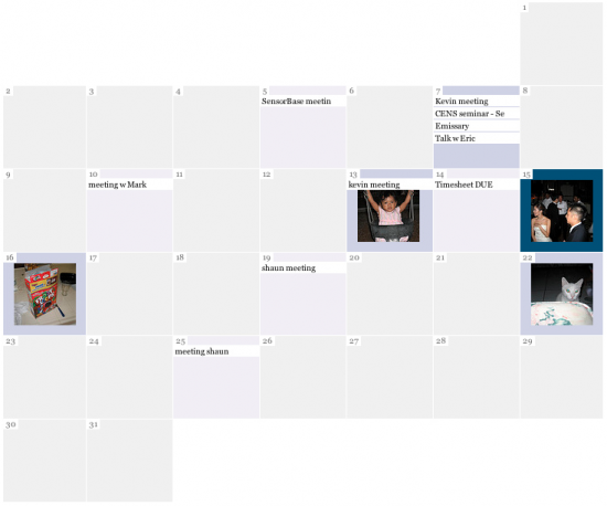
How about a calendar for time-based data? Time series charts work, but like maps, calendars already rest in that everyday sweet spot. Plus, a calendar, because we enter events into it, is a perfect place where personal data can couple with our regular lives of meetings, vacations, and classes.

Think about when you flip through old photos on Flickr or Facebook. A picture brings back memories almost instantly. You remember when your first child was born or what it felt like on your wedding day. You don’t get that benefit from a regular data point. It’s just a number without a backstory. Put your data into a familiar place though, and you get some context, and that data starts to mean a little more to the everyday data journaler.
Finding Value
So now we start to get more mileage out of data journaling. Maybe it’s not the kind of insight that we’re used to thinking about with data. It’s not so much about trends, outliers, and correlation at this point as it is about capturing memories. The data that usually runs separate from our everyday has the chance to provide another layer of memories to old archives, because the data is now a part of the archive.
Okay, I feel myself getting a little too dramatic here, but you get the idea.
When the data becomes a part of peoples’ personal stories is when they’ll feel more comfortable digging deeper.
Election data can be extremely interesting when you’re following the actual election. Sports statistics are fun, because they’re part of the game. The numbers say something about a candidate’s campaign or an athlete’s abilities. Similarly, your own data, whether it be about your finances, your health, or what movies you watch, can be really meaningful.
One of the keys to the success of personal data is to not lose that human aspect, which is tough because it is numbers. But it is possible.
If you lose that human aspect, you become more like a robot. It’ll make you feel like one too. You want it to be the other way around.
Let the data flow more freely (man, I’m full of cheese today), and it could improve your day-to-day life. Data, after all, is simply a representation of it.
As technology improves and data collection becomes more automatic, it won’t seem so odd. Until then, I’m fine with being one of those people. But sooner more than later, one of those people will be the person who doesn’t have a personal data stream to look at, and oh boy, won’t he be red in the face.


 Visualize This: The FlowingData Guide to Design, Visualization, and Statistics (2nd Edition)

Awesome, i’m starting data collection today.
I’m happy this service exists, but I think a lot of the poor slobs using it are just oversimplifying their lives. Data is NOTHING without models. How we choose to model ourselves controls what we perceive and conclude. By systematically measuring certain little personal things, we also systematically ignore a thousand other things, and we also commit ourselves to a specific ontology that we will resist changing (because it would invalidate our data).
Efforts at measurement thus often become efforts to stop inquiry and pondering about the many different ways we can understand a system. It’s a self-imposed cognitive prison.
I saw an article where a fellow announced that his personal data showed that coffee did nothing to make him more alert. But he defined alertness only as “time spent on task” or something like that. It’s pretty easy to poke holes in such a simplistic view. Do you think he’s going to think critically about that after collecting a month of data? Or is he going to say to himself, shut up doubts, I’m collecting data. Don’t question this!
Right, and that’s one of the major challenges. There’s another side to this though where: (1) the personal data isn’t manually collected and the metrics aren’t decided by the individual; and (2). the individual isn’t the one doing the analysis.
Health is (obviously) one of the hot application areas. Maybe a patient has to wear a mobile heart monitor for a week. Data is sent to a place where a doctor or medical practitioner can make an assessment. At the next checkup, the data complements the usual Q&A, so that the doctor can make a better decision about what to do next.
At the same time though, if the patient is collecting this data anyways, and can see it, then he or she might learn a few things too. Conclusions won’t be as complex or accurate as the expert, but it’ll be something.
Good points. That’s why I’m glad this service exists.
I also like the idea of data collected automatically… and then not taken too seriously.
http://everydaysystems.com/habitcal/
I track 6 things using habitcal and I’ve found it really useful. Then I usually update a google doc spreadsheet once a month to see how I’m doing.
@Madelaine – Nice. At the end of each month, is there anything that ever surprises you about your habits, or is it more of a “huh, that’s interesting” type of thing?
Well… I did notice a run of going to bed late coinciding with a run of snacking and a slight increase in my weight. It made me think a little bit and try to keep better habits the next month.
At this point it’s more of a tool to keep my habits in line than a forum for analysis, but it’s been interesting anyway.
Nathan, I really like the idea of using a calendar as a visual timeline tool, probably because it’s such a simple idea.
On a more nerdy note, Daniel Tenner wrote an interesting blog post yesterday about how he used weight data logging and charting as a means to motivate himself to lose weight. Basically, visualising the long term trend over days helped him not give up by the occasional slip up, as it was just a little bump on a generally downward line. Definitely worth a read – http://danieltenner.com/posts/0018-how-to-lose-weight.html
PS. I’ve re-written my comment, as it didn’t get posted the first time.
thanks, hrishi. akismet is finicky sometimes.
My quantified life (public pieces visible at http://david.dlma.com/lifestream/ ) is entirely passive, it’s just the aggregation of data left as I go about my life.
What it’s become is an external brain. When I forget something, I can often find what I’m looking for by searching the global data (or filtered data, if I know an appropriate filter, which I suprisingly often *don’t*).
I’ve been interested in your.flowing.data, but it turns out that data collection in my life needs to be passive, or I forget to do it.
So my thesis work (different ways of interacting with and thinking about email) eventually addresses these points. Although it’s not included on my website (since I haven’t had time to update it since graduating), in my book I came to the conclusion that email itself contains a huge amount of personal data that I’m assuming quantified nerds are hired to examine and interpret and that there isn’t any reason why an average joe couldn’t get something interesting or poignant out of a similar analysis of his/her own personal email.
I also mentioned your site and daytum as examples of personal data collection (but there are a ton, including that creepy one about sexual habits) and that the primary problem with these sites, as you mentioned, is that people do have to update things manually. It seems unlikely to me that most people a) have enough self-awareness to WANT to learn about themselves in this way and b) have enough time to devote to doing it.
In addition to that, I talk about a few different kinds of visualizations that I did for my thesis work but how they felt much flatter and more hollow than what they were representing. There are reasons specific to me for this… one is that I’m not a statistician or a programmer, so a lot of my work was a wild stab in the dark, another was that my data set was too small. I’m sure there are more but there’s also the idea that bar charts and line graphs, even if they’re lovely are still cold.
The only actual visualization I ended up semi-happy with represented people in my email archive as silhouettes that as the rate of email exchange increased over time, the silhouette approached the camera and as the exchange decreased, they turned around and walked away.
http://www.refwdemail.com/2010/05/simple-memory/
There’s also a different mode that allows for scrubbing through the archive/animation over time but I ran out of time to make that more presentable (and all the images kept choking my computer). Although the data its showing isn’t exact, it felt so much more personal to me than anything else I’d done previously–even a poster I did with the exact same data.
So. All that said, why isn’t it possible to take advantage of systems that already collect a huge amount of data about our lives and use THAT to discern patterns and meaning?
(Oh, and if you’re interested in reading my thesis book, I can send you a PDF as long as you know that it was pretty much written and designed in a two-week period.)
This is awesome. As a total newbie to data visualization I have begun using this and over time i hope i’d get to use the dataset for some of my own visualization projects. Thanks Nathan Yau! Keep it visual!
I use Google Calendar to visualize some of the data i collect in Google spreadsheets. The sense of context helps when evaluating data; for example i’m learning a lot about my sleep schedule and how other factors in my daily life influence it.