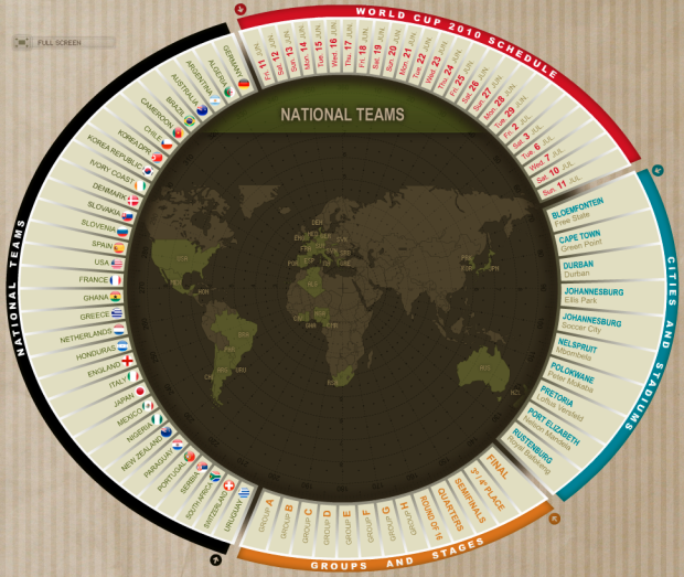
I was born in and live in the United States, so to me football is a bunch of big guys in full armor trying to tackle each other. To the rest of the world though, all eyes are on the World Cup, starting June 11. So this is for you, international readers (and maybe one or two Americans). Marca has an interactive World Cup schedule so you can make sure not to miss any important matches. Mouse over a date, a team, a group/stage, or cities/stadiums to focus on the matches you want.
[Thanks, Judi]


Yeah, I really liked this graphic. Very nice design and use of space.
The US team is actually fairly decent (#14 in the world) and ESPN is promoting the heck out of it so I think plenty of Americans will be watching.
Nice graphic. As Mugizi points out, though, the game’s more popular here than you’re giving it credit for. Many bars across the country will be packed for the big game against England on Saturday.
How about a graphic of World Cup 2010 ticket sales by country? I bet you’ll be surprised by who tops the list… ;-)
i’m sure it’s been growing, but compared to america’s major sports, it’s probably pretty tiny. someone needs to graph it :).
Hi everyone. This Marca interface is a great design for communicating a lot of information around the World Cup in terms of groups, schedules, venues, teams etc.
If you are interested in this sort of visualisation/information device, I have included it in my ‘Visualising the World Cup’ post here: http://www.visualisingdata.com/index.php/2010/06/visualising-the-world-cup-2010/
Cheers
Pingback: jodischneider.com/blog » World Cup 2010
Pingback: Infographic of the Day: The Only World Cup Schedule You’ll Ever Need | Web Design Cool
Pingback: 円形デザインを使ったワールドカップ日程の面白い可視化 « ++ t-empire.com ++
Pingback: Where’s today’s match? | Wide Angle
Pingback: Infographic of the Day: The Only World Cup Schedule You’ll Ever Need
Pingback: A good interface design | "Off the shelf" project, my research blog