In 1870, Francis Walker oversaw publication of the United States’ first Statistical Atlas, based on data from the ninth Census. It was a big moment for statistics in the United States as the atlas provided a way to compare data on a national level using maps and statistical graphics.
What continues to amaze me about these old illustrations is the detail – all done by hand. That’s ridiculous. The kicker is that a lot of this stuff looks way better than a lot of what we see nowadays. Here are some selections from the 1870 atlas.
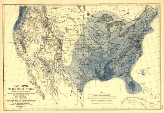
First, there’s this lovely map of rainfall.

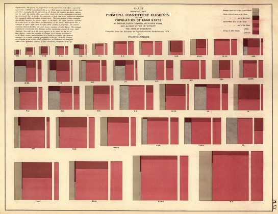
Then there’s population measurements. Is this the beginnings of a treemap?

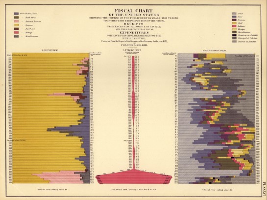
Ooo, stacked bar charts of expenditures and receipts.

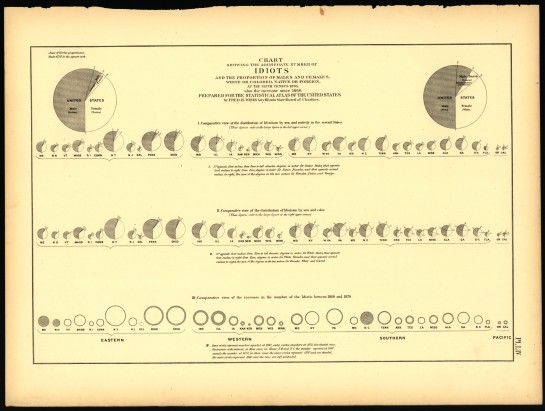
Finally, let’s not forget the chart of “idiots.” I think we use “mentally challenged” now. Pie charts and bubbles galore.

Okay, so they’re not all better than what we have now, but come on, it was the 19th century. It was only 16 years after John Snow’s map.
In 1880 and 1890, geographer Henry Gannett took the reigns to produce similar atlases. In 1900 though, the atlas was headed for decline, and the last one was published in 1920 – that is, until 2000. I must say though I still think the first one in 1870 was the best. I hope there is a 2010 atlas. If there isn’t, I’m so doing it myself.
Sidenote: we should be receiving Census surveys really soon. Make sure you fill them out and send them back! Really important. You only have to do it once per decade.
[via radical cartography | thanks, @krees]

 Visualize This: The FlowingData Guide to Design, Visualization, and Statistics (2nd Edition)

If you like these, you should definitely check out Barry Lopez’s short story, “The Mappist”. PRI selected shorts broadcast a podcast of it, which was brilliant (you should google it). It’s all about a man who tracks down a mapmaker who creates extraordinary hand made maps…
thanks, omw. I’ve actually had ‘the mappist’ in my queue for a while. maybe it’s time to have a listen.
I also hope they do one for 2010. I’ve got a copy of the 2000 one by Cindy Brewer et al. (http://bit.ly/9db3r7), and it’s been a great resource to show to cartography students.
If any of them ever complains about GIS being hard, I’ll have to resist the temptation to show them the 1870 atlas and hand them a pack of colored pencils.
Pingback: Infographic of the Day: What the Census Said About Us…in 1870 | JK Technologies |
Pingback: Infographic of the Day: What the Census Said About Us…in 1870 | Web Design Cool
I studied geography in college and am amember of the american association of geography. you should link up with our community of geographers:
1. attend one of our conventions
2. present your graphics to a publisher of geographic textbooks, they might like your stuff
3. market the flowing data website to geographers, i don’t know how that works so much but make it so you come up in a search for the keyword geography?
Pingback: Statistical Atlas from the ninth Census in 1870 | @FlowingData « ImJustCreative
Is that part of a successful infographic? something you’d eventually want to hang on your wall long after the chance to make a decision with it has passed
Pingback: Infographic of the Day: What the Census Said About Us…in 1870 | Stocks!
Pingback: Digest – March 21 2010 – The Story
Pingback: WiredPrairie - From Many Eminent Men of Science