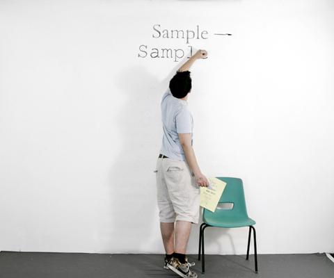
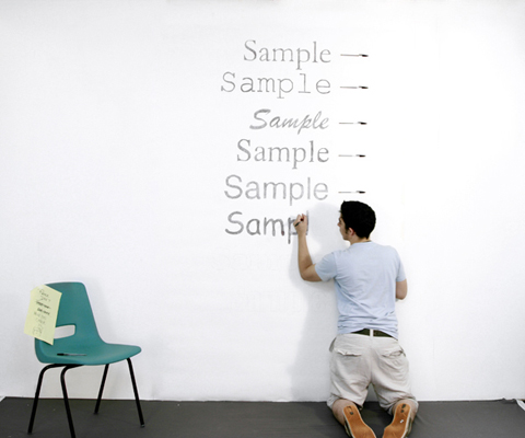
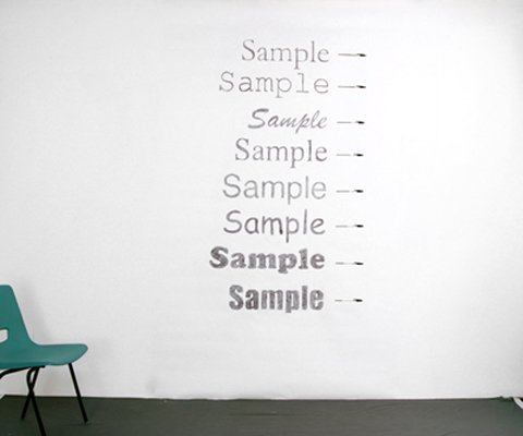
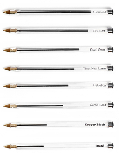
Designers Matt Robinson and Tom Wrigglesworth looked at ink usage of some commonly-used typefaces, by hand-drawing them with ballpoint pens.


Scribble, scribble, scribble, and they got this simple bar chart with ink usage measured by, well, ink:

Impact font is such an ink hog. Such a drama queen.
See all the shots here.
[Thanks, @bambock]


Very cool! :)
Pingback: ¿Cuanta tinta de boli se gasta con cada tipo de letra?
LOL, I just namechecked the very same project in a post about the environmental impact of printing, just a couple days ago! (http://webworkerdaily.com/2010/01/27/sustainable-printing-the-environmental-impact-of-your-printer/)
Good to see all the evil looking fonts are also the most profligate…
A for style and intent. C for test conditions control.
Try the same, but with ink or toner. Draft a lorem ipsum document (or something you actually need many copies of) and see how many times you can print it with a single cartridge for each font. This assumes of course, that cartridges are consistently filled.
I suppose that each font should probably be typeset to serve readability standards, which would be difficult with Impact and Sample.
i guess we can’t all be experts in experimental design :)
A for accuracy. C for creativity.
A for a*******, C for ****
Pingback: Which Fonts Should You Use for Saving Ink - News from Tech
I’d like to see Garamond vs. Helvetica UltraLight :)
The only problem is that the fonts that save ink also require more light energy to display on a monitor. Maybe we should all promise never to print anything out and all use Impact instead?
Standard LCD screens don’t change the amount of light they output with what is drawn on them, they use backlights that don’t vary with the graphics. This statement could be true if you use an OLED screen, which right now are only available on certain cameras or cellphones.
Pingback: Which Fonts Should You Use for Saving Ink | Syamsurian.com
Pingback: This Is Star » Blog Archive » Carousel 1/29/10
Pingback: I font da utilizzare per risparmiare inchiostro quando si stampa un documento. | TuttoVolume
Pingback: Which Fonts Should You Use for Saving Ink « Wordpress Test
“such a drama queen”… rachei de rir =D
Pingback: Daily interesting articles | Aww Dip
Pingback: Daily Digest for January 29th
Pingback: Which Fonts Should You Use for Saving Ink | Intipadi.com
Pingback: Save pens. Use Garamond font « nothing to see here
There are a lot of stupid, wasteful, idiotic things that are being done out there–but this takes the cake. This is not just mind-bogglingly stupid, it’s also wholly, totally inaccurate, unscientific, lunatic and a serious reminder that educational standards have fallen dramatically in the recent past. Worse than all that; it doesn’t even make a shred of sense. NADA. Notengo. Nothing. First of all these are typefaces, not fonts; and the new computer ones are, or can be, different from the original ones some around for hundreds of years. None, however, in hundreds of years, mis-used so egregiously as this. Grow up children. Get a life.
Nice Stanley. Way to let them know about that.
Are you going to tell us to get off your lawn as well?
There’s always a troll
This is what Edward Tufte means when he talks about ‘data ink’, I think.
Pingback: Which Fonts Should You Use for Saving Ink | Chaitu's
Pingback: Pens
“I like this.” – What an interesting experiment that was conducted… now I wonder how accurate that is in actual comparison to the ink used in a printer.
Save a Pen, use a Pencil.
This looks more like an art project than an experiment. for everyone who is complaining that these arent proper test conditions: no shit.
this is called fine “art”
the fonts are being drawn and the pens put beside them to create and interesting thought producing image.
honestly, these are some of the least creative/thoughful posts i’ve seen in a long time. why take everything so seriously.
Pingback: Pen Graph « Gemma Ellen Williams
Pingback: Save pens. Use Garamond font « IM260/291 Julia Art
fuck you guys, this is cool.
Pingback: Liensdumatin 02/03/2010 « Ray's liens du matin
I really like this!! Nice job
Pingback: Ahorra en tinta usando la fuente Garamont | Mundochica | Moda, decoracion y sexo
Where are all the math geeks. I figured at least one geek would have commented with the precise volume of each sample using a fancy algorithm. This is the Internet after all.
This is pretty stupid… A laser or inkjet printer uses ink differently than these two dorks writing on the wall. I’ll bet actual ink usages are completely different than their results.
Man, calm yourselves, people. This was for amusement more than anything.
Well.. that approach is as scientific as it can get.
Mithbusters would be proud.
The correct way would be with a printer and a continuous inking system (the colors are outside of the printer in a visible container) and printing same text pages with different fonts.
It`s rally easy.
this looked like a fun project congrats!
I liked the post at least!
Good work! Hmm, what about printing? ;)
Very nice but where is the Arial?
Pingback: Pop Loser – Use Garamond
Pingback: dre in the morning » Blog Archive » Friday
Pingback: Experiment „Save pens, use Garamond font“ » Mediengestalter-Blog.de
Pingback: Save pens. Use Garamond font | FlowingData « mensonblog
Pingback: Almacén de creaciones » Archivo » Aprovecha tus bolis escribiendo con la Garamond
Pingback: This week in Type « Typeforge
Pingback: crepe, shantung, batiste, paper taffeta | Kills Me Dead » Blog
Pingback: Things I Do When I’m At Home Sick « A Ten Cent Gem Jar
Pingback: Save pens. Use Garamond font | @FlowingData « ImJustCreative
Pingback: Which Fonts Should You Use for Saving Ink | Free And Full Download
Pingback: Weekly Roundup: Design Related Links #5 « Discovery Session… by Gerard Dolan
Pingback: Digest #24 : ::: Think Macro :::
Pingback: Garamond ahorra « Librillo de Ramón Buenaventura
Pingback: Sauvegarder de l’encre, utiliser la police Garamond | JulienCollinet.info, a lifesytle blog (Julien COLLINET)
Pingback: Measuring Type – Openmedi
Pingback: Daily Dose of Common Sense » Garamond Font Wins Ink Usage Competition
Pingback: AiGD Weekly Insp Feb 16 « clntgrne
Pingback: Save Pens. Use Garamond Font « Karrrmel's Blog
Pingback: Qual a fonte que consome menos tinta? « Denny Torres
Pingback: Who Needs Gauge?! trying to get through life without planning...
Pingback: Go, Garamond! | Madison Ave. Collective | Corvallis, Oregon
Pingback: Harmjan » Blog Archive » iiink fishy fishy
I wonder how they knew exactly how the outcome would be, as the fonts on the wall appear in the correct order of their inksaving rate…
He probably drew them all out on a smaller sample scale first,beforee the big picture.
Go the lefthandeds! One day we will take over the world.
very nice approach, bravo!
see also http://www.ecofont.com
greets
Richard
All very clever, but apparently Century Gothic is the most economic – and legible – font there is (besides things like Eco Font).