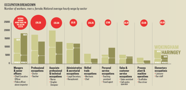
We all know (or at least should know) about the pay gap between men and women in the workplace. This graphic from Shakeup Media was made to highlight that gap by comparing two cities in the UK at opposite ends of the spectrum. In one city women are paid way less than men while in the other, women are actually paid a tad more.
The aesthetic is nice and the subject matter is important. I also like the use of the Easy Tooltip jQuery plugin.
I just wish there was more focus on the actual pay gap. Instead it was more of an exercise in displaying demographics of two cities, where each section is separate from the other. Some annotation in the tooltips about the cities’ differing demographics would have tied things together nicely.
[Thanks, Ryan]


 Visualize This: The FlowingData Guide to Design, Visualization, and Statistics (2nd Edition)

Nitpick: neither of those are cities. Wokingham is a town and Haringey is a borough within London. :)
Nice chart, but as you said, it doesn’t tell you what the pay gap is in absolute terms. Judging by the much higher household income in Wokingham, you might infer that women there earn much more than those in Haringey, despite the pay gap % difference.
Also the way household income is display makes it look that Haringey’s is about a quarter of Wokingham’s when in fact it’s just under half.
I find it bizarre that the people behind this, Shakeup Media, are also responsible for the offense to both eye and mind that is http://www.horoscopes.co.uk
Studies have shown that when education, and women’s desire to take time off for child rearing is controlled for, there is not pay gap. We have to compare apples to apples to have a valid comparison.
I know more stay-at-home dads than I do stay-at-home moms. Sure, it may not be a global trend, but it points to something important. The men stayed home because their wives made more money than they did. Staying home with your children is as much (if not more) a financial decision as it is a biological decision. Perhaps women stay home not because they have some burning “female” desire to be with their children, but because they get paid less and it doesn’t make financial sense to return to work and pay the cost of child care. I don’t want to be too critical without knowing for sure what studies you are citing, but it seems to me like these are questionable statistics.
-Justin
i found this really confusing, myself.
I was surprised that a large and well-paid sector of the economy appears to be ” *mangers* and senior officers.”
nathan – you are totally right, we should have been more clear about why we chose these particular demographics — they were chosen for very specific reasons, each of them is a vital part of explaining the secondary causes of the pay gap figure. we were trying to avoid an explanation of the simplistic total pay gap figure (17.1%) which we find a little misleading without proper explanation. (and i hope that slightly answers your first point jonathan)
* average household salary because men tend to be better represented in better paid jobs (and thus the pay gap larger in richer areas).
* full time v. part time figures because women often work more in part time roles because of childcare duties (among other reasons) and part time work is often less lucrative than full time.
* occupational breakdown because in the higher paying sectors men often are the majority (this is the most complicated and controversial set of statistics because, as the police v. nurse debate shows, it gets down to the value of particular occupations to society).
* and the prevalence of children, young children in particular, because those children often limit a woman’s ability to work
we should make this more clear in the graphic though, that’s for sure
laura – wokingham is a town but its also a borough and we are using the statistics for its borough-ness, not its town-ness
jonathan – totally right on the salary comparison, you were first, but definitely not the last to point that one out. sorry and thanks. and we changed it.
pete – it hurts my eyes too. like blood from the eyes style. we are in the long long process of redesigning it now.
ben – ellen is going to reply to you.
Ben – I’d be very interested to see these studies.
I do know that girls outperform boys at every level of education in the UK, so quite how that translates to a pay gap once they reach employment I can’t see.
The question of childcare is far more complex and is closely linked to the debate surrounding parental leave, however I don’t accept that women should earn less on returning to work after having children. Remember these statistics are based on hourly rates for full-time work, so they’re not affected by part-time hours or time taken off work for raising children, both of which naturally impact overall earnings.
The Basics section has Haringay dark, and Wokingham light… but they swap colors on the two bar charts. This made me re-read that section several times to make sure I was interpreting it correctly. And the uncertainty this created made me take three times longer reading the other sections, even though the rest remained consistent.