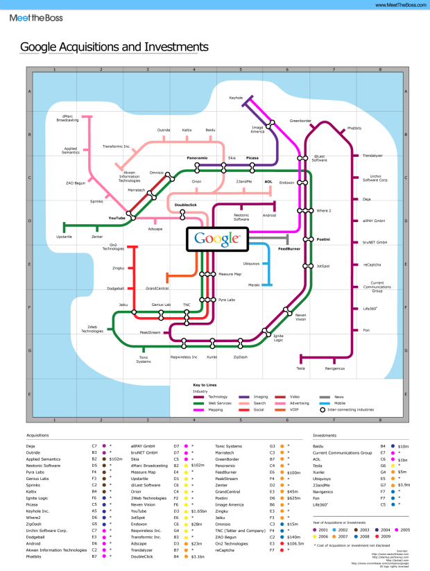
Tack another graphic to the growing list of subway map metaphors. Meet the Boss “maps” Google acquisitions and investments, color-coding tracks by industry. The maroon track, for example, represents video, hence YouTube, which also interconnects with advertising and web services.
The design is nothing new (and kind of overdone), but the data are pretty interesting. I’ve never even heard of most of the acquisitions.
Does anyone know who was the first to use the subway map metaphor?
[via TechCrunch]
 Visualize This: The FlowingData Guide to Design, Visualization, and Statistics (2nd Edition)
Hi Nathan,
I still don’t understand what’s with the subway metaphor. To me it just sounds like a formal decision. It’s good for showing density and multiple interconnecting pathways I guess.
A guy that I worked with in the past, who lives now in Tokyo, has a thing called the Webtrendmap. He uses the Tokyo subway system map as a base for his visualization. http://informationarchitects.jp
My main concern is readabilty. Shoehorning datasets into visualizations otherwise created for different purposes does not lead always to the expected results. In this case, the original intended purpose is going from point A to point B.
BTW, I find myself coming back to your blog very often. Keep up with the good work.
Cheers,
jp
Thanks, JP. Speaking of webtrendmap, we’ve got a a guest post from one of its developers coming up :)
The subway map metaphor is usually stretched too far. In a subway line, stations are arranged on lines according to their physical locations along the line. In the false maps, there is generally no relationship between adjacent “stops”. Are they listed in order of proximity to Google’s core technologies? No. Are they listed by date of acquisition?
The shared colors between the subway lines above and the dates of acquisition below lead to confusion. Maybe the subway metaphor is useful to capture one’s attention, but a more accurate description of this information would be a simple table.
João, Jon,
One pattern that I like in this instance of the Subway Map scheme is that of stations linked to more than one, often parallel tracks. This indicates the station has the set of attributes composed of those for each line. Long stretches of parallel tracks make it easy to see what terms (or in this specific case, industrial areas) often occur together.
This could be the basis of a general system for presenting collections of things that have been annotated with a set of tags: all my delicious links that share “blogs” and “infovis” would be represented as stations that access those two “tag tracks”.
Mac –
It would be less contrived if you had columns for each of the categories (i.e., subway lines), and put a checkmark or other symbol in each that related to a specific acquisition. Then you could scan or sort by these columns and see what groups of acquisitions fit together.
Pingback: Planner Reads » Blog Archive » Google Acquisitions Subway Map
This is pretty poor, the makers have listed 23andMe and Navigenics (both genetic testing companies) on different tracks.
You mean “Google Acquires Subway Map” — “acquisition” as a verb is not a word…
Levon –
Nathan’s title is correct. It’s a Subway Map of Google Acquisitions, and the title is not meant to be a complete sentence.