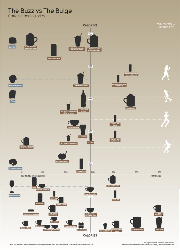
David McCandless from Information is Beautiful plots the calories in popular beverages versus the amount of caffeine in them. At the bottom right of the plot are drinks low in calories and high in caffeine. At the opposite end, top left, are beverages of high calories and low in caffeine. Food items (on the left) and physical activity (on the right) provide context to the calories.
[Thanks, Peter]
 Visualize This: The FlowingData Guide to Design, Visualization, and Statistics (2nd Edition)
This is awesome! What better way to really show people what they’re putting in their mouth. Great chart!
Why on earth do the axes intersect at 150? Traditionally, things below or to the left of an axis are negative numbers. That really confused me.
Also, right above the comments section, a banner says, “Data is beautiful.” It should be “Data are beautiful.” ;)
it can go either way. for “beautiful data” o’reilly made me change all my data “are” to data “is”
Well good luck finding foods or drinks that have a negative amount of calories or caffeine.
The intersection does seem arbitrary, but it certainly is helpful to have four quadrants to compare this sort of thing than to just have one. I don’t know much about nutrition, but if the intersection has any meaning, it’s may be some average or required amount.
Negative Calories is possible.. think 0 calorie soda served on ice. Your body expends energy warming it up to digest it (It may be minute, but it’s still non-zero).
Negative Caffeine… not so much.
“it certainly is helpful to have four quadrants to compare this sort of thing than to just have one”
Then have the axes intersect at zero, and divide the space into ‘high / low’ on each axis to get to a 4×4 grid. The layout in this format is dumb, arbitrary and misleading.
love the combination of equivalences (both calorie gaining & dispensing)
one question though – why is the X-axis drawn seemingly arbitrarily at 175 calories?
Not entirely sure what all the activities to the right are. Tennis, running, and boxing? What’s the 4th one? Labels or a legend would help.
A minor pedantic suggestion: calorie burning rates vary within activities depending on intensity. Maybe choose one activity such as running and vary the references over one variable (speed, duration) while keeping the others constant (for an average person).
With all the other horizontal lines, emphasizing the axes as well as the axis titles (e.g., bold) would make it clearer.
roller blading, i think. or dancing with shoes with wheels.
I thought the placement of the axis intersection was odd. None of the quadrants balance. My assumption it’s to distinguish traditional beverages (lower left) versus the specialty drinks (frapps and “energy” drinks).
Overall, the intent is well executed.
I thought the 150 cal line made sense (says the biochemist :*P), that is about where you cross from a regular drink to extravagant sugar loaded concoctions and food items. I like this :-) It’s simple and conveys some general information nicely.
Very very nice, and a bit of an eye opener for some, who would have thought that a mocha could have so many calories!
Maybe this is just indicative of how coffee is made in the states (which as an aussie completely boggles my mind – sorry) but how does a large cappuccino have more caffeine than a double espresso? A large cappuccino should have a single 45mL shot of coffee in it, whereas a double espresso has 2*30mL shots…
Also I’m blown away by how much sugar has clearly been added to the speciality drinks – a skimmed frappe coming in at higher than coffee icecream?? I never would have guessed that…
Pingback: Draw a Picture? (or, Check out this data on metal bands) « The Other Side of the Coin ™