I, uh, well. Hmm. Yeah. New Scientist recently compiled a list of visualizations exploring the growth of the Internet. Here they are in no particular order (plus the one above).


What do you think of this series? Which ones are good? Which ones are bad? How can they be improved? Do they need improvement? Discuss in the comments below.
[Thanks, Brian]
 Visualize This: The FlowingData Guide to Design, Visualization, and Statistics (2nd Edition)
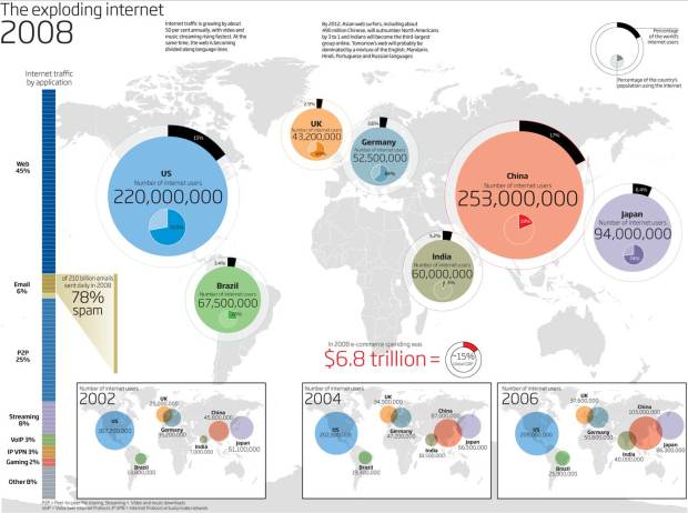
I think the first chart stands out in the sense that it brings out the growth rates very well. Interesting to see that Brazil hasn’t lived upto expectations, while China and India would equal (or surpass) US + UK + Germany + Japan put togehter in the next few years. Going by the same rate, China’s base would say in another 10 years be challanged by India’s faster rate of growth. And to think that the penetration rates there aren’t yet anywhere eve close to the developed world…
The submarine cable capacity is interesting; it’s an obvious known, but to see the U.S., Europe, and East Asia vastly outweighing the rest of the world. It would be interesting to see the same format applied to the types of usage between pipes.
I’d never really thought that a visualization of IP ping data would be cool or broadly useful, but this approach is certainly interesting, though a bit unclear. I can only assume blue is unused IP addresses, or– since it’s labeled multicast at the top– traffic routing to all the other blocks. The fact that registrars have such a big chunk must be symptomatic to parked domains and nameservers?
Good stuff.
I liked the Internet Census Address Map. I didn’t realize until reading the map description that the current domain name system is in need of an upgrade because we’re running out of unique identifiers.
There is some interesting information in these charts, but I don’t see how any of these show growth, which is what they are supposed to be about. The first one shows previous years, but the maps for previous years are scaled down so it is hard to make a comparison. Actually, now that I go to the actual web site, I see that they are all separate graphs. Still not as powerful as they could be growthwise. Show me a time series plot so I can see the rate of growth! It’s hard to judge by the areas of the circes.
By the way, Nathan, I’d like to hear your take on things once in a while. It seems you usually just say “this has its problems” or “what do you think?”… tell us what you think!
go go xkcd!
http://xkcd.com/195/
Pingback: ¿Dónde queda la Web hispana? | Stralunato
The last one would be nice if they had not cut off the cables in the ocean. The visualization would be better if they had centered it on India. Here’s a quick chop-cut:
http://farm3.static.flickr.com/2626/3840364468_c39f7c007b_o.jpg
I find the heat map very hard to read, but the last one really irks me!
Like Eliot said above, it cuts int eh wrong place. They removed New Zealand!
Per me last visualization is clearest and does not require much efforts. All others require effort in searching related info like legend or correlations.
In the case of first visual the problem is the Title “Exploding growth”. To get a quick picture of the growth you have to have side by side comparison and not the bubbles shown in different places (2002,2004,2006 and 2008 are represented as bubbles in different places of visual, only way to check the growth is by reading the numbers)
Second visual provide great details about each cable line. May be very useful in specific context like technical overview, but one who is interested to know overall picture the last one is still better.
To understand the heatmap of addresses, it will take some time for me!..
Poor Australia
Pingback: Mapping the Growth of the Internet – ich blogge nicht
Pingback: Reading blogs #18 : ::: Think Macro :::