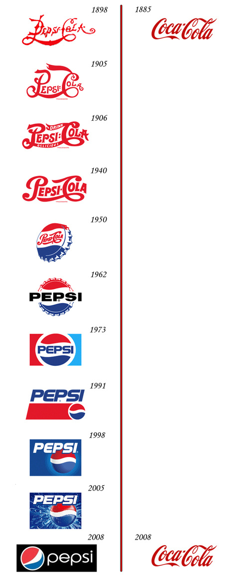
There have actually been some subtle changes in the Coca-Cola logo but not nearly as dramatic as the Pepsi logos. I personally think the new Pepsi design is atrocious. They should have stopped in 1973.
[via clusterflock & Daily Dish & Consumerist]
UPDATE: As some of you pointed out in the comments, Coca-Cola has in fact made quite a few logo changes, and the evolution is probably not as straightforward as the above graphic suggests. No doubt there was some overlap as well as issues with stuff getting hand-drawn. There was probably a good bit of market testing in the later years too – which is why I put this in the “miscellaneous” category. In any case, here is a revised version from Brand New:

P.S. The new Pepsi logo is still ugly.
 Visualize This: The FlowingData Guide to Design, Visualization, and Statistics (2nd Edition)
Brand New also lists some of the other variants of the Coca Cola logo:
http://www.underconsideration.com/brandnew/archives/coca-cola_vs_pepsi_revised_edition.php
Luckily I seemed to miss New Coke.
Kev
I second the previous post. This oversimplification has been debunked for a couple of weeks now.
(never had a chance to express that I really appreciate your blog as invaluable source of information ;-))
The case of Coca Cola logos might be a little bit more complicated: http://www.graphicdesignblog.org/pepsi-and-coca-cola-logo-evolution/
I agree with you, the 1973 logo is the best one. They should not have never. The latest one is terrible… and I am biased on this matter as I have always prefer Pepsi over Coke.
If everyone here already knows that this graphic is innacurate why post this and not the (more) correct version (the one with the actual logo evolution from Coke)?
The extraneous hue of blue was always a frustrating weakness of the 1973 logo.
do you left one pieces? http://energio.tumblr.com/post/157996530/coca-cola-vs-pepsi-revised-edition-brand-new
Well, good to know folks are quick to catch a mistake. Looks like Coke did miss a couple of changes.
Some of it I wonder if it’s more of a branding of a product or promotion rather than branding of a company.
to me the changes pretty much stopped in the 1900s, I don’t remember if in 1985 it “COKE” was the only logo used (didn’t they have another small logo beside the corporate signature?
the gray stripe in 1987 I thought was just a box change thing.
ditto with 1990.
If you guys are including all of the variations, there’s plenty that are missed you can see for yourself on the coca cola web site: http://www.coca-cola.com/index.jsp
http://bunnitude.com/misc/files/pepsi_gravitational_field.pdf
The full explanation of the new Pepsi logo can be found at the link above.
I really like the faux-science to it all, how ever the pepsi verse part at the end starts to get tired!
Wow, I can’t believe (well, actually I can) that people spent this much time and energy to make such a lousy logo. Everytime I see it I keep trying to figure out what Korean Airlines is trying to sell me until I realize that it’s actually a pepsi ad.
The Pepsi universe at the end was indeed over the top.
Thanks Jim!
Pingback: Comparación del logo de Pepsi y CocaCola a lo largo de 100 años
gosh jim: appreciate the post. what a find!
Pardon me, what a bunch of gobbity gook, it’s almost if someone drank too many Pepsi one night and had a caffeine overload.
Pingback: Coca-Cola vs Pepsi « Creativity, Innovation, and Tech
Pingback: Ein Lehrstück in Markenführung — handelsmarke.org
Pingback: A little bit of marketing history « Economic History Blog
Pingback: Weekend miscellany — The Endeavour
Pingback: Ukens anbefalte - 19 August 2009 | Raymond Karlsen
The new pepsi logo looks too much like the Obama avatar/icon or whatever you call that thing – which makes me sick to my stomach to even look at it.
Pingback: Small advice « La puce, die Welt and everything else