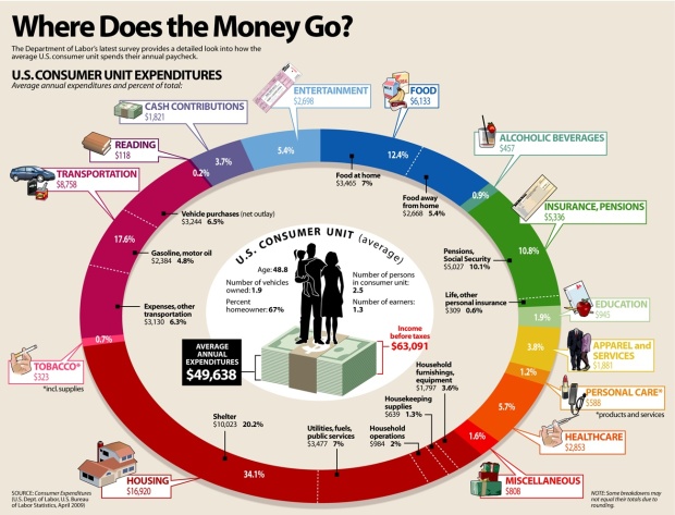
Add another graphic to the list of ways to show consumer spending. Visual Economics displays data from the most recent spending survey (April 2009) from the Bureau of Labor Statistics. Compare this to last year’s survey results via an NYT interactive.
The biggest difference I’m seeing is that between last year’s spending on housing (42%) and this year (34%). Maybe that’s why my mother-in-law keeps telling me it’s a good time to buy a house. Do you notice anything interesting?
 Visualize This: The FlowingData Guide to Design, Visualization, and Statistics (2nd Edition)
I would say it is interesting how little part of our money we actually spend on food. It could also be argued that so many things in our lives are created needs. We need a lot of money to keep up with artificial needs, while we spend little or no money on education, health, personal care or reading….
Oh, no…not another overstuffed donut chart. Just like a real donut, it’s filled with stuff we don’t need, and missing stuff we do need.
It compares gross income with net expenditure in the donut’s hole…but misses out a metaphorical opportunity to show whether consumers are spending themselves into a similar ‘hole’, because it doesn’t tell us net income.
It has a note at the bottom left that says “Some breakdowns may not equal their totals due to rounding”. Fair enough, but ironic given that this round format itself removes any chance of us using our huge visual cortex to help digest the information, I’d say it suffers from undue visual rounding.
Its colors are garish, and even worse, it lacks contrast between light words and light backgrounds in many segments.
Its clip art is amateurish and distracting. It takes up a huge amount of screen real estate, but gives little information per pixel. For instance, a better graph would show how this has changed over time. Hell, a better design could have showed changes over a decade, and still had room for clip art.
I wish the chart creator would spend some of their average $118 reading money on a data visualisation book…
Missed something…it’s such an inefficient waste of space dedicated to a pretty bad static measure…the ‘average’ So it misses answering interesting questions like what kind of diversity is there between lower income, and higher income, or between young and old, or between urban and rural, or between last decade and this decade.
It tells us nothing about diversity period. Even some measure of spread would tell us something far more meaningful to the ‘average person’. That is, if there was such a thing as an average person…
Fascinating data, beautiful chart, but very hard to interpret the ratios and relative amounts. I have posted an alternative presentation format at http://www.freakalytics.com/aas
Best,
Stephen
Fascinating data, beautiful chart, but very hard to interpret the ratios and relative amounts. I have posted an alternative presentation format at http://www.freakalytics.com/aas
Best,
Stephen
http://www.Freakalytics.com
Where’s taxes? Statistical averages on taxes are very difficult to calculate since the federal income tax system is regressive and state and local taxes vary widely, but not including some form of taxes may make this graphic misleading. It appears that the average consumer unit actually spends less than they earn, since income before taxes is greater than average annual expenditure – but with the U.S. consumer debt ratio increasing, is that the case?
I find it a bit disturbing that the average expenditures is higher than the average gross household income for the city I live in. I would really like to see something like this done for different SES levels – shelter alone definately takes up more than 20% of the net income of my neighbors. Also annoyed (as above commenter) that they used gross income but expenses are based on net. Use net income, net expenses for more accurate representation of how much is available for savings.
A bit disturbed for our culture – what does it mean that we’re spending more than 4x on alcohol than on reading?!?
Re your comment “what does it mean that we’re spending more than 4x on alcohol than on reading?”
…perhaps the relative economics of drinking and reading are shifting, as more content moves online ;-)
I agree with ecampbell, any discussion about where money goes needs to start with taxes. It’s not an accident that they’re withheld before the “average” person spends their first discretionary penny. I think a small multiples by tax bracket or other income category would be much more interesting (and informative).
Also, there’s the classic issue of which average their using (as Jeff pointed out). I can only assume the mean (unfortunately I can’t read the fine print to see if they note something different). I’m guessing that gross income is probably a skewed distribution and mean is particulary meaningful.
Where is this data coming from? I’ve been all over the BLS website and everything I read says the most recently available data is from 2007 and was released in Nov. 2008.
Visual Economics is not the most effusive website when it comes to discussion of its graphics. In fact its a pretty terrible website. I have to manually open the images in another tab just to read most of their graphics.
I’m guessing the data come from the CE database, which I can’t open right now, or they asked BLS for the new data, because the NYT one from last year is well past 2007. The data bureaus are usually good about getting data to you if you ask for it and they have it.
They must have asked for it, because the CE database still only goes up to 2007. Although looking at the NY piece closely, it is measuring CPI against CE. What the colors are tracking is change in CPI. The values representing percentage of consumer spending are static. It doesn’t say how current the CE data is, only that the CPI data runs from March 2007 to March 2008.
Those are 2007 numbers. I just checked the BLS website. If they reported them as 2009 numbers they made a mistake.
-gocubs
You sound like a big baby.
i think it’s interesting that the “average consumer unit” is 2.5 people.
Isn’t that is an average family unit?
Pingback: Respuestas de un planner sobre cómo las marcas deben conectar con sus audiencias | Impresiones, el Blog de Javier Velilla | Comunicación
Pingback: ¿Cómo los consumidores gastan su dinero? | Digiriendo
Pingback: How The Average Consumer Spends His Paycheck [Charts] | Gizmart Blog