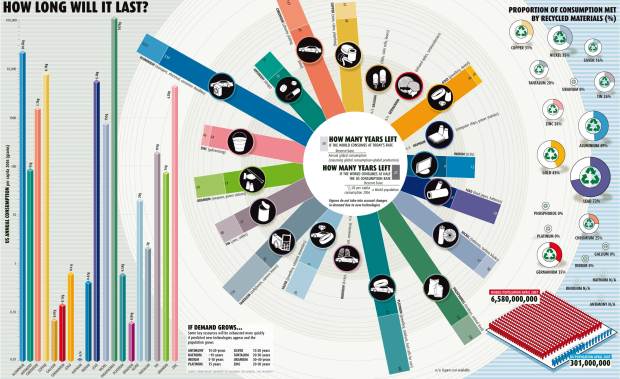
This graphic from New Scientist shows when certain natural resources will run out in the world if we continue at the current consumption rate. However, reader beware, this graphic feels more like eye candy than real data. I’m no ecologist, but something about these numbers doesn’t seem quite right. Completely out of gold in the entire world in 45 years? No more indium (for LCDs) in 13 years? I don’t quite get the comparison between world consumption rate vs half of the US consumption rate. Why half? Again, I’m no ecologist, so maybe this is totally normal. I dunno. Maybe someone who knows better than me can chime in here.
Data assumptions aside, the design is interesting. A little scattered – but interesting. Can you think of some ways to make this graphic more informative?
 Visualize This: The FlowingData Guide to Design, Visualization, and Statistics (2nd Edition)
I’m reminded of the recent Circos post. Making the middle graph circular adds nothing but difficulty in reading, as far as I can see. A standard rectangular graph would be better.
Circular graphs should probably be reserved for circular data.
Economists have already answered this question.
“In 1980, Julian Simon repeatedly challenged environmental scientists to bet against him on trends in prices of commodities, asserting that humanity would never run out of anything…”
Simon won the bet.
http://en.wikipedia.org/wiki/Simon-Ehrlich_wager
I would think a standard line chart would be much more effective, because it would show when each resource would hit zero, driving home the first point (how quickly we’re running out). I’d go with a linear scale for time instead of logarithmic, because it would stretch the extended timeframe much farther across the graphic, driving home the second point (how much of a difference reducing consumption can make). That second point is (I believe) why current world consumption is compared to half the current US consumption.
I’m actually most curious about the presence of Hafnium on the chart here. I can somewhat understand some of the N/A values on for various materials (though it’s interesting that N/A here means “data not available” while it usually means “not applicable”), but Hafnium is listed as N/A for every chart in which it appears. If there’s no data available for any of the included measurements, why include it on the graphic at all? On a related note, I find it curious that there’s no data about the current consumption of Hafnium, but somehow there’s a prediction about its longevity if demand (and thus, consumption rate) increases.
I don’t understand why you keep on repeating you are not an ecologist. Why do you need to be one to follow numbers on natural resources?
The data seems quite real, I am afraid. Here’s a test case for silver:
http://minerals.usgs.gov/minerals/pubs/commodity/silver/silvemcs05.pdf
Reserves are what we can realistically and profitably extract with today’s technologies. These would be enough for 13 years. Reserve base is what the graph uses, and it includes the stuff that might one day be extractable. These would last for 30 years.
This is not to say that we would be completely out of silver by then, but that we would have no new source of it, we’d have to make do with whatever is around. Given that we currently only recycle enough to cover 16% of consumption, I’d say things will be pretty rough.
A major part of the point of the graphic is to show how much more irresponsible/wasteful the US is, compared to the rest of the world. The half is probably just to keep things realistic – a scenario of ‘what if the rest of the world was consuming as much the US’ is not realistic, but a scenario of ‘what if China and India made it to US consumption levels’ is.
Ivan, I know you weren’t replying to me, but thanks for pointing out the world-rate vs. half-the-US-rate difference. My last comment was based on me confusing which measure was which. In light of that, I’m not sure what the message of the graphic is anymore. Is it showing how few resources we have? How wasteful we are in using them? How much more wasteful the US is than the rest of the world? I’d also add that most charts designed to illustrate the pitfalls (in this case, wastefulness) of one particular group (in this case, the US) aren’t very interested in keeping things realistic. Using raw, unmitigated numbers would provide a better impact, especially in this case, if that was indeed the intent.
There just really doesn’t seem to be a clear message here. Worse, all the possible messages I can draw from it are only pessimistic. How useful is it to simply illustrate how bad the situation is without also suggesting how we could make it better? Regardless of validity, I think this calls into question the value (that is, usefuless) of the entire chart. I’m willing to accept charts that employ some sort of bias and choose metrics specifically to support that bias, but I just don’t understand a chart that doesn’t seem to have any position at all.
@Ivan – i’ve collaborated with ecologists in previous projects, and i’ve found it’s always much better to get the expert’s point of view. If I were talking about the economy, I’d want an economists point of view.
Pingback: list of metals we’ll run out of in 42 years (with bonus wacko cult)
Pingback: Natürliche Ressourcen | lilagrün.de
Pingback: ¿Hasta cuando nos quedan recursos naturales? | Comunidad en la Red
I was wondering if anyone has the link to the article corresponding to this graphic. I tried to google it and search on the NS website with no luck…
I agree with Marty, the log scale here makes the graphic counter intuitive. I am a big proponent of log scales but not here. A regular linear scale would be better.
And I think this would be much better just as a timeline chart showing the amount of each going forward in time and showing the decrease to zero. All the n/a’s are very distracting too.
I had to work way too hard to understand this one!
The problem with the presentation for me is that it does not take into consideration the shifting ways in which we use resources. For example, if we are no longer laying thick copper cables for telecommunications, but rather fibre-optics comprised of silica surely rates of consumption will change (not on a massive effect world-wide I believe, but the point here is shifting trends).
What I would like to see would be something that takes these trends into consideration (kind of shown in the text to the right of the bar graph), but also shows increasing efficiencies of resource usage (or the opposite).
These predictions always remind me of Malthus and his views on dwindling agricultural resources in the face of an ever growing population ( http://en.wikipedia.org/wiki/Thomas_Malthus ). Although that doesn’t mean resource depletion isn’t a grave concern.
I definitely agree with you that the design is a little wonky. A bit too much data and not quite enough explanation of what the terms mean. Specifically, what is it saying about the U.S. vs. the rest of the world? U.S. consumption is singled out on the left and in the population minigraph, but everything else is worldwide, no? Not understanding the connection there.
“Circular graphs should probably be reserved for circular data.”
Circular charts should not be used at all, even for cyclical data (and I won’t even get into the most reviled circular charts of all, pie charts):
Radar Charts are Ineffective
Spiraling Down the Drain
Replacement for an Oil Price Radial Chart
This graphic is trying to be too cute with the data. The circular radial bar log-scale monstrosity in the middle is the hardest part to read. but any log scale on a bar chart (as in the section at the left) will cause confusion, since people can’t judge the logarithmic lengths of anything, and have to instead rely either on the data labels or the axis scale.
Is there any meaning to the size of the pie/donuts on the right?
Speaking of data labels, since everything is labeled, and since the graphical depictions are confusing, we can simply put all values into a table. This chart fails the JunkCharts self sufficiency test.
Pingback: Natural Resources | The Big Picture
To elaborate a bit on resource consumption rates:
1) it _is_ hard to predict the exact (or even approximate) time when we will exhaust the economically viable reserves of a given commodity, as many people have discovered (Ehrlich/Limits to Growth, Malthus). There are 2 important ‘unknowable’ factors in the forecasting equation:
+ The “rate of innovation” – our ability to reduce the cost of extraction over time. Since direct and indirect energy inputs are the most significant costs for most extraction industries, the advent and exploitation of fossil fuels (and consequent technological development) has steadily and dramatically driven down the cost of most commodities over the past century.
+ Incomplete resource data – for most resources, we have only searched a small fraction of the earth’s surface and/or volume for deposits. There is no economic incentive to search for new resources once we have something like 50 years of supply. Once a resource becomes relatively scarce, new surveys will usually find new sources. In general, the new sources will have higher extraction costs (sometimes significantly so) compared to the existing costs, especially for more ‘mature’ commodities. Oil is an relevant example – the cost of extracting the marginal barrel of oil has increased steadily over the past 2 decades, as the newly discovered and exploited oil deposits have moved to ultra-deep deposits, or the the harsh polar climate.
These trends are compounding, as well, since technology can make entirely new types of sources available for a resource.
An representative example is gold: Veinous gold deposits have been heavily exploited for millenia, and new discoveries are very rare. The South African gold mines are now extracting gold from more than 2 miles underground, because they have cleared out the easily mine-able gold closer to the surface. At some point, the combination of technical innovation, and the increasing price of gold made it feasible to start extracting gold from very low grade ore. This is much more expensive to extract (step 1: blow up a mountain…), but adds huge amounts of gold to our reserves.
There is such a thing as a prohibitively high extraction cost. For example, we _can_ extract gold from seawater, but it takes a _lot_ of energy to do so, and it is unlikely that we will ever have sufficiently cheap energy to make that worthwhile.
Neither of these observations guarantees an indefinite supply (though many economists assume that they do, because they have so far) – only that it is probably impossible to predict when our consumption will outstrip our ability to overcome scarcity or increasing extraction costs. At some point, surveys for new sources will only yield sources with prohibitive costs; at some point, technology will reach the limits of efficiency for extracting each resource. We just can’t know when this might happen…
Energy costs are of particular importance in this analysis. The the centuries-long decline in energy costs has masked the increasing amount of energy required for extraction for ‘scarce’ resources. Since 2000, the decline in energy prices has halted, and even reversed slightly (even ignoring the spike in oil prices last year). If we enter an extended period of increasing energy costs, then the possibility of exhausting critical resources increases significantly (or to put it in economic terms: the price for scarce commodities with no easy substitute or alternative supply will skyrocket).
Energy production is subject to the same logic as other resources, too – it takes energy to produce energy. This positive feedback loop has made our current prosperity possible (as we discovered cheaper and cheaper energy sources, energy gets cheaper,…). However, the same loop is quite destructive when energy prices rise – everything becomes more expensive, very quickly.
So for the most general case, you want to monitor energy prices to understand whether we will run out of a given commodity…
General references: “Limits to Growth (updated 2004 edition)”, “The Skeptical environmentalist” by Lomborg, “The Upside of Down” Homer Dixon
I see 4 ‘stories’ in the diagram:
1) ratio of ‘reserves’ to the rate of annual consumption for various minerals (Center): 2 rates are shown – extrapolating current rates, and extrapolating current rate of growth in consumption. I like the choice of data (ratio’s rather than absolute amounts, 2 different rates for comparison), and the presentation is pretty good (stacked bars are a decent representation), but the bars should definitely be parallel, not circular (as suggested above). The central legend is good – generally enough information to interpret the chart, and some good background info, but not too dense. A couple of key points are missing (see recycling discussion below).
The biggest miss here is that they apparently don’t represent “rate of reserve addition” at all (per my previous comment), which makes the presentation very misleading. This is a data selection/definition failure, rather than a presentation failure. If they factored that into the ratio’s, and stated that in the legend, you wouldn’t need to change the presentation.
2) % recycling: This is a nice way to represent percentages, but the redundant recycling logo in the center of each graph is too distracting – it should at least be smaller, and fainter than the graph data, since it is eye candy.
There are 2 big problems with this section:
+ They do not explicitly state whether the consumption rate in the center section is _net_ of the recycling efforts or not. Certainly we are meant to assume that, but it is unclear.
+ the recycling rates are completely disconnected from the reserve ratio data for a given commodity. They should be adjacent to the commodity reserve ratio data, so we can compare the ratio of recycling with the expected lifespan (presumably to incent us to recycle more silver…:-) This could be parallel charts, with the bars lined up by metal, or small sparklines (or circle)
3) Ratio of US consumption to World consumption. this is a complete failure. The only way to infer this ‘story’ is to mentally take the ratio of the 2 reserve estimates for each metal, then take the ratio of the US to World population from the graphic on the lower right, and compare the 2. Without this story, the population ratio graphic is useless, and should be eliminated. If they want to tell this story, they should explicitly compare per-capita usage US vs world. This is an important story for resource consumption forecasting, so I would re-work the graphic to include the comparison chart.
4) relative rates of consumption for each of the metals. I am not sure why this chart is here, or what the takeaway is. The fact that we use a lot of some metals, and very little of others is moderately interesting, but not particularly insightful or actionable. For a chart aimed at a mainstream audience, logarithmic scales should be a red flag – very few of your readers will know how to interpret the data correctly. I think this graphic should be junked as well. Since there is no story to tell, I don’t think a table would be useful either – no-one is going to remember, reference, or even assimilate this data because there is no story attached.
So I took a stab at a more intuitive graph for this. Y’all take a look and let me know what you think. I know not nearly as flashy but I think much more informative and intuitive.
http://www.cavemanforecaster.com/2009/04/worlds-natural-resource-depletion.html
I see red flags all over this chart.
The way recycling has been dealt with is confusing, and it’s unclear whether it has been included in the calculations for how many years left. Looking at the numbers presented for lead, it seems unlikely (72% recycled, but only 42 years of resources remaining?).
Why has iron been omitted? It accounts for 95% of total annual metal production. I suspect this is due to the large abundance of iron ore, and it’s high recycling rate (over 75%).
As others have said already, the log scale for annual consumption makes relatively small values look bigger, and a linear scale would be more representative. My point here is, if you justify leaving iron out of this graph because it dwarfs the rest of the data, why include phosphorous when it has the same effect? Whereas phosphorous as a fertilizer cannot be recycled, it’s interesting to note that the next four highest consumed materials (Al, Cu, Pb, Zn) all have recycling rates greater than 25%.
If iron was in and phosphorous out, with a linear scale on the consumption graph, it would look like things aren’t so bad after all. Issues of resource consumption, recycling and sustainability are of great importance, but the manipulation of data for political purposes does not help.
Pingback: Newsfilter » Newscast: Επεισόδιο 51
Pingback: Ressources naturelles : Combien de temps reste-t-il | GraphSeo Bourse
Pingback: Natural resources: how long will they last? | Think-Through
Pingback: Is Everything Finite? « The Porphyrogennetos
Pingback: Twitter Weekly Updates for 2009-05-01 at Visualizing Economics
Pingback: Magazine Quality vs. Informative Infovisualization | PTS Blog
I made a new version of the chart as well. I tried to take into account everyone’s comments here about what was wrong with the original. Tell me if I missed anything.
http://gmarceau.qc.ca/blog/2009/05/how-long-is-it-going-to-last.html
Guillaume –
“Sent to Landfill”? That’s not the same as consumption.
I think this was touched on above — as prices rise, previously uneconomic reserves become worth extracting. Another factor is that in most categories companies only report “proven” reserves, and when there are decades of supply left, there is no real incentive to go out and find more. You can find similar charts from the 1970s showing dire predictions that we would run out of this or that resource in 10, 15, or 30 years. Not to say that we won’t *ever* run out of *anything*, it’s just hard to say exactly how much we have left given changing technology and economic conditions. I read a great explanation of this re: uranium (some people apparently had been saying that a massive scaling-up of nuclear power would cause us to run out of uranium) but I can’t find the link now. Just keep in mind that many of these metals are quite common in the Earth’s crust, and so mining companies have no real incentive to “prove” more than a few decades’ reserves at any given time.
It’s also important to note that recycling rates tend to increase naturally as things become more scarce. Interestingly, aluminum is one of the few common materials that it is economical to recycle — despite the heaps and heaps of bauxite at our disposal, it is extremely energy-intensive to make new aluminum versus recycling scrap.
In other words, this data is probably too complex and speculative to be distilled into a chart like this.
Pingback: Ressources naturelles : Combien de temps reste-t-il | GraphSeo Bourse