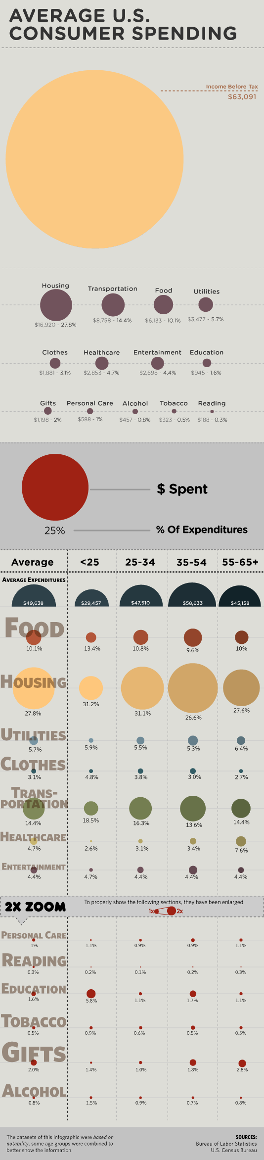
If there’s anything good that has come out of America’s financial crisis, it’s the interesting and high-quality infographics. This isn’t one of them. Below is an ill-conceived bubble chart from BillShrink that “shows” average U.S. consumer spending. Notice anything wrong with it?
Bar versus bubble debate aside, there is a ton of room for improvement as well as huge need for some fact-checking and common sense. For a blog on a site for personal finance, the graphic is, well, not something to be proud of. FlowingData readers know that I like to stay away from heavy-handed critique on what works and what doesn’t (I leave that to you guys), but this BillShrink graphic is just so clearly confusing that it’s worth pointing out what doesn’t work so we can learn from others’ mistakes. Can you find the flaws?
[Thanks, Jess]
 Visualize This: The FlowingData Guide to Design, Visualization, and Statistics (2nd Edition)
They obviously haven’t reflected about the role of pi, or Ï€… Also, the colors and shadings of these are confusing; as is the fact that some areas are half-circles only.
What about the data themselves (Itself?) — how is it possible that the (relatively young) seniors in the chart spend as much on entertainment as the youngest do?
Well I would say they drew the circles with radius relative to the presented quantitty, which translates visually to something relative to square the quantity… remember – we see the circle area which is = PI * radius ^ 2. they should’ve used radius = constant * sqrt(quantity)…
Am I right ?
Not a math guy, so I can’t speak to the correctness of the circle size, but I can say that the graphic:
* Doesn’t tell a good story: What’s my key take-away?
* Doesn’t help me compare the important points: They clearly want me to compare spending across age groups in different categories, but also want me to see how an age group’s spending breaks down. They’re trying to do too much.
* Takes context away: The total income is at the top and the spending categories are in percentages, making it difficult for me to truly visualize how much of the pie I’m spending in certain areas… So, are the circles next to spending relative to each other or relative to income?
Any graphic that has to change the scale (the “entertainment” break-down at the bottom) to make comparisons must be doing something wrong.
It implies proportional symbols but they are not proportional symbols.. just symbols. The sidebar text is scaled as if it has meaning, statistically, but it is just scaled to fit the space. The 2x zoom concept is interesting, but in this case a chart would have made more sense. The large section with the red circle is a lot of space to devote to a Key, which is more confusing than useful; an infographic like this should be able to work without a key. I’m at a loss as to why the gigantic beige circle exists as the opening data point: is 63k the national average income? To borrow a phrase: chartjunk.
Sorry to be a little lo-fi but if this dat ais supposed to reveal proportion then surely there needs to be a fixed scale. How about a (shudder) pie-chart?
Failing that can we have some other visual queue?
Also, is the ‘zoom’ bit the slice of pie that’s too small to draw and usually ends up being called “other” ?
The bubbles in the categories section have an area proportional to their absolute value and their tag says the percentage of the total value, which is misleading.
I have to agree with Dan above. This graphic is overly busy and lack any real takeaway point to it. Personally I find myself just scrolling up an down the page just trying to get an sense of the structure. In essence if fails the squint test where by I can’t get a feel for what is going on at any level other than the lowest detail level.
I won’t even get into the bubble nonsense. The first thing I noticed was the the big circle at the top is labeled as pre-tax income, while spending generally comes out of post-tax income. At the very least, the amount of tax taken from that income should be accounted for in the detail if it’s included in the total.
Investigating a bit further suggests that perhaps some tax is taken out, since the percentages don’t quite match up. For example, if I take the first Housing figure of $16,920 and calculate its percentage out of the stated $63,091, I get 26.8%, not the 27.8% listed. In fact, all of those percentages are off from the stated total, which in truth seems to lie somewhere $60,700 and $61,000 according to the percentages. Perhaps we’re supposed to magically assume that $2,000 was taken out for taxes? If so, I want to know who in the US manages to pay just 3% in total income taxes.
Next I have a problem with the labels. The age groups aren’t labeled as age groups, which is problematic, but at least those are reasonable enough to guess at. I just shouldn’t have to guess. In the lower portions, however, it gets much worse. The data point (the bubble) and its associated data label (the percentage) don’t actually refer to the same figure at all. This is hinted at by the legend inthe middle, but it’s a subtle distinction that would likely confuse people.
Notice, for example, the Food line. The percentages and circles are actually inversely related: the larger the circle, the smaller the percentage! This is naturally accounted for by the difference in average salaries among the various age groups, but sinc epeople are used to data labels matching up with the visuals next to them, this is very misleading. On a related–more general–note, the circles should have also been normalized to percentages to account for variance in salary among the age groups. Raw dollar amounts are fairly useless when there’s that much variation.
One other note about labels. The row labels on the left-hand side are sized according to the width of the characters themselves, rather than relating to any data at all. This simply ensures that each label always takes up the full width of the column, but at a glance, it seems to suggest that there’s some data at work there. I spent a few minutes trying to figure out which data points it matched up with before I realized it was purely aesthetic.
I didn’t even realize that red dot was the key until I read the comments! I couldn’t figure out what that was.
It seems like the big beige dot in conjunction with the tiny dots below would have been better served as a pie chart – also – income BEFORE taxes? Well then I hope you show how much the average family pays in taxes because then it might seem like they have more disposable income than in reality.
Graphics for the most part are either consumed in print or the web. Either way, this graphic is too vertical. It’s 2+ screens for my 1200px vertical meaning I have to scroll up and down to make comparisons. It’s not worth of a poster to be put on a wall. It wastes space literally…and figuratively.
One things that’s “wrong” is health care expenditures can’t be accurate. I’m guessing because many get it deducted from paychecks, it’s “invisible.”
My low premium, high deductible (health care costs) are about double my auto expense and about half my housing.
Apparently the creator was paid by the amount of space they could fill. A stacked bar would have been for more efficient and readable.
There’s nothing more pathetic than someone calling out a colleague in public.
Diameter not surface area?
@JR
So we should just ignore mistakes and poor work? I don’t think that is the way to improvement. By the way, I wouldn’t say this post was “calling out” anyone.
@JR
We all learn from others mistakes. Unless you prefer seeing this ‘colleagues’ inaccuracy duplicated all over the place.
aside from that, there is this thing called the internet, it allows for a public exchange of ideas. If the author didn’t want any criticism, they probably should have kept it on their hard drive.
@ Jess,
This is a good point, we all do learn mistakes from others. Next time I see a piece you create, riddled with poorly spelled text, I’ll be sure to call attention to it.
Pingback: Ideas That Spread » Blog Archive » Infographics Galore
I only posted this as a way to learn so that we can all improve, the creator of this graphic included.
@JR – Typos are one thing, and the fundamentals of data and infographics are another. Typos are simple mistakes that can be fixed easily while the above graphic did a poor job of representing the data and shows an incorrect interpretation. If this were a piece of art, then fine I wouldn’t have been so critical, but this is an infographic that thousands of people saw and in turn, thousands probably made incorrect conclusions. That’s a fact.
Like Jess said, this is the Internet, and we’re all entitled to our opinions. Just like you are – who happened to post a comment here.
The difference between a poor visualization and a typo isn’t even one of how easily it can be fixed. It’s about how easily it can be understood. Most typos and other spelling and grammar mistakes don’t make text unintelligible. It’s usually pretty easy to figure out what the intention was, without any loss of clarity. Sure, it looks a bit unprofessional, but the point still gets across.
A visualization like this one goes beyond that. Imagine an article written in two languages, alternating between them randomly. Those who know both languages, or how the writer thinks, would be able to interpret it just fine. But the rest of us would be left scratching our heads, at best. At worst, we might understand parts of it and *think* we understand other parts. It might seem just close enough to what we know that we think we get the point, but we’re actually reading the wrong things into the text.
The purpose of both writing and data visualization is to convey information. If we don’t do so in a way that conveys the information we intend, it’s a failure. And personally, as author of not only a blog, but a book as well, I would most definitely want someone to call me out if I wrote something in a way that would cause this much confusion.
I could just picture that ******** making finger quotes in the air while saying ‘colleague’
lol, I think ‘someone’ needs an ‘internet’ ‘hug’.
um…the percentages don’t add up to 100%…someone give me a cookie
The biggest flaw to me is the lack of comparison, why wasn’t this done as a pie chart? The data represents percentages that make up a whole, with the remainder being profit.
Pingback: Breaking Down the Budget « Information Design at Penn
@Keane, a pie chart would be too efficient and save space, where as a really tall image looks like there was more work involved.
RE: Size of a graduated point symbol
Using graduated point symbols to symbolize a range of quantitative values is not as straight forward as one might think. I offer two reasons.
First, point symbols cover areas of page or screen space while the underlying data are usually referenced to a linear scale (Tufte, 1983, commented on this when he introduced his “lie factor”). Such a mismatch does, indeed, require a PI-based conversion so that symbol areas will increase linearly with data (and not so that symbol radii or diameters increase linearly with data).
Second, but more complicated, cognitive psychologists have found that humans tend to systematically underestimate the sizes of point symbols when they read them. That finding lead Flannery (1971) to develop a method for adjusting point symbol sizes to compensate for this observed human tendancy. Today, we call it the Flannery Compensation Method.
All that said, the graphic at hand is too darn big to allow readers to make any effective comparisons. Chart junk – plain and simple.
References cited
Flannery JJ (1971) “The relative effectiveness of some common graduated point symbols in the presentation of quantitative data”. The Canadian Geographer 8(2): 96-109.
Tufte ER (1983) “The Visual Display of Quantitative Information” Graphics Press; Cheshire, CN.