I ran a contest last week to improve a graph from Swivel that showed immigration to the United States. FlowingData readers sent in lots of different approaches (that took me forever to get organized for this post), and I still stand by my statement that there’s always more than one way to skin a dataset.
The winner of the contest is… *drumroll* … Ben Parizek for his stacked line chart [PDF] annotated with significant historical events. While Jodi and me both agreed that the graphic is quite large, we also agreed that it had a nice polished look that did an excellent job of telling a story.
Thank you everyone for entering, and I hope you enjoyed making your graphs as much as Jodi and me enjoyed looking at and judging them. Here are all of the other entries in their entirety. Please let me know if I made a mistake in crediting any of the graphs. It’s getting late and all the words on the page are starting to blur.
The Entries
To start things off Yoav sent in this suggestion:
The screen displays a world map, each continent in a different color. On the top there is a label with the current displayed year number, and within each continent there is a number that shows how many people immigrated form that continent to the US . On the bottom there is a scroll bar that allows to change the years, also, the size of each continent in each year is proportional to the number of people that immigrated from it to America in that year – so upon each scroll of the scroll bar the year number is changed, the size of the continents change and the number within each continent changes as well. Last but not least I’ll display besides US on the map a pie chart that displays the aggregated number of immigrants (divided by continent) up to that year.
If we could add a wishlist to the data source, I’ll add for each year a major historical event for each continent, and display! this info besides the continent, thus allow the viewers to also have a better understanding of the reasons for the immigration that year.
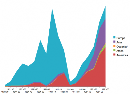
Neerav went with stacked lines in Excel:
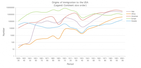
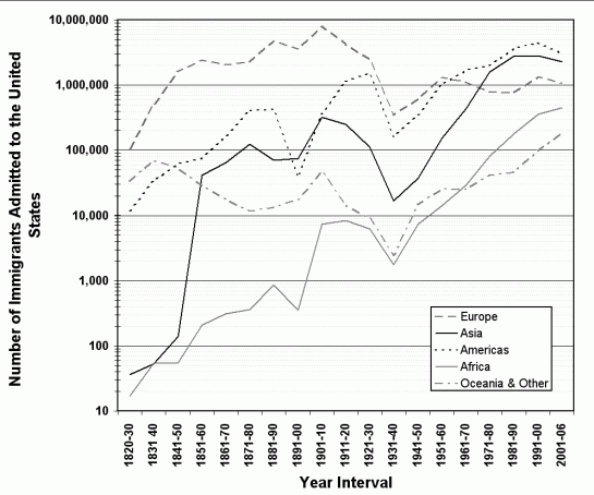
Matthew used a logarithmic scale and did some smoothing:
Yihui used R and used arrows to indicate increases and decreases:
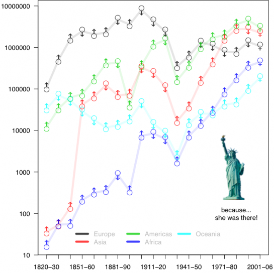
Larger version [PDF]
Bernard produced a series of graphs breaking the data down into different pieces:
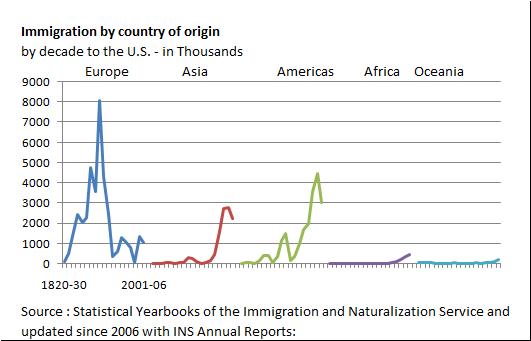
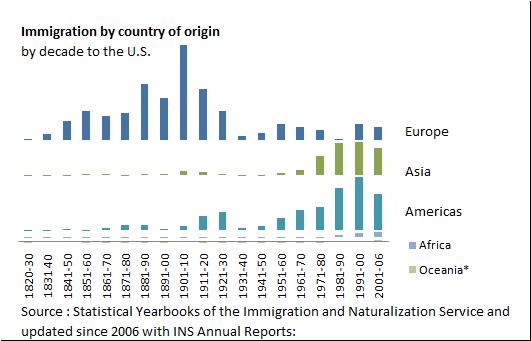
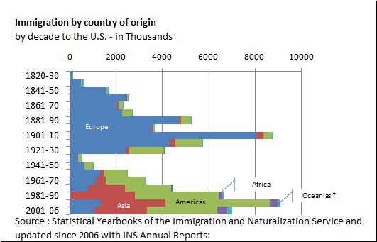
Adelino actually made submitted this graph done in Powerpoint:
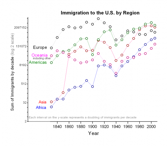
From Matt, “I used a log 2 scale on the y-axis since in my mine, a doubling of population is meaningful (as opposed to a increase of 1 or 10x increase)”:
From Steve, “Log scale allows one to see what is going on with the ‘lesser’ categories (one of which appears to increase in a log-linear fashion). Gray scale make the image suitable for publication in non-color venues (and suitable for the color blind)”:
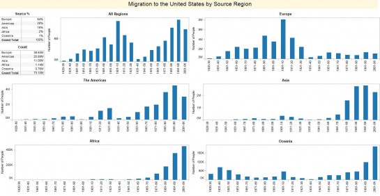
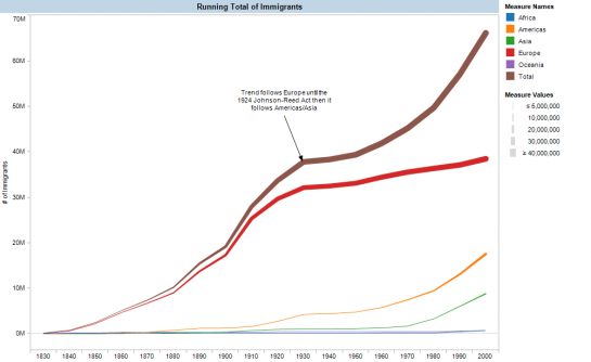
Daniel used Tableau to create these bar charts:
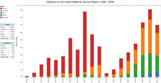
Andy also went with Tableau. I appreciate the annotations:
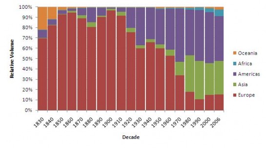
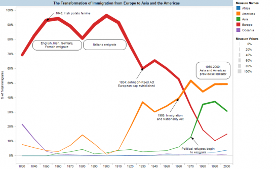
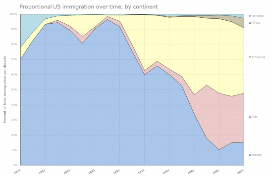
Kester sent in this graph using proportions rather than counts:
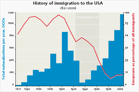
Jerome compared counts against Europeans as percentage of all immigrants:
Taggart shows immigration as percentage of U.S. population and where immigrants are coming from:
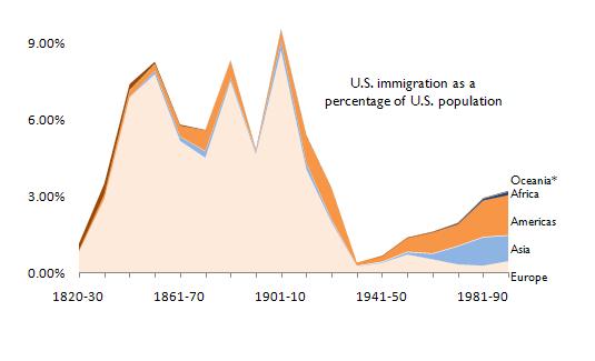
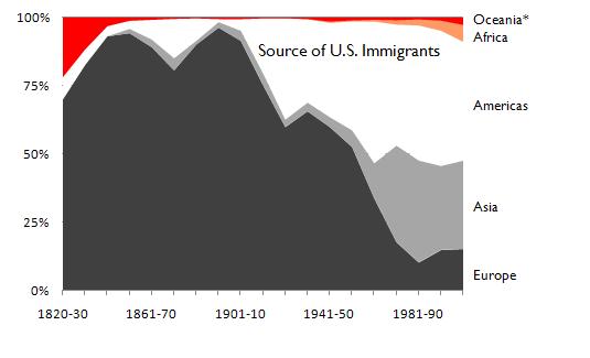
Rik goes with the bubbles:
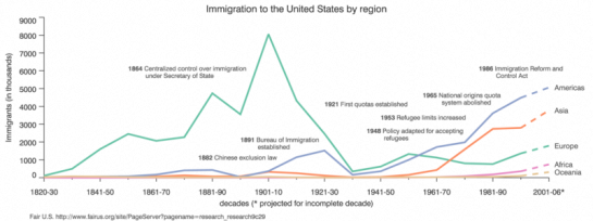
Mike elects to use a straight y-axis and puts annotation in the important spots. I like the dashes for projected values.
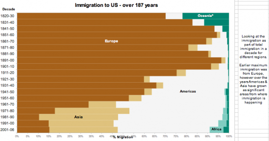
Marc went all out on the research and displayed immigration by percentage:
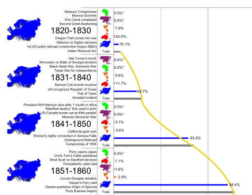
Full version [PDF]
Jie graphs with a stacked chart and some lead-in text:
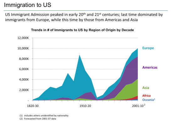
Ian goes the animation route, showing streams of people shoot over to the U.S.:
Edgar used Flash and made his graphs interactive:
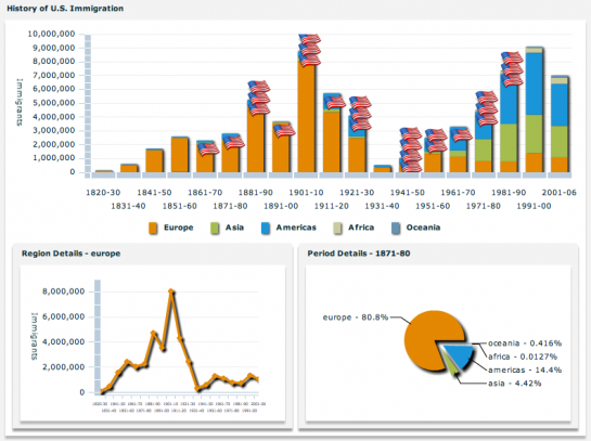
Parveen went with stacked bar charts:
Dibyo uses a stacked line chart and bright colors:
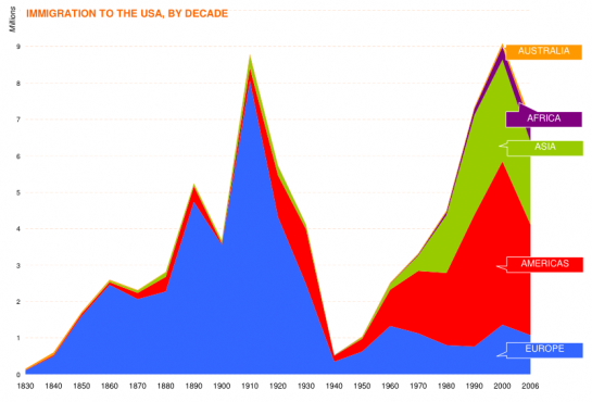
Erik also used a stacked line, but used a different labeling scheme:
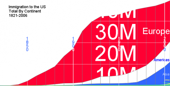
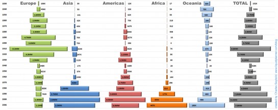
Charles uses centered bars to show trends over time:


 Visualize This: The FlowingData Guide to Design, Visualization, and Statistics (2nd Edition)

Thank you so much for running this contest– even though I wasn’t moved to submit an entry, I’ve been excitedly waiting to see how others approached the problem. Please run more contests in the future–even without a prize, the exercise is definitely a valuable one for everyone!).
I agree with Raymond, there definitely should be more competitions in the future, I enjoyed entering this competition as it gives me an excuse to do something creative with data for an end goal, rather than just fiddling around.
You should definitely link to bigger images though, my bubble one (which should have been the winner, of course) looks far better when it isn’t squashed down to 500px wide: http://tinyurl.com/6afh3s
Nathan, contests are a great idea as it allow us to share different approaches and exchange ideas & best practices.
I think we all had a great time getting our teeth into this.
Looking forward to the next one
All the best
Thanks for running the contest!
A feast! Agree with all here, its a great idea. Pls run such contest regularly, prize or no prize.
Some good entries, and some less so. There were a lot of interesting approaches. I wish I’d had more time to work on this, but there are bills to pay. And I already have Teufte’s books.
The winning entry is certainly polished and deserves to be published on nice stock in glossy finish. The Americas and Asia items in the Total stack are reversed, and the timeline distance between 2000 and 2006 is the same as that for all the ten year periods. The annotations were nicely done, and I wish I had a larger monitor that could do it justice.
Not to get technical, but I’d call this a stacked area chart. Interesting that many of the stacked charts showed the larger series stacked on the smaller ones.
The log scale is an interesting approach which is rarely seen in an infographic intended for general audiences. The log scale line chart with the circles with arrows had me searching at first for hidden male/female information, until I looked closely. The arrows show what can be seen by inspection, and actually detract from the chart.
A few of the charts used glaring colors, hmm. Some charts used dates along the vertical scale, and one of these, the centered bar chart, used different scales for each series.
Nobody submitted a stream graph, but perhaps there was not enough data.
Pingback: shopyield.com › 4th dimension
I think I should remind some readers of an important fact that the last five symbols in my graph are FEMALE signs! haha :) (that’s why I said “because SHE was there”)
Yihui –
SHE the statue? She’s been there for longer than the last data point. You broke your convention in two ways: the symbol changed, and it no longer indicated up or down. All in all, the symbols are more of a distraction than a visual aid.
Whoah, Jon Peltier, settle down dude!
I’ll try to do more of these in the future :). I’ve updated the post so that some of the images are linked to their larger versions.
Doug –
Was I harsh? Didn’t mean to be, but this morning the coffee’s taking a while to kick in. I was merely stating some impressions.
I liked the bubble display. Usually I’m not wild about this technique, because it hides the textures in a data set, but this data was very straightforward.
The Rorschach graphics took me a while to decipher. It’s a clever idea, but in this case it was distracting.
Only a few submissions (by Mike, Jie, and Jerome) extrapolated the 2000-2006 to a projection for the full decade. Most others showed a decline for the last point, and a couple left it off.
This is an amazing exercise in creativity. The same data being seen through many eyes and what a treat to see what they see.
I liked the bubble chart the best – like Jon, I dont really like bubbles as much, but this is a great use of bubbles vs stacked (or concentric) bubbles.
Fascinated by data – maybe I will take part in the next competition.
Great work by all the contestants – remember there are no losers, it is just the representation is wrong !
I agree with the choice of winner, but I have to third the appreciation for the bubble chart. It’s just so clean, and makes the patterns easier to see than with any other chart.
By the way, this seemed like a good exercise to learn something about Processing.js, so I made an interactive version of my solution.
I like large and annotated charts that tell a story. Annotations are important, specially if we are using a very long time series, but in this case I think that major world events like the world wars or the Irish Famine explain much better the levels of immigration than the immigration policies (“policies” is missing from the chart title).
Like Jon, I would reverse the series order.
@Michael – I like it!
@Michel: this is why I’m a little jealous of people using Processing… You may want to add a dummy series just to show that there was a new policy. Ben’s idea of evaluating the impact is great, and you could perhaps use the background color to simplify the analysis.
I enjoyed looking at visualizations. It reinforces in my mind the fact that any visualization will make some compromise in that in will emphasize one thing or another. While this may be the intent of the graphic creator, it leads to bias. The original data should always be available as a reference.
Different people emphasized different aspects of the data. In whole, the different versions let me see things that I didn’t notice when I first looked at the data. I didn’t get a chance to play with the interactive versions, but that certainly seems a compromise between presenting a static interpretation of the data and forcing the user to pore through the data to create their own visualization. I guess in most cases, we all probably tried different approaches before settling on our final entry but that doesn’t benefit the viewer. An interactive presentation bridges the gap.
Pingback: links for 2008-12-12 at dekay.org
Pingback: And the winner is….. | Vectart
I enjoyed submitting and really enjoyed the many approaches taken, particularly the use of annotation to tell a story. Please, do more of these!
Pingback: Designtraining blog » Ðрхив блога » How to Make a Graph in Adobe Illustrator
Pingback: Immigration — Matt’s Waste of Your Time
Pingback: Flowingdata visualization competition » Justkez
Pingback: Visualize This: Poverty Rate By Age in America | Padub
Great contest.Its a great idea. Pls make more contest regularly.
Pingback: How to Make a Graph in Adobe Illustrator « erik albin dahl