This is a guest post from Michael Drumheller, Dirk Karis, Raif Majeed and Robert Morton of Tableau Software. They use Tableau to explore the relationship between polls and predictive markets.
Predictive markets such as Intrade and the Iowa Electronic Markets have attracted more attention this year than in past Presidential elections. Some political observers such as ElectoralMap.net look to these markets as indicators of who’s winning or losing.
Let’s explore whether that is a wise thing to do. Is there a relationship between betting-market “predictions” and poll numbers in the presidential election? If polls lead the predictive markets, maybe the markets are responding poorly to information that is publicly available. If instead the markets lead the polls, then perhaps the markets have some real predictive power; do they respond to events and policy positions before the larger (polled) public? Of course, you never really know about either the polls or the betting markets until the election is over, but we don’t have a time machine so we’re not going to go there. However, we do have the data, and we can use data visualization tools to make some educated guesses.
Our time-trend comparisons come from electoral-college vote estimates derived from polls and betting-market probability estimates derived from closing prices. To assess betting-market data, we used Intrade, which is one of the most popular and closely watched and whose data is easily downloaded. The electoral-college data we use comes from Electoral-Vote.com’s polling data over the past six months. The data reflects party preference and not individual candidates, so a voter whose strict preferences throughout were Clinton, then McCain, then Obama would have been classified as preferring Democrats in April but Republicans in September (after Sen. Clinton dropped out of the race).
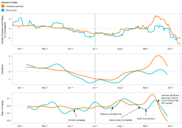
Figure 1 below shows our findings with electoral-college vote estimates (EV) for the Republican party in orange and Intrade data for the Republican party in blue. The bottom pane is our focus; it is a rate-of-change plot that highlights inflection points, making it easier to discern a leading/lagging relationship between the two data streams. Broadly speaking, we can identify two distinct regions in each plot. In the first half of the year, there seems to be no coherent relationship between them. But from July onward, the Intrade signal takes on a shape strikingly similar to the EV signal, while leading it by two to seven days. We think there might be several mechanisms at work here, but it seems like a key one is that during the first half of the year, there was an intense Democratic primary battle. Once that was resolved in Sen. Obama’s favor, Intrade investors, who are incentivized by their wallets to be extra sensitive to electorate-shifting events, may have gained a clearer picture of the race.

Figure 1: Electoral Vote projections and Intrade closing prices. The three plots show the normalized data, the Gaussian-smoothed data and the rates of change of both curves. The vertical line in the middle emphasizes the hypothesized “crystallization†of Intrade’s view after the Democratic chaos subsided.
To obtain the rate-of-change plot, we first scaled the raw Intrade and electoral-college data by their respective standard deviations about their means over time. The electoral-college data contained a third set for undecided voters, which had no counterpart in the Intrade data. We distributed these undecided votes 50/50 between Democrat and Republican in order to lend the polling data a “decision†character similar to the Intrade data. These transformations give us two signals that we could easily compare visually, as shown in the top plot of Figure 1. However, it still didn’t betray any clear connection between them.
The second plot suppresses the noise of day-to-day changes by applying a truncated, centered Gaussian smoothing filter with a sigma = 5 days. This filter “looks into the future†as well as the past, so it doesn’t exhibit the delay that a physically realizable filter would, but it’s intuitive and it keeps our graphs nicely lined up with time. Smoothing the data allows us to generate our final figure, the rate-of-change plot, by a simple first-difference without producing too noisy a picture. The rate-of-change plot highlights the rapidness of the shifts in the Intrade and EV signals; the more rapid shifts show up as stronger peaks and valleys in the rate of change.
Looking at the rate of change we can surmise how different external events may affect polling data and the betting markets. The time needed to collect and distribute poll results would seem to be an important cause of the apparent lag between Intrade scores and corresponding EV scores.
Furthermore, Intrade participants have a vested interest in quickly understanding the nuances of newsworthy events that take time to develop into mainstream news stories. However, some events still appear to impact the polled public very quickly – in the past month or so the Intrade lead time appears to have shrunk to about two days. Our speculation is that the voting population has paid very close attention to the recent economic data, resulting in a shrinking of the lag to no more than the time it takes to collect and report poll results.
So, what do we see when we dig into the state-by-state results? Would those polls and predictive-market probabilities show similar patterns? This year most of the state-level Intrade contracts were not heavily traded, but in future elections it would be interesting to look for trends there.
Visit the Tableau blog to download and explore the data yourself. Let me know if you find anything else interesting.
 Visualize This: The FlowingData Guide to Design, Visualization, and Statistics (2nd Edition)
This is fantastic analysis and the first I’ve seen that shows market forecasts clearly preceding the polls.
Did you consider looking at other markets like Betfair? One problem with Intrade is that it’s forecasts have been badly manipulated for the past month. I’ve often notice it fail to register shifts which Betfair has registered.
BTW The Tableau blog link is saying I’m not authorized to see that page.
Some very detailed analysis from a widely read Australian psephologist here
http://blogs.crikey.com.au/pollytics/2008/10/20/us-election-–-welcome-to-the-holding-pattern/
he’s been following intrade versus polls for some months, and doing all kind of analysis, with pretty graphs.
@ Nigel Eccles — Fortunately for our examination, the market manipulation on Intrade is limited to the specific market for Obama vs. McCain, while we chose the more abstract Democrat vs. Republican market. Also note that the post on Tableau Software Blogs is up now.
@Robert
Excellent, that was lucky! Great analysis. I expect I will link to it every time I get into a polls v markets debate.
@Nigel, hubdub looks cool and I can see what brought you to this topic on FlowingData!
@Robert Still very much in beta. We want to have lots of data driven chart goodness soon.
Pingback: Polls lead the prediction markets « The Enlightened Despot