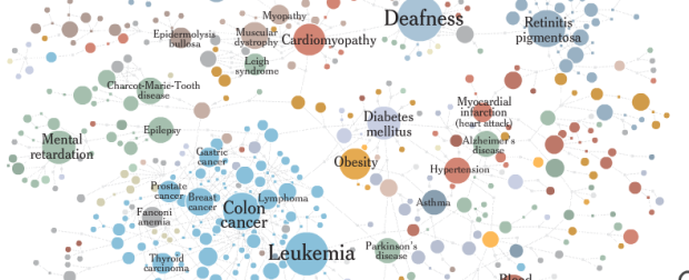
Matthew Block and Jonathan Corum from The New York Times use a network graph to map diseases and the genes they have in common. Color indicates the type of disease, circles represent diseases, and gray squares are genes that the diseases have in common. The graphic has a nice magnifying glass zooming feature, so that you too can be a biologist.
Mapping the Human Diseasome With a Network Graph
3 Comments
Second Edition
 Visualize This: The FlowingData Guide to Design, Visualization, and Statistics (2nd Edition)
 Visualize This: The FlowingData Guide to Design, Visualization, and Statistics (2nd Edition)
New tools, refined process.
What a beauty! I have been struggling for years to get this one right, at this is by far the best attempt I have seen.
I have a few points to make…
— The layout algorithm matters. I can’t tell by this representation what algorithm is used to layout the points. The viewers experience of this graph has a lot to do with the distance of the links and the white space between the circles. Some of the links (e.g. between parkinson and huntington) are stretched quite far. I believe the common genetic background of those two diseases are at least as similar as the ones between many of the cancer types.
— The grouping of the diseases will always be contextual. Disease classification is a topic of its own, but here no clear criteria are used for grouping diseases. Some of them are anatomical others etiological. Consider what criteria defines the groups of “cancer”, “ear, nose, throat” and “psychiatric”.
— The difference between compound descriptions and observable traits matters. Obesity is a observable trait (your BMI crosses some border), Charcot-Marie-Tooth is syndrome, which is characterized by a number of required and possible observable traits.
In conclusion I realize that this is not a precise scientific representation, but rather aimed at readers of NYT. But I am left with a question about what message the interactive Diseasome is trying to tell me… I have the following guesses…
— The world of diseases and genes is complex and we know very little.
— Some diseases have many genes involved (probably has more to do with the definition of the disease than the genes).
— Some diseases are like each other (having the same color)
— Diseases that we tend to group together seems to have been associated with some common genes.
I know this is getting a bit technical, but if you want to dive into the statistical background and the challenges faced by computer scientists working in this field, you are more than welcome to contact me.
If you want to see a presentation of the questions in form of a slideshow take a look at http://www.wjc.ku.dk/library/publications/nih_madsh.pdf
Hi, I just found your site, while researching Excel Data Visualization Experts. I really liked your post. Have you seen any Excel data tool sites? I’d enjoy connecting by email if you do. My client’s site is http://www.tableausoftware.com/fast-analytics if you’re interested. Keep up the blog posts — I intend to come back.
Hi, I just found your site, while researching Excel Data Visualization Experts. I really liked your post. Have you seen any Excel data tool sites? I’d enjoy connecting by email if you do. My client’s site is http://www.tableausoftware.com/fast-analytics if you’re interested. Keep up the blog posts — I intend to come back.