I studied electrical engineering and computer science in undergrad and now as a stat student, I still work with a lot of engineers and scientists. Something that has always confused me as I walk through the engineering (and statistics) halls of conference posters is the use of the rainbow color scale.
I can think of two reasons for this – the authors felt that more colors meant more pretty or default settings got the best of them. I want to say it’s the latter, but I’ve worked with plenty who felt the former. Bernice Rogowitz and Lloyd Treinish from IBM discuss why use of all colors of the rainbow should stay in your lucky charms when visualizing certain types of data.
Three Perceptual Dimensions
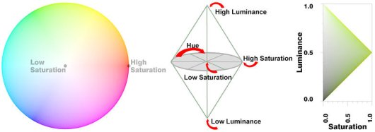
The authors go over a lot of stuff, but the main take away (for me, at least) was the three perceptual dimensions – hue, saturation, and luminescence. Luminescence is the how bright something appears; saturation is the intensity of color; and hue is the actual color. To represent continuous metrics, it was found that use of hue is poor while it’s easier for us to interpret continuous changes (i.e. magnitude information) with saturation and luminescence. For interval data with a threshold, you can use multiple colors.
Here’s a good example:
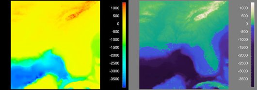
Both images represent the same exact data. The only difference is in the color scale. Look at the left one. Now look at the right one. What does the right one look like? What does the left one look like?
That’s why you should care about color.
 Visualize This: The FlowingData Guide to Design, Visualization, and Statistics (2nd Edition)
some of us do:
http://geography.uoregon.edu/datagraphics/EOS/index.htm
some of us do:
http://geography.uoregon.edu/datagraphics/EOS/index.htm
i wouldn’t expect anything less from a geography department.