Email has grown to be a huge part of our lives and is very much commonplace. We can connect with others in just a few clicks. With all the email sent per day, how can we understand these connections? How can we visualize the type of email we’ve been sending? Can we tell a story somehow with the thousands of emails we’ve sent, received, and deleted?
These 21 email visualizations investigate. I’ve split them up into six categories – exploratory, analytic, mapping, metaphor, networks, and abstract.
Exploratory
We almost always think of email in list-form – read, unread, spam – but here are a group of visualizations that show you email differently and encourage users to explore their inbox.
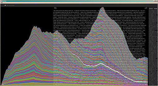
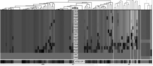
Mountain
It’s the mountain of email by Fernanda Viegas from the IBM group.
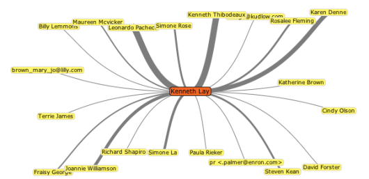
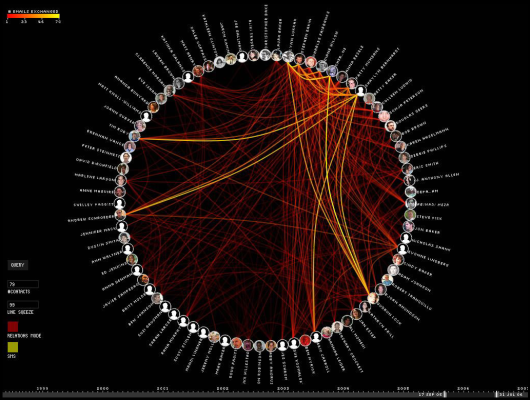
Enron Explorer
I posted about this in 6 Influential Datasets that Changed the Way We Think. When did Enron start going under?
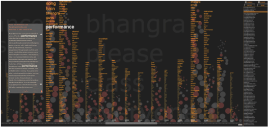
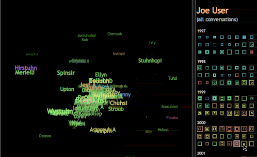
Themail
Themail splits your emails into keywords and phrases.
Contrasting Portraits
Analytic
How can we look at email from a quantitative perspective?
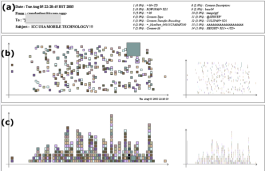
Rhythms of Relationships
Dynamic Coordinated Email
Mapping
Email mysteriously floats around in some network, but here are some maps that try to attach location to our messages.
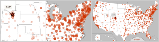
Small World Email Networks
Spam Map
Of course there’s going to be tons of Google Maps mashups. I’ll just put this one – once you’ve seen one, you’ve seen them all.
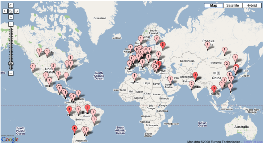
ForwardTrack
Created by Eyebeam in collaboration with Stamen.
Using Metaphor
Instead of messages, we can think of email with metaphors. Oftentimes, metaphors make complex ideas easier to understand.
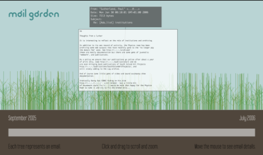
Mail Garden
Each plant is an email.
Spam Plants
Spam isn’t just the best canned meat ever, it’s also now a plant.

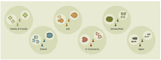
Anymails
It’s like animals. Emails are animals that cluster in herds.
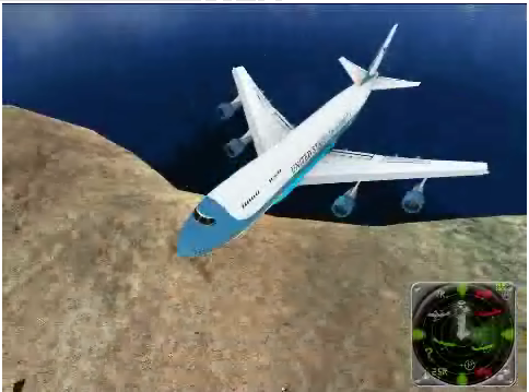
3D Mailbox
In attempt to make email fun, 3D Mailbox places it in a virtual world.
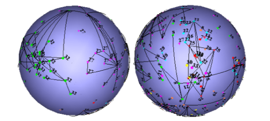
Forming Networks
We’ll send an email and make a connection. These visualizations show those virtual connections.
My Map
BuddyGraph
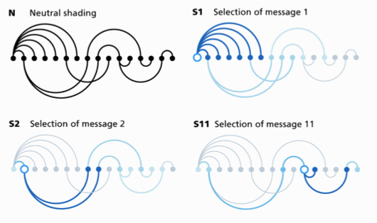
Thread Arcs
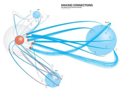
Making Connections
Abstract
Returning to theme of data-driven art, here are some email-driven pieces and artworks. They’re not graphs and charts and not really anything concrete. Instead, they look for the inner beauty in something that feels so mechanical.
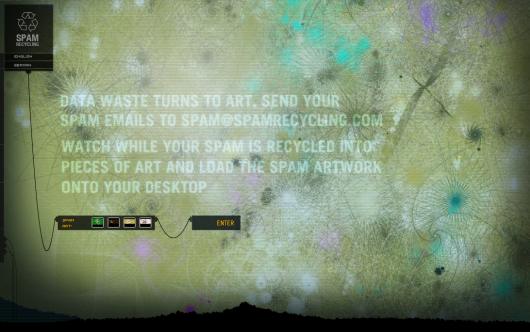
Spam Recyler
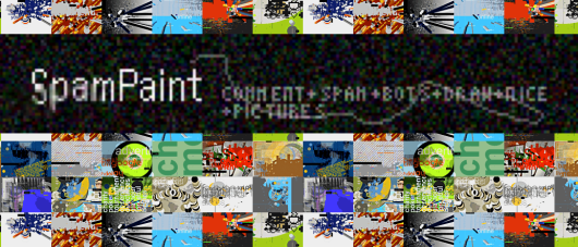
SpamPaint
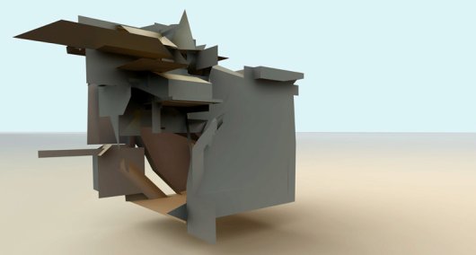
Spam Architecture
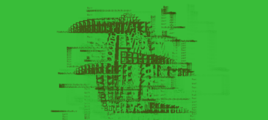
Texone Spam
Phew, that was a lot, and yet, I’m 100% sure that I missed some, so if you know of any that aren’t listed, leave a link in the comments below.
 Visualize This: The FlowingData Guide to Design, Visualization, and Statistics (2nd Edition)
This is amazing. I have thought about visualizations of many services that we use on the computer but never the email inbox. It’s brilliant because it would likely allow us to view how we communicate with other people in a dramatically different manner, and then narrow down to how we communicate with each person as well. Thank you for posting this Nathan, very impressive.
Great post again! Another very intersting and promising email application is Xobni (http://www.xobni.com/learnmore/), which is not so much about visualization but seems to come with good analytics. Certainly worth knowing about it.
@Fabian: interesting, and definitely worth looking at.
Pingback: links for 2008-03-21 « Mandarine
Pingback: restruct » Email archive visualization on the web
Pingback: Simple Complexity » Blog Archive » Cool Info Visualization Links from Last Week
Thanks…very useful research and analysis.
Pingback: Raffy’s Computer Security Blog » links for 2008-03-25
Haha I like that algae looking spam plant. Speaking of spam…Hai and I (both glued to our email) both sent our outcries about the spam problem. Jose worked some magic and now I am getting pretty much no spam!
Some time ago I had an application that showed a Ryanair jet landing everytime I received an email. I think it might be 3D viz you have there. I had to get rid of it because my apartment sounded like LAX on a holiday weekend.
Pingback: 21 Maniére de voir ses mails ;) at As-map Blog
May I offer another two content-based visualizations for your consideration?
1. http://zesty.ca/zest/out (see http://zesty.ca/zest)
2. http://zesty.ca/threadmap/bicycles/
I hope you find them interesting.
Pingback: david ascher - » Email Visualizations
Pingback: 3 Rules of Thumb When Designing Visualization | FlowingData
Wonderful site and beautiful stuff here.
Brilliant. Well done!
Pingback: 21 Ways to Visualize and Explore Your Email Inbox | WhiteSandsDigital.com
Pingback: mcdave.net » links for 2008-08-17
Pingback: Email archive visualization on the web « Blog Archive « placodermi
Pingback: Ð’Ð¸Ð·ÑƒÐ°Ð»Ð¸Ð·Ð°Ñ†Ð¸Ñ Ð¿Ð¾Ñ‡Ñ‚Ð¾Ð²Ð¾Ð³Ð¾ Ñщика - e-mail маркетинг 2.0
Pingback: Data visualisation | Lunchbox
Pingback: Web 2.0 Storytelling: Emergence of a New Genre (Bryan Alexander y Alan Levine, EDUCAUSE Review, vol. 43, Nº. 6, nov/dic 08) : Centro de Estudios de Medios
Pingback: Web 2.0 Storytelling: Emergence of a New Genre « watershed news
Pingback: 21 Ways to Visualize and Explore Your Email Inbox | VizWorld.com
Pingback: Larry’s Things .net » Blog Archive » Data Visualization
Pingback: Data visualization and infographics resources for design inspiration
Pingback: Ð’Ð¸Ð·ÑƒÐ°Ð»Ð¸Ð·Ð°Ñ†Ð¸Ñ Ð¿Ð¾Ñ‡Ñ‚Ð¾Ð²Ð¾Ð³Ð¾ ÑщикаВначале была почта