Step-by-Step Tutorials
Make and design charts that fit your data, audience, and purpose.
Courses
Learn all the steps to visualize data, from analysis, making, to publication-ready graphics.
The Process
Keep your knowledge fresh with the weekly newsletter on the small but important steps in visualization.
Full Archive Search
Quickly access thousands of posts and links on FlowingData, public and members-only.
Tools and Resources
Members-only links and guides focused on the how of visualization.

Get Charting Help
Ask questions. Get expert advice.
What Members Say
I teach a class on data visualization, and FlowingData has been a source of inspiration and provocative examples for me and my students. Nathan Yau creates discussion generating graphs, starts conversations about other noteworthy data and graphing efforts, and provides useful insights on coding and workflow.
I’ve used skills from the visualizations both for internal tools at work, as well as for public facing visualizations.
I love being a member of FlowingData because you just can’t beat Nathan’s approachable and easy-to-follow tutorials – they’ve saved me so much time. Plus, he always has his finger on the pulse of the data viz community so having access to all of his posts and the weekly newsletter is a MUST for me!”
I think of your weekly emails as lessons that I actually take notes on every week and apply the knowledge I learn to my actual job as a data analyst… The membership fee is more than worth it for the information and education you get…
As a student who is just getting into the game of visualization (and plans to continue), it has been very helpful to be able to have a closer look behind the scenes.
The tutorials are very helpful to move from “Oooo, cool!” to how to actually DO the cool.
…one of the finest resources on visualization…
Design Any Chart
Go beyond defaults with step-by-step tutorials.
The tutorials — covering a range of basic, to advanced, to my own visualization projects — walk you through so that you can make useful data graphics for reports, presentations, and analysis.
You will design data graphics that speak to different audiences. You will be able to make any chart. You will pick the right chart for your data and purpose.
Tutorials include datasets, file downloads, and examples to work with so that you can easily dig in to your own data.
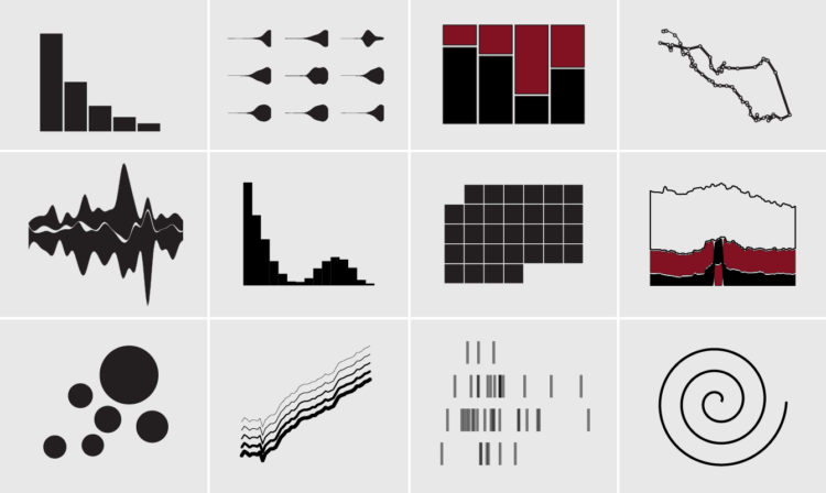
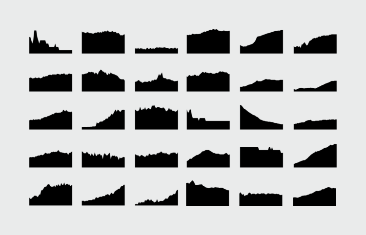
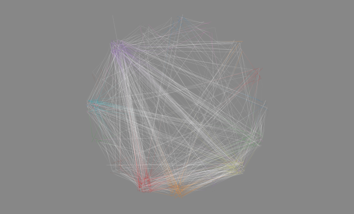
Sample of the Tutorials
- Alluvial Diagram
- Slopegraph
- Heatmap
- Calendar Heatmap
- Beeswarm Chart
- Frequency Trails
- Network Diagrams
- Dot Density Map
- Voronoi Diagram
- Square Pie Chart
- Difference Chart
- Horizon Graph
- Working with Shapefiles
- Unit Chart
- Chord Diagram
- Custom Charts
- Making More Readable Charts
- Choropleth Map
- Animated Visualization
- Much more…
If you get stuck, ask questions or see previous answers.
It’s not just how to press buttons or to copy and paste. You learn how chart types and visual encodings work so that you can make any chart. Customize to your needs and apply in your own projects.
Even if you don’t have a specific chart in mind, the growing tutorials collection serves as a great reference.
In-depth Guidance
Learn the basics and then advance with the courses, at your pace.
If you don’t have a specific visualization in mind, and instead are eager to learn it all, membership provides bonus access to self-guided courses. Work with the suggested schedule or move at your own pace, with a combination of reading and practice exercises.
Visualization for Clarity
Learn how to get from spreadsheet or CSV file to polished graphics to present to an audience. It’s not about the tools. It’s about process.
Visualization in R, From Beginner to Advanced
Create basic charts, make use of visualization packages, map geographic data, and create custom graphics to use with your own data.
Mapping Geographic Data in R
Make beautiful and insightful maps that allow you to see spatial patterns across regions and are great for presentation and communication.
Visualizing Time Series Data in R
Everything you need to know to see and show patterns over time, from basic chart types to the more advanced.
The Process
Get the members-only newsletter covering the practical side of visualizing data.
Stay up-to-date with visualization tools, what’s new in the field, and learn how experts design data graphics.
You also get access to the archive, which is coming up on 300 issues in 2024.
It’s worthwhile to learn the principles behind visualization, but in practice, there are always trade-offs. The “rules” always work more like suggestions. The Process is a weekly newsletter for FlowingData members that looks more closely at how to apply what we know about visualization in your everyday work.
Visualization in Practice
Learn with real data and concrete examples.
The best way to learn how to visualize data is to start doing it now. Make charts. Work with real data. Get expert guidance.
With membership:
- Make great charts right away.
- Look at real datasets.
- Gain technical know-how and design skills required to visualize your data in a way that is both useful and beautiful.
- Analyze your data to make meaningful things.
- Experiment with how visual forms work.
- Learn how to negotiate between more efficient and more visually compelling chart types.
- Learn about how the charts get made instead of relying on templates.
- Download source code to apply to your own datasets.
- Support an independent site.
- Build the visualization skills that everyone with data wants. Become indispensable.

Who is this guy?
Hi, my name is Nathan Yau. I make a lot of charts and analyze data. I’ll help you do the same.
I have a PhD in Statistics, with a focus on visualization for presenting data to non-professionals. I’ve been visualizing data for two decades, and I believe that visualization is the best way to communicate data to everyone, regardless of background. I wrote two bestselling books on the topic.
I use charts for analysis, for reports, for presentations, and for communication to a wide audience. My work leans towards practical but has also reached millions of people.
I was a winner of a FastCompany Innovation by Design Award for Graphic Design & Data Visualization; I’ve won Information is Beautiful awards; and I was featured in The Best American Infographics. I’ve worked as a researcher and for mainstream publications.
My tutorials, courses, and books are based on these experiences and have helped thousands advance past the defaults.
Where Your Support Goes
Membership is the best way to support FlowingData. This is a one-person site that I (Nathan Yau, a real person) started in 2007.
Your generosity supports:
- FlowingData blog and newsletter — a publicly available resource on visualization, statistics, and design, every weekday since 2007
- Tutorials — how to visualize data step-by-step with a variety of tools, from a practical perspective
- Courses — detailed instruction from beginner to advanced
- The Process members-only newsletter — discussing what’s new in visualization and the design process of making great charts
- Data Design Guides — for communicating data effectively and honestly
- FlowingData Projects — charts, analysis, and visual experiments exploring the everyday-ness of data
It means FlowingData keeps the lights on, hopefully until I can’t data anymore. Membership makes this possible.
Become a Member Today
Analyze and visualize data beyond the defaults, while supporting an independent FlowingData. Select a plan below.
Questions and Answers
Can I have an invoice/receipt?
A lot of people use their education credits from work to pay for membership. You’ll get an invoice and receipt via email when you sign up. If they get stuck in spam or you don’t get it for some reason, just let me know and I’ll help sort it out.
Can I cancel my subscription at anytime?
Yes. There is no minimum subscription length. Membership auto-renews. Cancel anytime via your profile with a few clicks, hassle-free. There are no refunds.
Do I need to know how to code first?
No. Some tutorials are more advanced, but they are written for various backgrounds. You can also work through the courses first, which assume minimal coding experience and can lay a foundation to build on. Ask questions any time.
Do I need to buy any software?
No. Most of the tutorials cover R, Python, or JavaScript, so there’s no software you need to buy. They’re free to use. There are a few tutorials that use Adobe Illustrator, but I provide open source alternatives. The only non-free solution is Microsoft Excel, but my hope for this category is that you can use software already on your computer.
How is this different from your books?
Data Points and Visualize This provide overviews of visualization and concepts. Tutorials and courses on FlowingData show you how to execute. The collection of tutorials and courses is also constantly growing. If you read the books (thanks!) and are ready to make all the charts, the tutorials and courses will get you there.
Can I purchase a group membership?
Yes. You can get a group membership for 5 or more people so that everyone on your team can better visualize your data. There are savings for additional members.