Visualization
Showing the stories in data through statistics, design, aesthetics, and code.
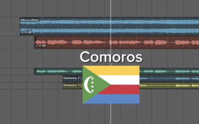
Africa by Toto with the lyrics switched out for the countries
You’re probably familiar with the song “Africa” by Toto. This version, by There…
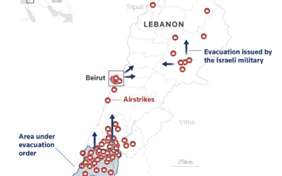
Maps and charts for what is happening in Iran
Reuters Graphics has a feed of maps and charts for updates on Iran.…
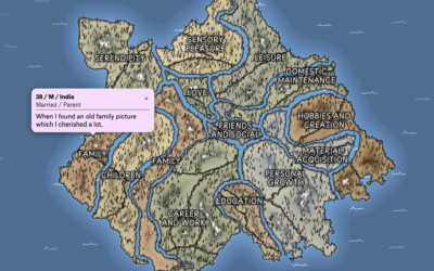
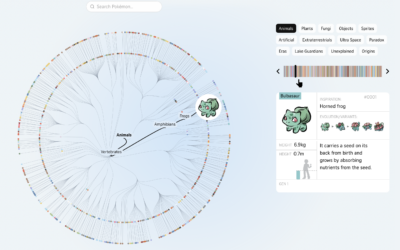
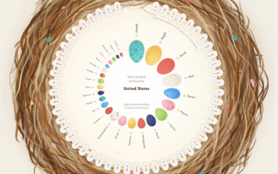
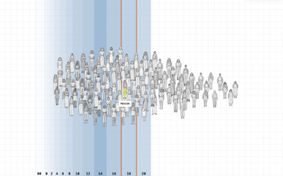
Mapping what makes us happy
In 2017, researchers asked study participants via MTurk to list three happy moments…
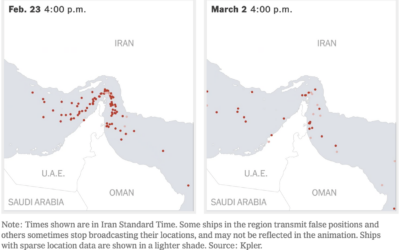
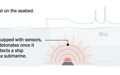
Oil supply chain slowdown
The New York Times mapped the traffic difference at the Strait of Hormuz,…
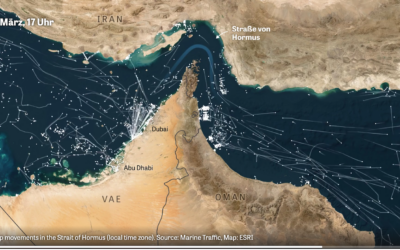
Marine traffic through the Strait of Hormus
Normally there is a steady flow of ships through the strait, but when…
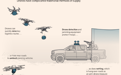
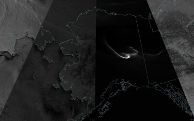
Drones and modern warfare in Ukraine
With hundreds of thousands of Ukrainian drone flights every month, countries have had…

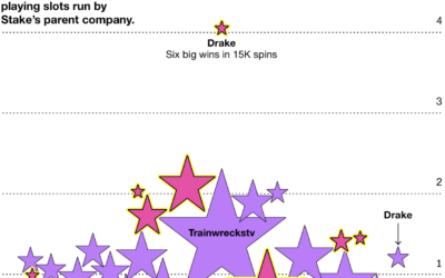
Unusual luck for streamers in the crypto casino Stake
For Businessweek, Cecilia D’Anastasio, Olivia Solon, and Leon Yin analyzed the unusual luck…

Famous chess matches visualized as 3-D wireframes
Imagine points for each piece on a chessboard. They move to x-y positions…
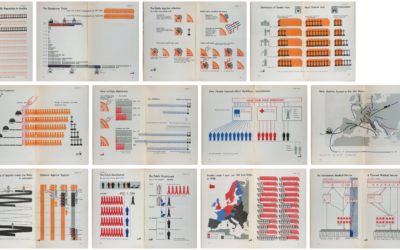
Visual catalog of Isotype examples
Isotype, or International System of Typographic Picture Education, is a picture language used…
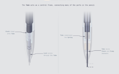
Illustrated engineering in everyday objects
Mechanical Pencil is a project by Bryan Macomber that illustrates the mechanical bits…
Mysteries of women’s clothing sizes
The challenges continue for women who want clothes that fit properly. For the…
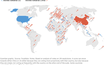
Map of countries aligning with China
Using an analysis from Focaldata, the Guardian used the angled arrow approach to…
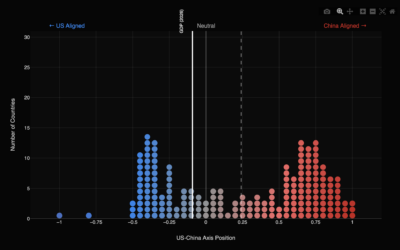
Geopolitical axis between the United States and China
Focaldata calculated United Nations voting patterns by country, relative to the United States…