Visualization
Showing the stories in data through statistics, design, aesthetics, and code.
What Do You Think of This Evolution Graphic?
What do you think about the above graphic? Good, bad? Effective, or not?…
Crisis of Credit Explained in Animated Infographics
This video (below) explains how we got into this credit crisis. It’s a…
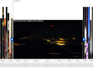
Explore Flickr Videos On Flickr Clock by Stamen Design
Stamen Design, whose work you’ve most definitely seen, comes out with their most…
Nokia Collaborates With Generative Artists for Beautiful Interactive Pieces
In collaboration with generative artists Marius Watz, field, and others, along with Universal…
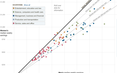
Paycheck Gap Between Men and Women – Guess Who Makes Less
Hannah Fairfield and Graham Roberts from The New York Times show the disparity…
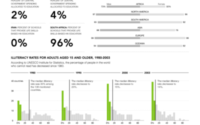
Progress: A Graphical Report on the State of the World
You might recall that the United Nations Statistics Division launched UNdata about one…
Microsoft’s Vision for 2019 is Data Visualization
Google’s chief economist tells us statistician will be the sexy job of the…
Banking Execs Flee with Millions of Dollars in Golden Parachute
I figured out how I am going to get rich, and I’m going…
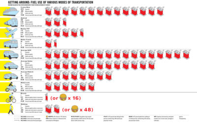
How Many Gallons of Fuel Does it Take to Travel 350 Miles?
GOOD Magazine, in collaboration with Robert A. Di Leso, Jr., explores fuel use…
How Much Junk Orbits Around the Earth?
You might not realize it, but there’s a lot of junk that orbits…
The Universe in 2009 from Seed Magazine
Seed Magazine, a publication dedicated to cool things in science, give us The…
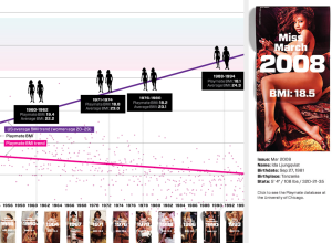
Wired Relates Playboy Playmate BMI and Average BMI, 1954-2008
Playboy playmates continue to be a point of fascination. Remember that study on…
Alternate View of Obama’s $819 billion Stimulus Package
OK, so we saw CreditLoan’s representation of Obama’s stimulus package. Here’s Washington Post’s…
CreditLoan Maps Out Obama’s Economic Stimulus Plan
President Barack Obama has a $800 billion+ economic stimulus package in the works.…
USA Today Digs Into Job Forecasts for 2009
While on the topic of job losses, USA Today provides a look into…
4 Different Looks at Job Losses During Recessions
There are so many ways that you can cut a dataset whether it…
MIX Online Explores Visualization in Project Descry
MIX Online, a community of designers and developers, released Project Descry – a…
Ranking and Mapping Scientific Knowledge – eigenfactor
The Eigenfactor Project and Moritz Stefaner collaborate in these interactive visualizations “based on…

