Visualization
Showing the stories in data through statistics, design, aesthetics, and code.
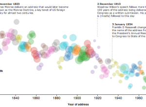
State of the Union address decreasing reading level →
With the State of the Union address tonight, The Guardian plotted the Flesh-Kincaid…
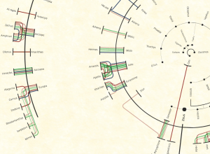
The many relationships of Zeus
Viviana Ferro, Ilaria Pagin, and Elisa Zamarian had a look at all of…
Artists use data to make political statements →
Bringing the human to data…
Mapping translations of Othello
Tom Cheesman of Swansea University, along with Kevin Flanagan and Studio NAND, dives…
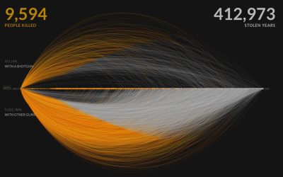
A visual exploration of US gun murders
Information visualization firm Periscopic just published a thoughtful interactive piece on gun murders…
Time running parallel
In Waters Re~ artist Xárene Eskandar placed video of the same landscape at…
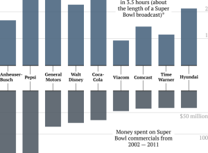
Super Bowl ad costs vs. company profit during game
Ritchie King for Quartz compared money spent on Super Bowl ads — now…
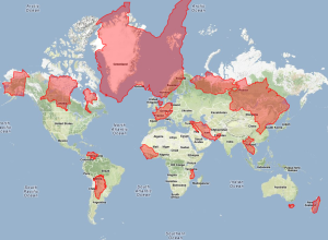
How much is mapping worth →
A comeback for geography…
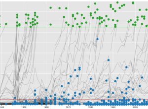
Baseball Hall of Fame voting trajectories
Carlos Scheidegger and Kenny Shirley, along with Chris Volinsky, visualized Major League Baseball…
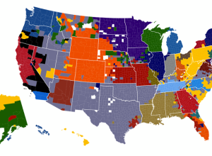
NFL fans on Facebook, based on likes
As the Super Bowl draws near, Facebook took a look at football fandom…
Ten years of cumulative precipitation
We’ve all seen rain maps for a sliver of time. Screw that. I…
Dogs of NYC →
Map of most popular dog names and types by area…
Evolution of science fiction covers in color →
Arthur Buxton plotted the most common colors of Penguin Publishing science fiction colors…
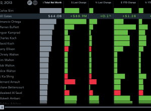
Billionaires of the world ranked and charted
How wealthy are the richest people in the world? How do they compare…
Vintage American Infographics →
Small collection of graphics from mid-19th century…

silenc: Removing the silent letters from a body of text
During a two-week visualization course, Momo Miyazaki, Manas Karambelkar, and Kenneth Aleksander Robertsen…