Visualization
Showing the stories in data through statistics, design, aesthetics, and code.
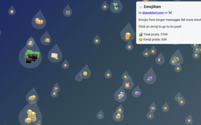
Emoji rain and Bluesky Matrix
Bluesky firehose fun continues. Jared Short shows emoji usage as rain drops that…

Tunnel through the live Bluesky firehose
Bluesky has a relatively easy-to-use firehose that lets you dip into the stream…
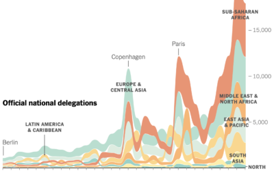
Participation in the annual United Nations climate conference
For the New York Times, Mira Rojanasakul visualized annual participation in the United…
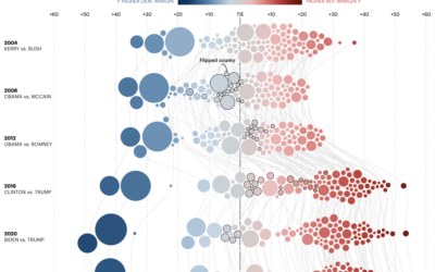
Margin of victory over past elections, in Minnesota
For the Minnesota Star Tribune, Yuqing Liu and C.J. Sinner show how the…
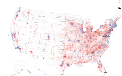
Dot density map for election results
With what is now a common mapping method, The Economist used a dot…
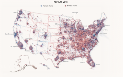
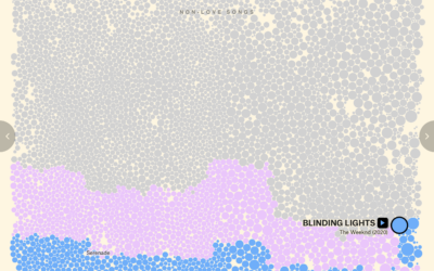
Mapping every voter as a grain of sand
To show the mix of votes across the country, the Washington Post used…

What might have sank the Bayesian superyacht
A $40 million superyacht called the Bayesian sank off the coast of Sicily,…

Restored rose and lily illustrations from the Pierre-Joseph Redouté collection
In the early 1800s, botanist and painter Pierre-Joseph Redouté painted hundreds of lily…
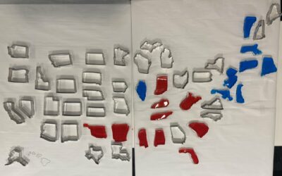
Jello map as states are called
The Bloomberg Graphics desk is building out a jello map as states are…
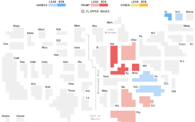
Electoral vote cartogram
The major news outlets all have electoral vote cartograms, but I appreciate Bloomberg’s…
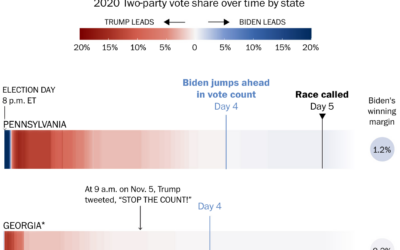
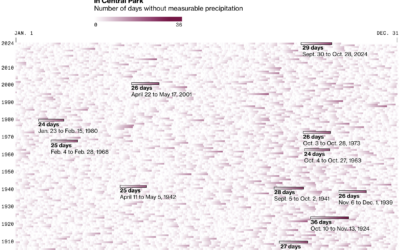
Why states swing while counts come in
Some might wonder why early results lean towards a party and then shift…


Election touchscreen really deep dive by The Onion
The Onion gained access to the most granular election data yet. Technology sure…