Visualization
Showing the stories in data through statistics, design, aesthetics, and code.
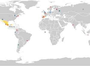
Visualising data with ggplot2
Hadley Wickham gives a two-hour video tutorial on how to use his ggplot2…
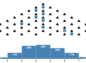
Central limit theorem animation
The central limit theorem:
In probability theory, the central limit theorem (CLT) states…
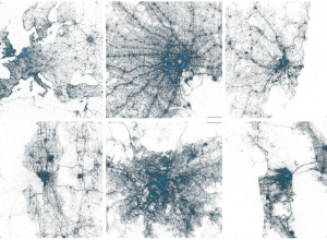
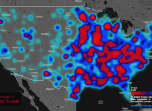
Geography of tweets
Twitter mapped all the geotagged tweets since 2009. There’s billions of them, so…
Money on the Bench
The New York Times has a set of tickers that keep track of…
Guide to Arrested Development jokes →
In celebration of Arrested Development’s return via Netflix, NPR combed through the jokes…
DDoS attack animation
In distributed denial-of-service attack a bunch of machines make a bunch of requests…

The Art of Data Visualization
PBS Off Book’s recent episode is on “the art of data visualization.” It…
Sensory augmentation device
We’ve seen plenty of augmented reality where you put on some digitally-enabled glasses…
Vector tiles
MapBox implemented vector tiles for both scalability and flexibility. “MapBox has developed an…
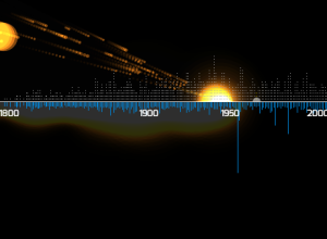
Meteorites seen falling since 2500BC visualized
About 35,000 meteorites have been recorded since 2500 BC, and a little over…

A quarter century of satellite imagery
In collaboration between USGS, NASA and TIME, Google released a quarter century of…

Coaches are highest paid public employees
Deadspin made a straightforward map that shows the highest paid public employee in…
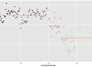
Ratings of TV shows over time
The quality of television shows follow all kinds of patterns. Some shows stink…
Making the game of thrones visualization
Jerome Cukier describes the process behind making his Game of Thrones interactive.…
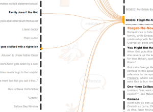
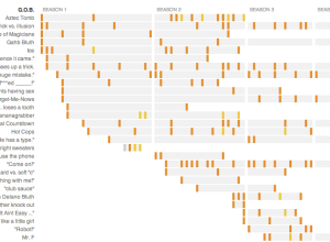
An exploration of recurring jokes on Arrested Development
Watch Arrested Development enough and you start to realize there are a lot…
Map of live Wikipedia changes
On Wikipedia, there are constant edits by people around the world. You can…
Geography of hate against gays, races, and the disabled
In a follow-up to their map of racist tweets towards Barack Obama, the…