Visualization
Showing the stories in data through statistics, design, aesthetics, and code.
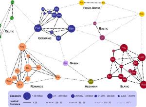
Lexical distance between European languages
Using data from linguistics research by Kostiantyn Tyshchenko, Teresa Elms clustered European languages…
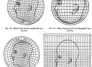
Map projections illustrated with a face
Most people, at least those who visit sites like FlowingData, know about map…
A visual exploration of refugee migrations
Hyperakt and Ekene Ijeoma visualized migrations over time and space in The Refugee…
Cherry picking years for random sports statements
When you watch sports, it can sometimes feel like the stat guy pulls…
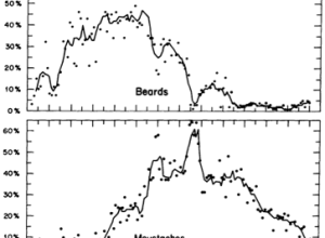
Facial hair trends over time
In 1976, Dwight E. Robinson, an economist at the University of Washington, studied…
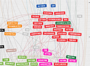
Timeline shows a century of rock history
Jessica Edmondson visualized the history of rock music, from foundations in the pre-1900s…
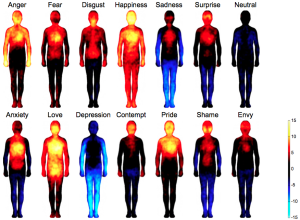
Body maps show where we feel emotion
Engineering and psychology researchers in Finland investigated where we feel and don’t feel.…
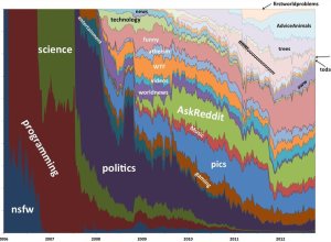
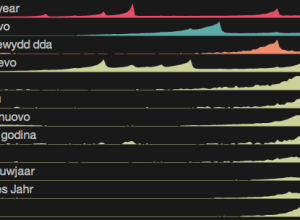
Evolution of reddit in stacked areas
Computer science PhD student Randy Olson likes to analyze reddit in his spare…
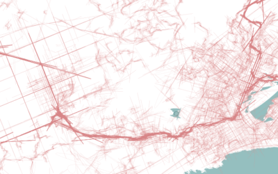
Highway traffic reorganized by color
In the video above, filmmaker Cy Kuckenbaker reorganized midday traffic by color. No…
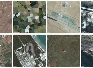
Military footprint
Similar to his collection of prison map snapshots, Josh Begley collected images of…
Network of subreddits
There are over 5,000 subreddits with plenty of overlap and similarities. Randy Olson…
Data and visualization year in review, 2013
Visualization continues to mature and focus more on the data it represents than on novel designs and size. Let's have a look back.
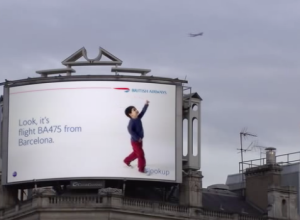
Airport billboard encourages wonderment
Airports conjure thoughts of security, bag checks, and cramped spaces, and flights are…
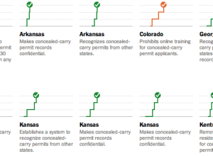
State gun laws since Newtown →
The New York Times explored state gun bills since Newtown.
In the 12…
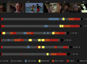
Rocky movie breakdown
Fathom Information Design watched all six Rocky movies, classified segments into dialogue, training,…