Visualization
Showing the stories in data through statistics, design, aesthetics, and code.
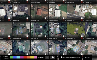
Satellite imagery of all the outdoor basketball courts
For The Pudding, Matthew Daniels extracted all the outdoor basketball courts in the…
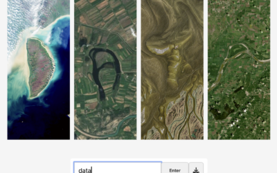
Spell your name with satellite imagery
Here’s a fun interactive from NASA Landsat that lets you enter your name…
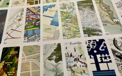
Atlas of Design, Volume 7
Every two years, since 2012, the North American Cartographic Information Society publishes Atlas…

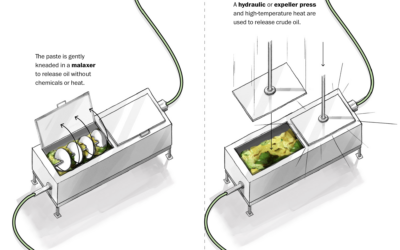
Making unrefined vs. refined avocado oil, illustrated
For The Washington Post, Anahad O’Connor and Aaron Steckelberg show the contrast between…
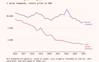
Falling cost of lab-grown diamonds
Natural diamonds require a lot of pressure and time, and then someone has…

Music visualizer in the style of a Pong game
You know the classic game Pong with the paddles and ball that moves…
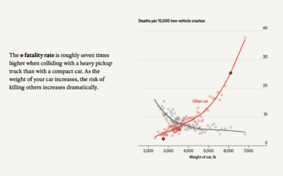
Weight of cars and fatalities
The Economist examines car weight and fatalities in car crashes. In two-vehicle collisions,…
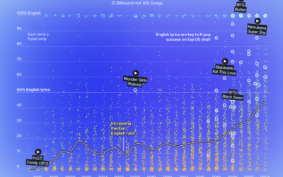
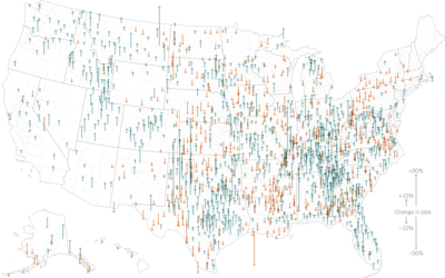
Internationalization of K-Pop
K-pop grew mainstream-popular in countries outside South Korea over the past few years.…


Visualizing poverty levels with a plant metaphor
To show poverty in the Pacific Region between age groups, gender, and location,…
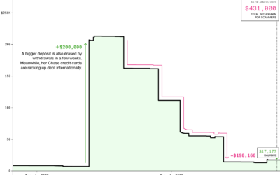
Scammed out of life savings, a line chart
Annette Manes, a retired widow and single mother who saved by spending little,…
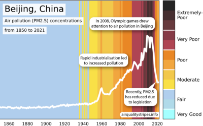
Maps of climate tipping points
The climate is changing, and researchers believe that after some point, there will…
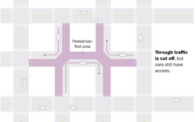
Superblocks, an urban planning compromise for cars and pedestrians
Living in city centers with little space to spend time outside and a…

Meat industry olympic chart
Speaking of data projects in unexpected places, David Mora repurposed one of my…