Visualization
Showing the stories in data through statistics, design, aesthetics, and code.

Editing photos as if they were audio files →
Masuma Ahuja and Denise Lu for the Washington Post applied a technique called…
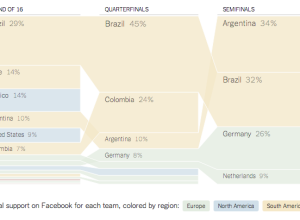
Voter approval rates as butt plugs
From a couple of years ago, but still relevant, I think. Matthew Epler…
Misery index based on perceived temperature →
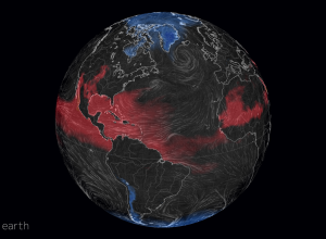
Late last year, Cameron Beccario made a wind map for earth, inspired by…
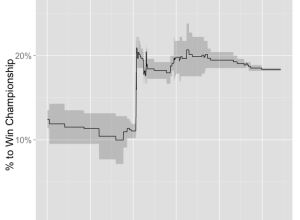
Spiky betting odds during LeBron James decision →
LeBron James decided to head back to Cleveland, so naturally the odds that…
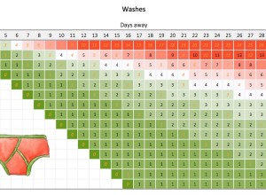
How much underwear to bring on a trip →
Packing underwear for a short trip is easy. You just pack a pair…
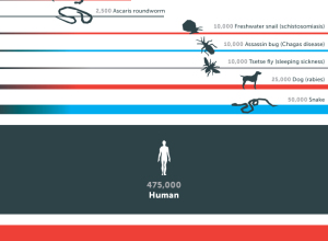
Mosquitos: The deadliest animal
This graphic from the Gates Foundation is from a few months ago, but…
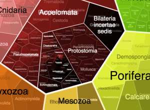
FoamTree: Visualize hierarchical data with a lot of groups
For small-ish amounts of hierarchical data, most JavaScript libraries can handle the load.…
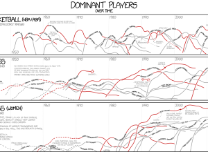
xkcd: Dominant players in chess and basketball →
I’m pretty sure xkcd is the only one who gets away with showing…
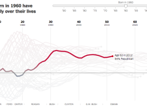
Birth year and political leanings →
A statistical model, from Yair Ghitza of Catalist and Andrew Gelman of Columbia…
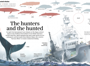
Whaling in Japan explained →
After a ruling by the United Nations International Court of Justice, Japan was…

Test your geographic knowledge in Google map game
Smarty Pins is a simple, fun map game by Google. You get a…


Filing cabinet follows people around, like a data trail
Jaap de Maat, a graduate student at the Royal College of Art, rigged…

Data Cuisine uses food as the medium
Ditch the computer screen for your data. It’s all about the food. Moritz…
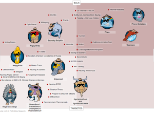
NSA programs with goofy names →
Julia Angwin and Jeff Larson for ProPublica made a chart of NSA programs…