Visualization
Showing the stories in data through statistics, design, aesthetics, and code.
Plant life cycle shows a breathing Earth
NASA mapped the annual cycle of all plant life on the planet in…
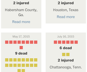
Mass shootings count – Depends on your definition
With recent events, you’ve likely seen the articles and graphics that get into…
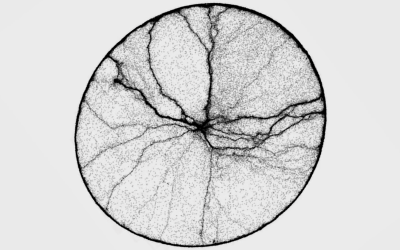
Ant time-lapse shows movement patterns
Ant activity can seem mysterious at times. The pack seems to start out…
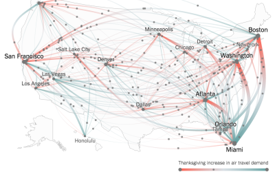
Thanksgiving flight patterns
Millions of Americans will fly home this Thanksgiving weekend. (Based on my morning…
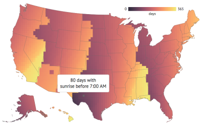
Daylight Saving Time geography
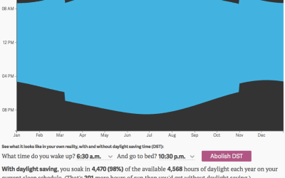
Keith Collins for Quartz made an interactive that showed how much more daylight…
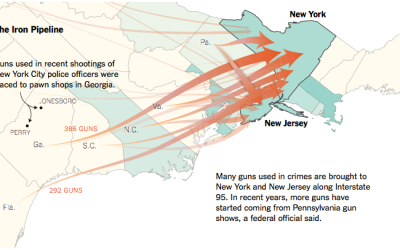
Out-of-state gun purchasing
In states with stricter gun laws, firearms still find their way in. Based…
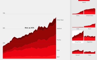
What the world eats
Diets vary around the world. Fathom Information Design for National Geographic charted the…
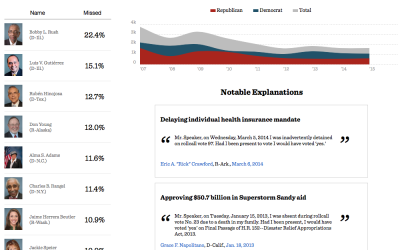
Missing votes in Congress
When members of the House of Representatives miss a vote, it is customary…
Average of faces in things
You’ve likely seen projects that take the average of people’s faces, but you…
Pale Blue Dot motion graphic
Joel Somerfield created this motion graphic to Carl Sagan’s Pale Blue Dot monologue.…
Motion graphics in Keynote
As an experiment, Linda Dong used Keynote, typically for your everyday slide presentations,…
US boundary evolution
We saw a similar video of boundary development over the centuries before, but…
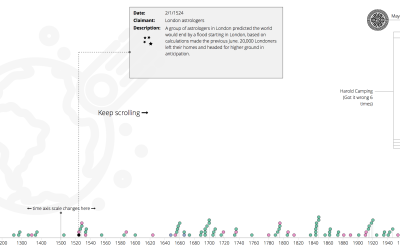
Past and future predictions of when the world will end
Wikipedia has a list of predicted dates for when apocalypse strikes, because of…
Daylight you get from daylight saving
We recently fell back an hour with the end of this year’s Daylight…
Pythagorean theorem water demo
This is years old, but it still tickles the neurons every time. It’s…


