Visualization
Showing the stories in data through statistics, design, aesthetics, and code.
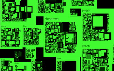
Geocities map, a snapshot of an old web
Geocities was a place on the web you could create your own space…

Pollution popsicles
Students at the National Taiwan University of Arts made popsicles using sewage runoff…
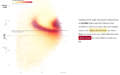
Baseball hitting angles on the rise
After the crackdown on performance-enhancing drugs, home runs in professional baseball dipped the…
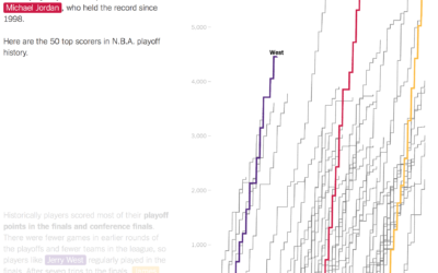
LeBron James passed Michael Jordan in playoff points
As a Golden State Warriors fan, I am obligated to dislike LeBron James,…
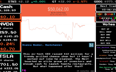
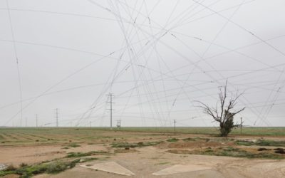
Multiplayer stock market game with real money
Twitch launched Stock Stream, which is a multiplayer stock market game that uses…
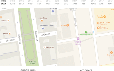
Comparing Google Maps and Apple Maps Over a Year
Google collects much of their own data to construct their maps, whereas Apple…
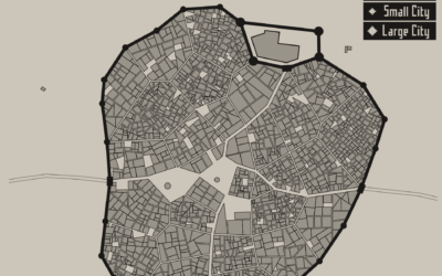
Medieval fantasy city generator
Game developer Oleg Dolya made a medieval fantasy city generator. Select the size…
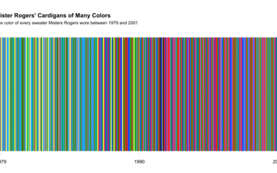
All of Mister Rogers’ cardigan colors
While watching a Mister Rogers’ Neighborhood marathon, Owen Phillips for The Awl wondered…
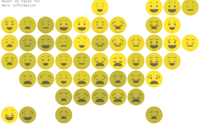
Chernoff emoji
Lazaro Gamio for Axios used Chernoff Faces that look like emojis.
This visualization…
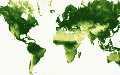
Breathing Earth of vegetation
Using data from NOAA STAR, Nadieh Bremer creates a breathing Earth that shows…
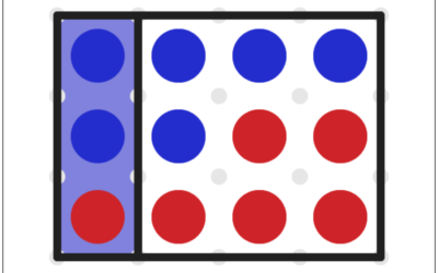
Gerrymandering game shows you how it works
Gerrymandering is the practice of manipulating boundaries in such a way that favors…
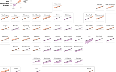
Life expectancy by state, against the US average
FiveThirtyEight continues their look at mortality by geography. This graphic by Anna Maria…
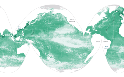
X-Ray of the oceans
Using satellite data and spatial models, researchers estimate human influence in the ocean.…
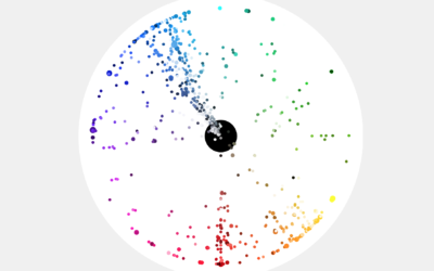
Most popular colors used by most popular sites
Paul Hebert was curious about the colors used on the web’s larger sites,…