Visualization
Showing the stories in data through statistics, design, aesthetics, and code.
Mortgages in terms of years of working life
Buying a house is often confusing and complex, compounded by a dollar sign…
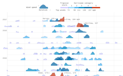
Thirty years of hurricanes
After their graphic for thirty years of floods, Axios follows up with thirty…
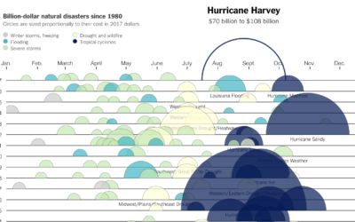
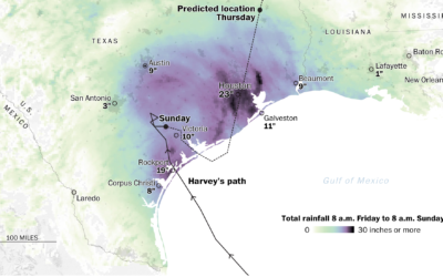
Cost of Hurricane Harvey
Kevin Quealy for The Upshot charted the estimated cost of Hurricane Harvey, along…
Everyday thresholds visualized in dramatic fashion
This is a fun one that’s weirdly suspenseful. Everyday thresholds, like the slow…
Most frequent how-tos we search for
Xaquín G.V., in collaboration with the Google News Lab, investigated what people around…
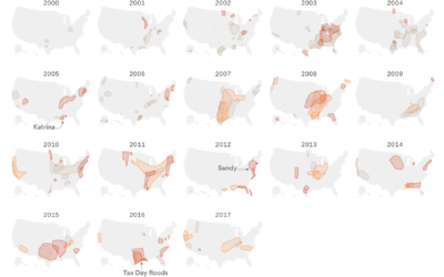
Thirty years of floods
Based on data from the Dartmouth Flood Observatory, Lazaro Gamio for Axios mapped…
Using an audience’s own data to highlight both play and security
This is great. Daniel Goddemeyer and Dominikus Baur made Data Futures, which collects…
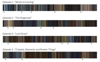
Color profiles of every Game of Thrones episode
As the final episode of Game of Thrones nears, Kavya Sukumar for Vox…
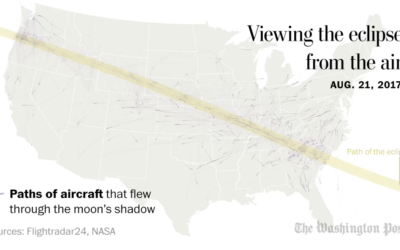
Flights passing through the shadow of the sun
Here’s a neat one by John Muyskens for The Washington Post. Using data…
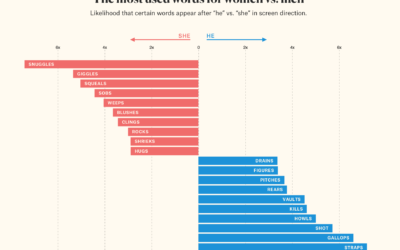
He vs. She in film screenplay direction
In screenplays, there are directions that tell actors and actresses what to do…
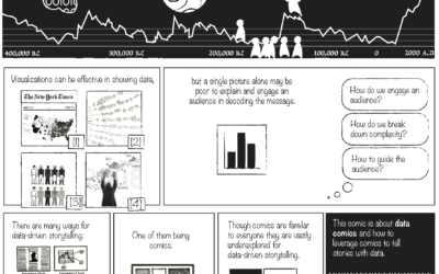
C’est la vis, teaching kids how to visualize data
By adulthood, it’s expected that we can read charts to some degree. You’re…
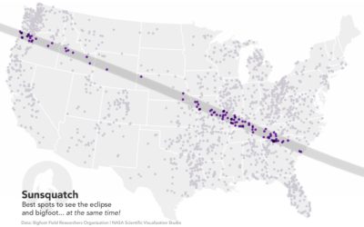
Sunsquatch, the only eclipse map you need
It’s solar eclipse time. There have been a lot of maps leading up…
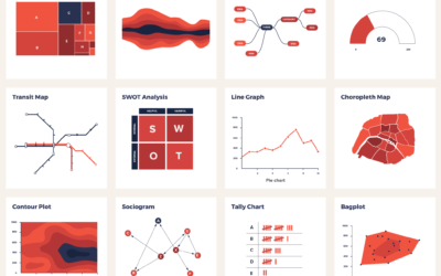
Catalog of visualization types to find the one that fits your dataset
There are a lot of visualization methods to choose from, and it can…
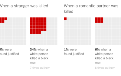
Killings of blacks by whites ruled “justified”
In a collaboration between The Marshall Project and The Upshot, Daniel Lathrop and…
Photorealistic balls of precious metals placed outside their mines
Artist Dillon Marsh uses CGI balls of metal placed outside of mines to…

