Admittedly, ever since the Spring quarter ended, I’ve either been preparing for my internship at The Times or have been occupied by the internship. I haven’t given much thought to my dissertation topic, which in the most vaguest of terms will somehow encompass three things:
- Social Data Visualization
- Eco-Visualization
- Visualization of my Life
I have yet to figure out how to tie the three together in a worthwhile way or even whether I will include all three. Wrapped around the three will be data sharing. I got to thinking a little bit about visualizing my life in data today.
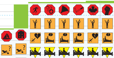
My adviser forwarded me this info design piece, by Gregory Dizzia (which was apparently also featured on infosthetics):

First off, this is a cool piece. If you haven’t seen it, go to the site and download the pdf. It’s a simple idea. Document past relationships — how they began, how they ended, what happened in between. The information is organized very well. At a glance, you can see how many relationships Greg has had in his life and all the one night stands he had after his mid-life, long-term relationship. The design is attractive and I could relate to the information, so I was drawn in to look more.
Dig a little deeper, and you’ll see that there’s not just one engagement ring during that long-term relationship with Sarah. There’s a second one during his very first girlfriend, Megan. Although, I’m a little wary of calling Megan a girlfriend since it was during Greg’s tender years at age 9 to 11. Stuff like that makes me want to know more.
Was he really engaged? Was it an arranged marriage or something? What do those breakup symbols really mean?
Life Visualization Appeal
Right off, Greg’s piece drew me in, because (1) it was pretty, and (2) I could relate to the data, and (3) there was a very human factor. This could probably be generalized to all types of successful visualization, but (2) and (3) are, I think, synonymous with life viz. That’s two out of three things that are automatic. Plus, as the visualizer I have a very strong emotional attachment to the data.
NOW, what happens when we have 100 people’s relationships to visualize? 1000? That’s when it gets really interesting and social data visualization makes its way into the picture. Well, something to think about.

 Visualize This: The FlowingData Guide to Design, Visualization, and Statistics (2nd Edition)

Pingback: Data Visualization Gets Personal - Putting Data Into Your Hands [PROJECT] | FlowingData